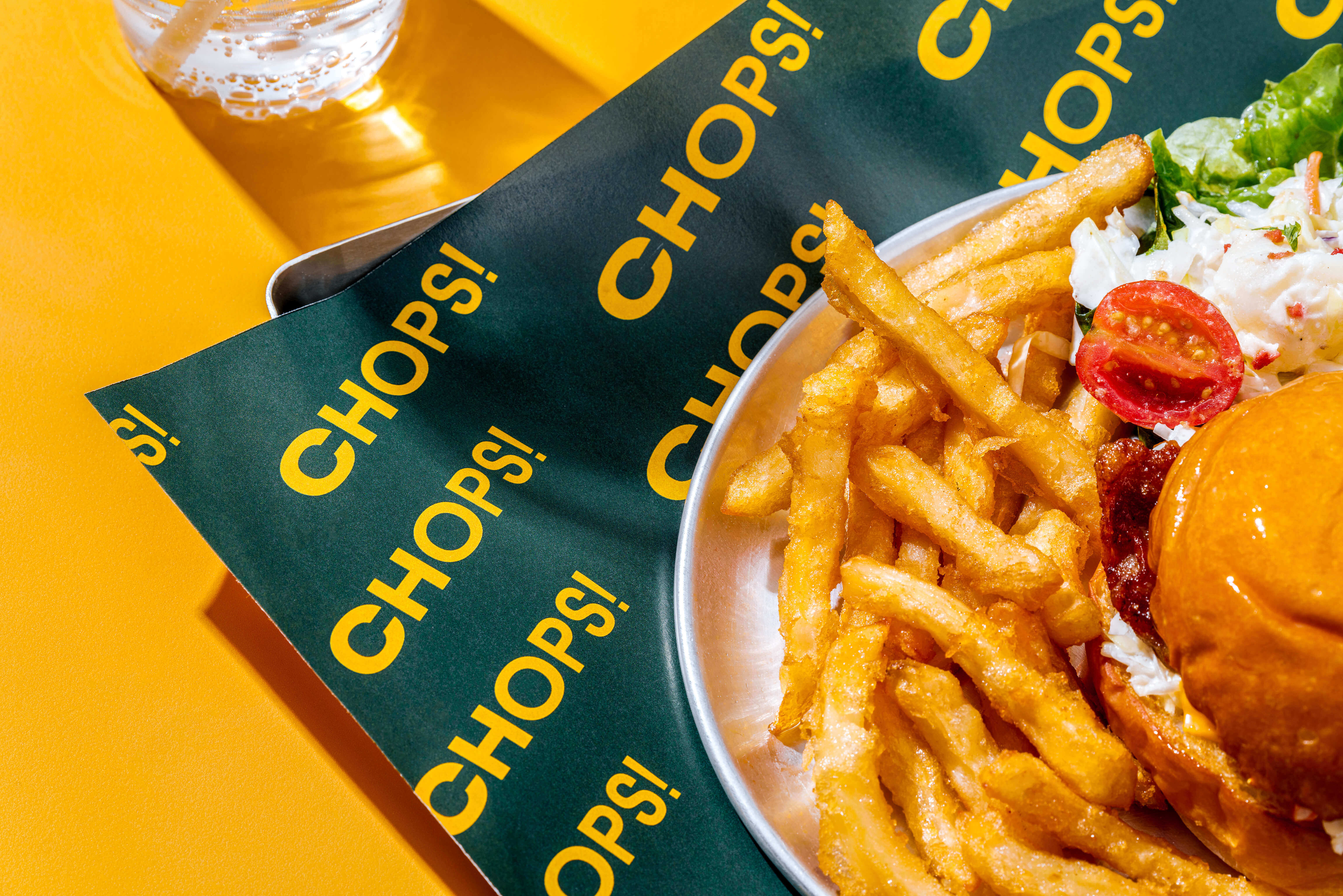
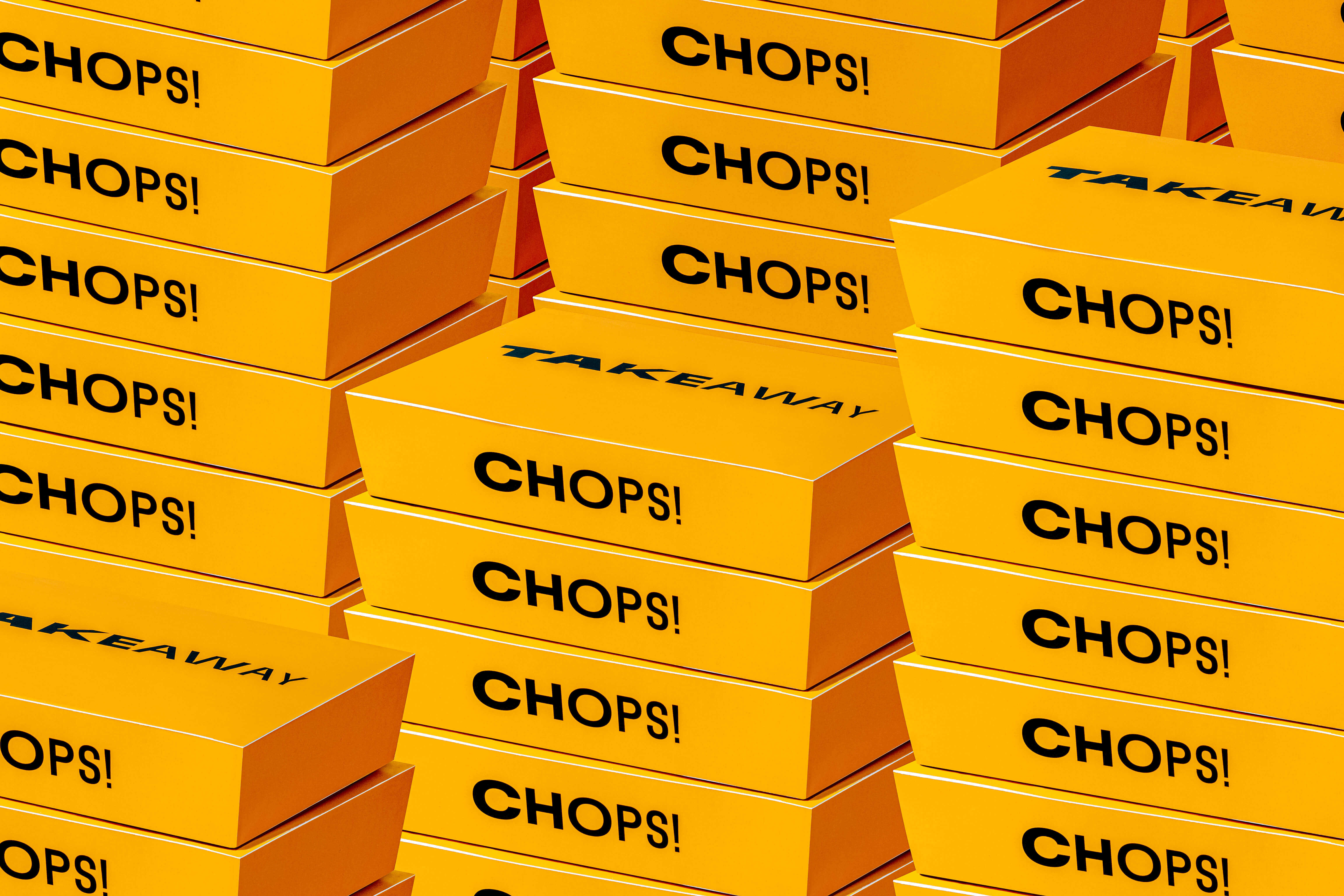
CHOPS! serves up quality Western food across numerous outlets in Singapore. Having been featured on popular food blogs and lifestyle magazines, it is well known for its freshness and generous portions.
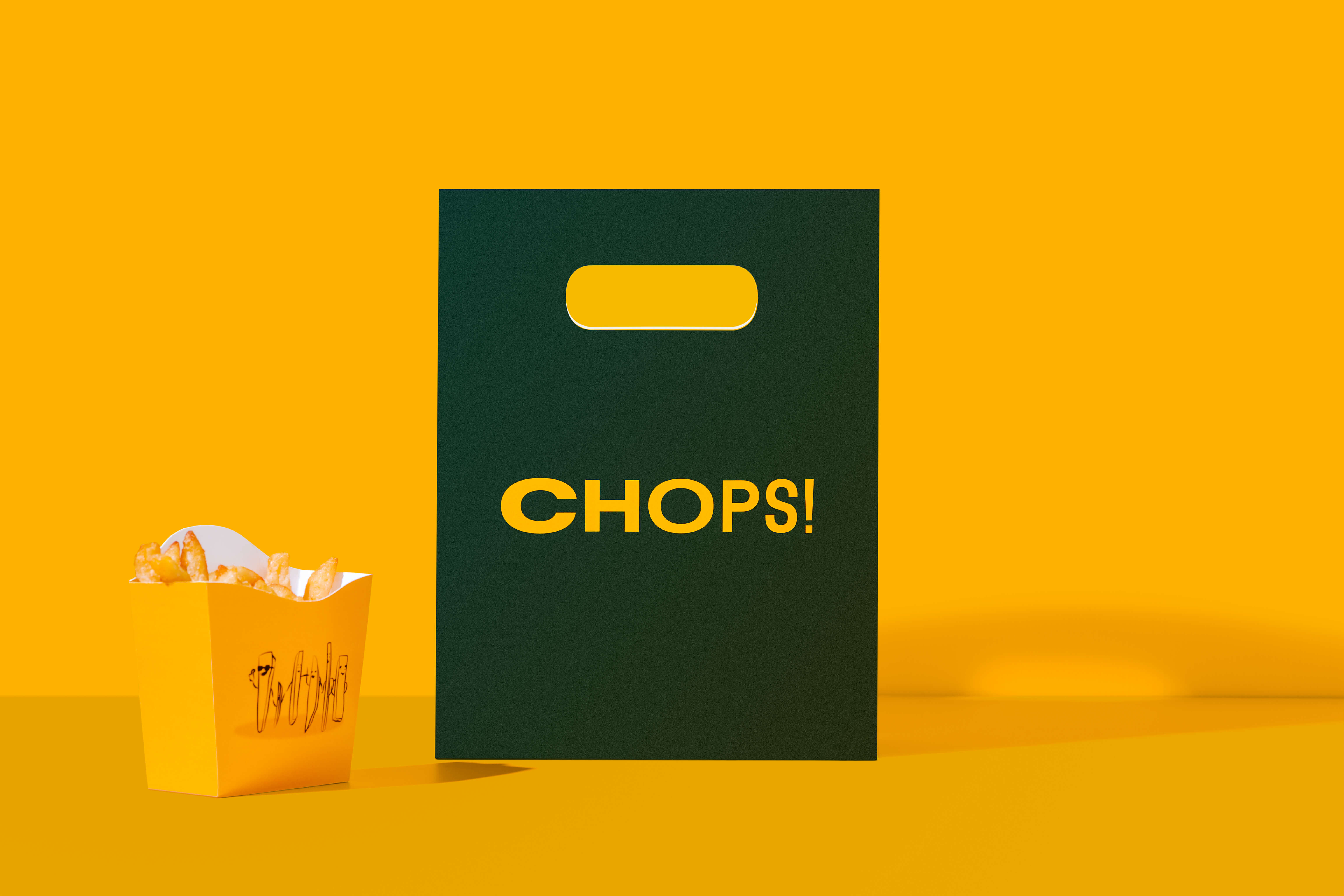
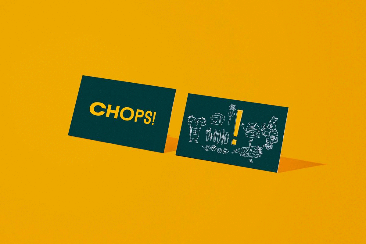
The identity is based on the idea of ‘Better Together’ through the sharing of hearty party platters among diverse individuals of all shapes and sizes. The logotype is set in the beautiful and super flexible variable family Flexa by Grilli Type.
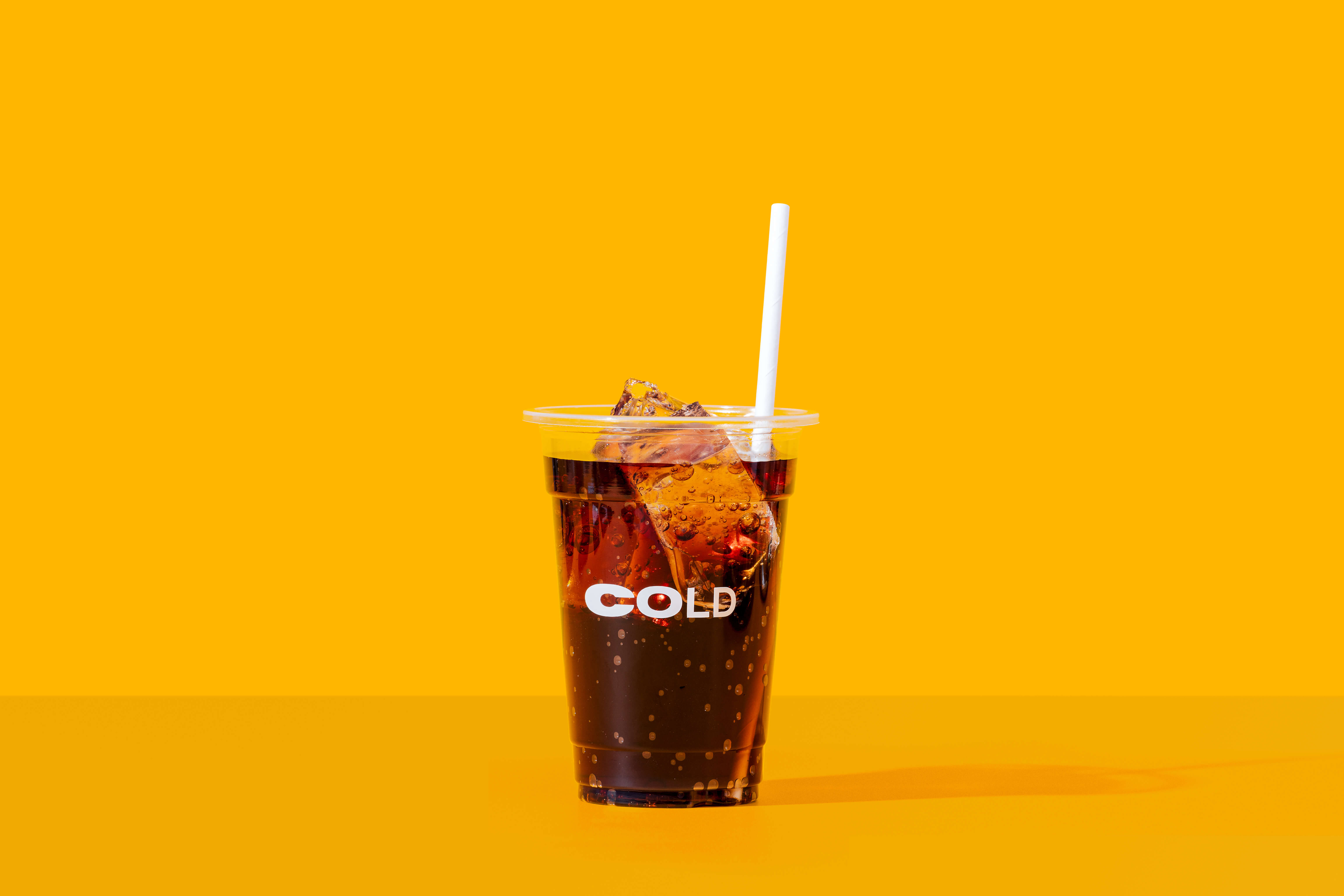
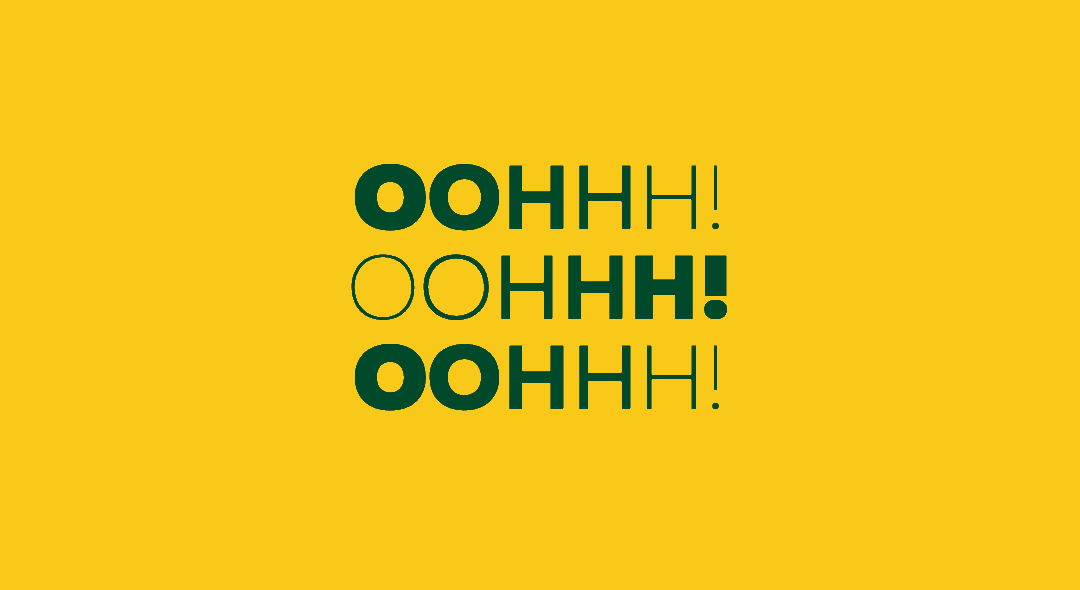
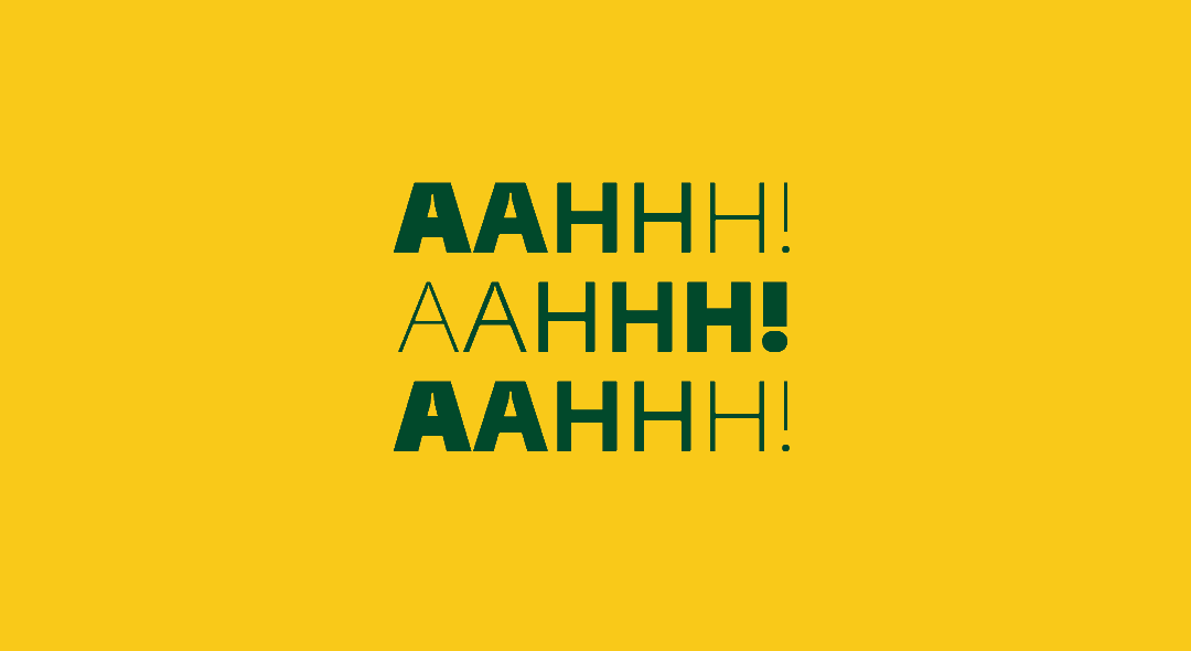
Using Python with DrawBot, we created ‘Sounds of Satisfaction’ that showcase the typeface dancing among font weights, akin to our bellies expanding (and contracting) after a satisfied meal. Other applications take after the dynamism of the logotype.
The identity is based on the idea of ‘Better Together’ through the sharing of hearty party platters among diverse individuals of all shapes and sizes. The logotype is set in the beautiful and super flexible variable family Flexa by Grilli Type.
Using Python with DrawBot, we created ‘Sounds of Satisfaction’ that showcase the typeface dancing among font weights, akin to our bellies expanding (and contracting) after a satisfied meal. Other applications take after the dynamism of the logotype.
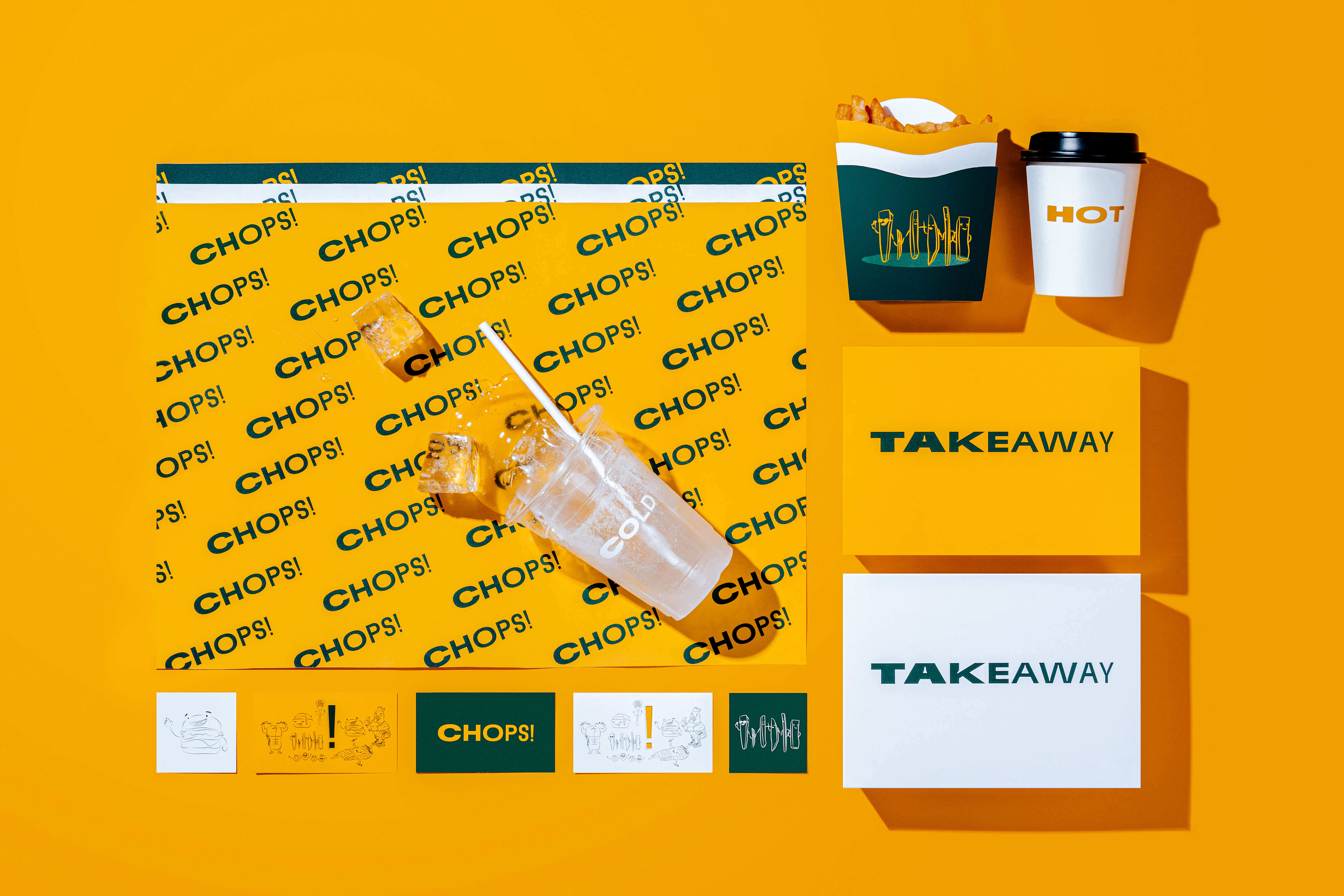
We also introduced the main mark to be a simple exclamation (!) mark—used at sleeker touch-points like signages and extended packaging. With its origins shrouded in mystery, it is widely accepted (and still debated) that it comes from Latin—with the combination of the alphabets I and O coming together to represent Delight and Joy (Did you know?).
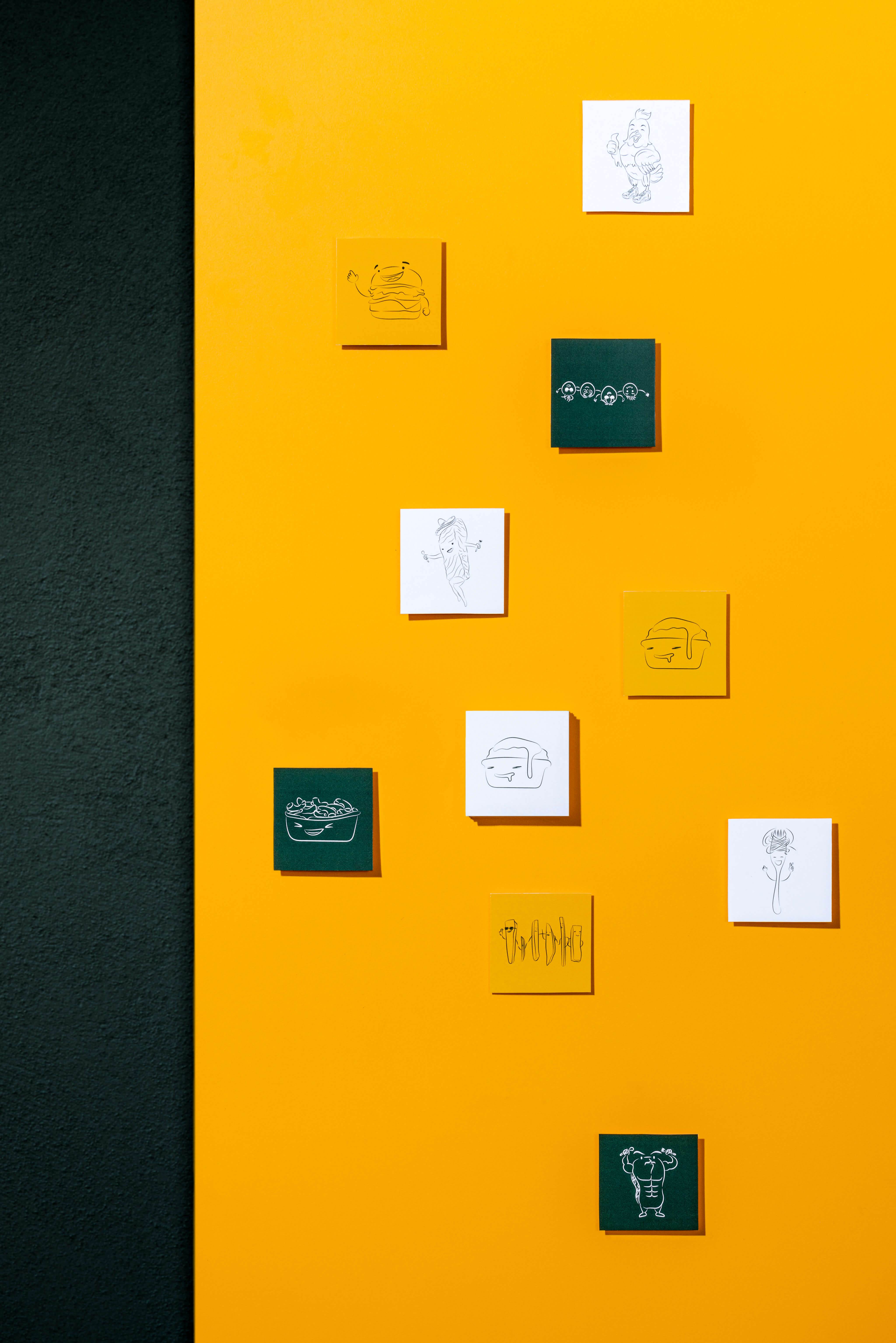
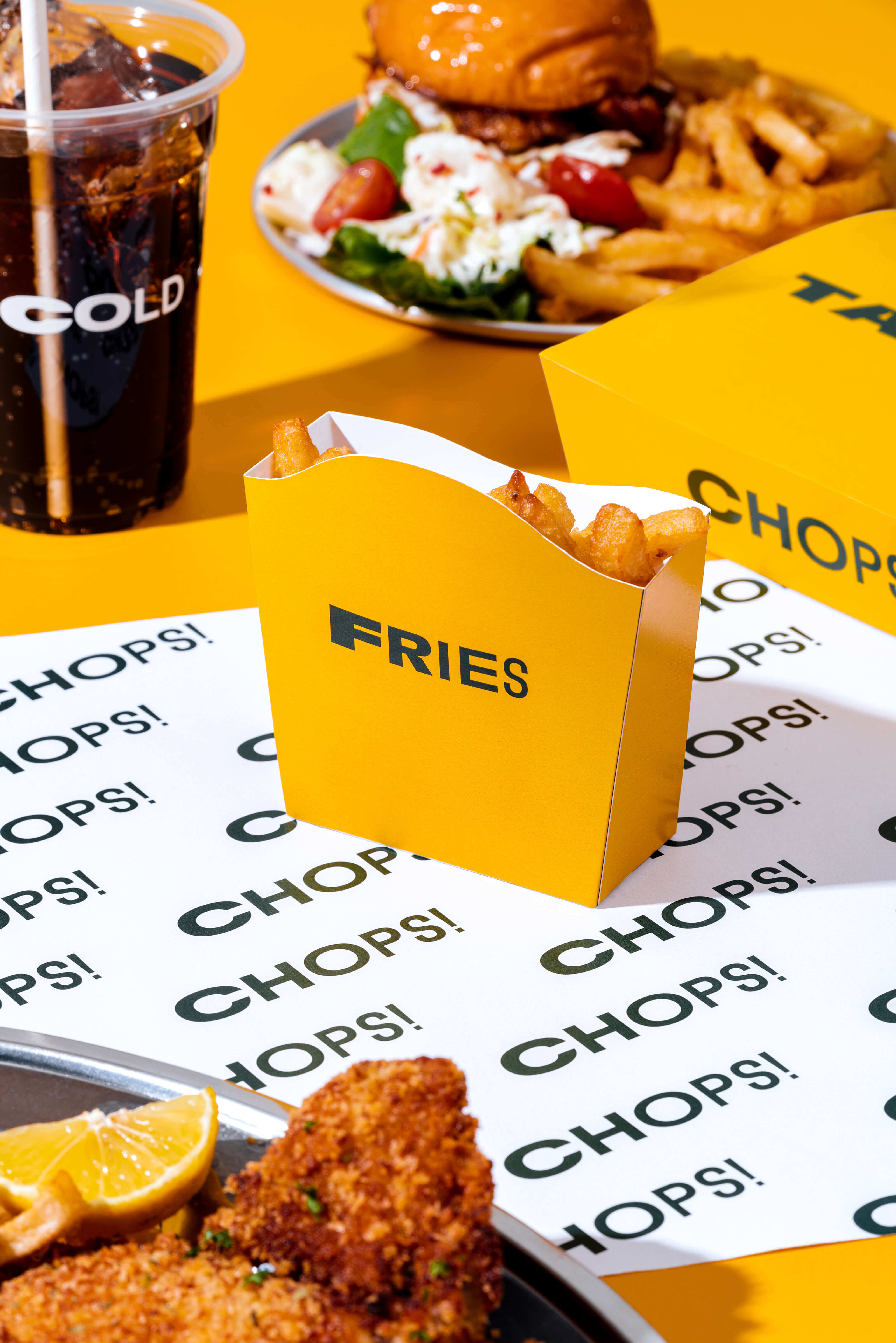
The language is further enhanced and accompanied by a myriad of illustrations and namings based on their best-selling menu items. Our favourite is, of course, Friend Fries.
Photographers: Samuel Wong / The Gentle Studio
![]()
The language is further enhanced and accompanied by a myriad of illustrations and namings based on their best-selling menu items. Our favourite is, of course, Friend Fries.
Photographers: Samuel Wong / The Gentle Studio