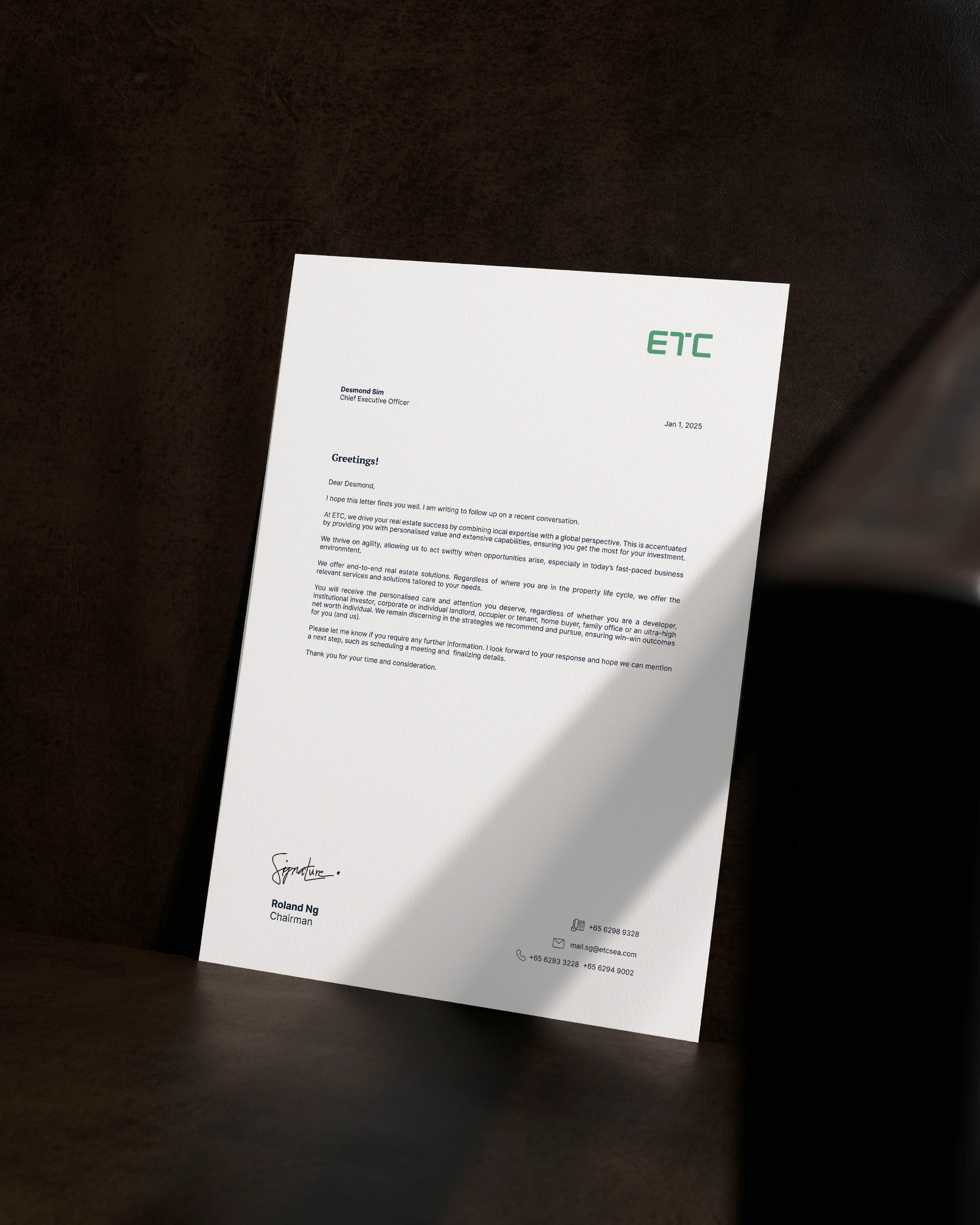
ETC is a long-established leader in the property industry—trusted, bold, and ambitious real estate advisors with deep expertise across multiple business pillars. The rebrand distills its legacy into a sleek, modern identity while preserving its heritage. The transition from Edmund Tie & Company to ETC reflects both continuity and evolution—a company with deep roots, primed for the future.
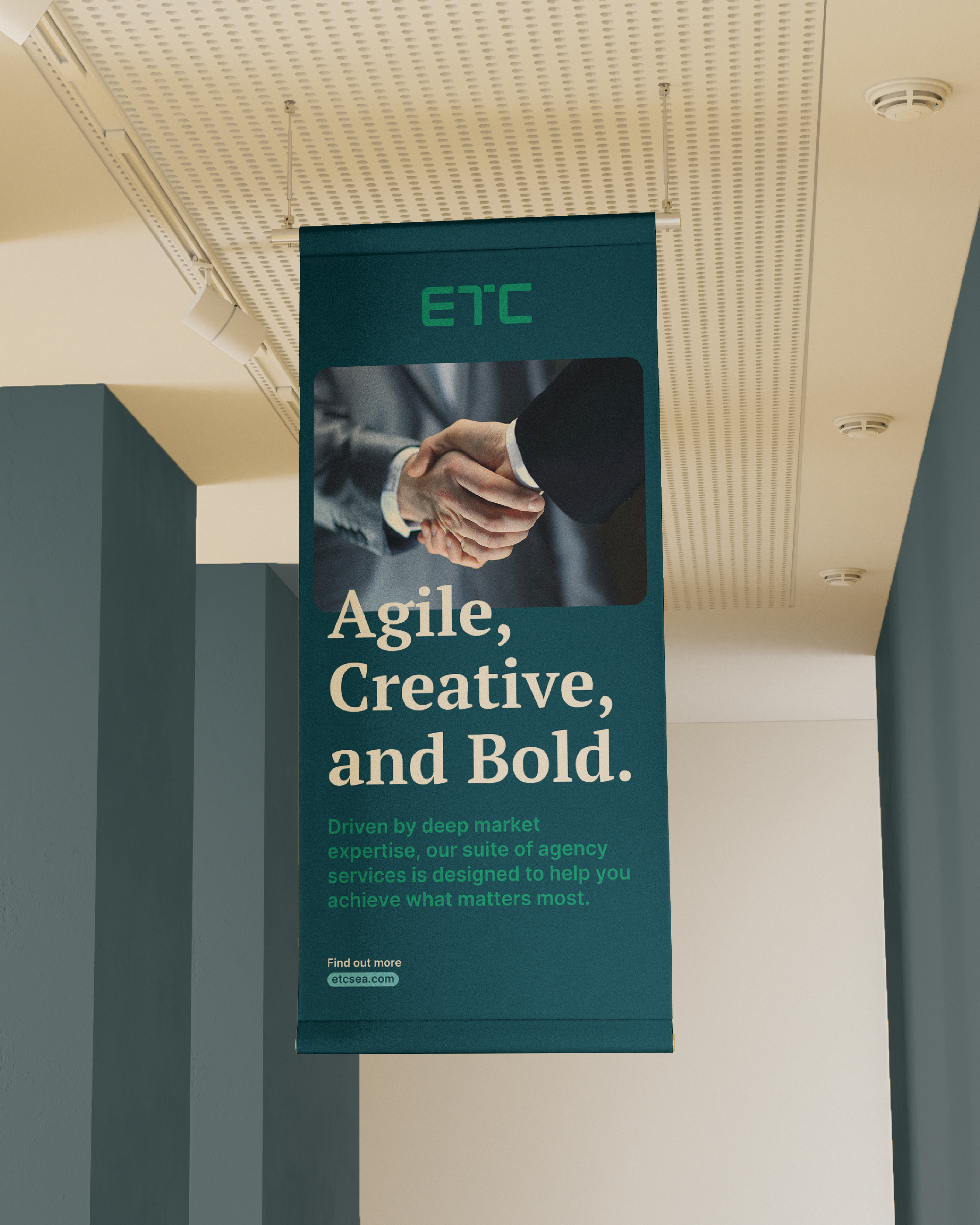
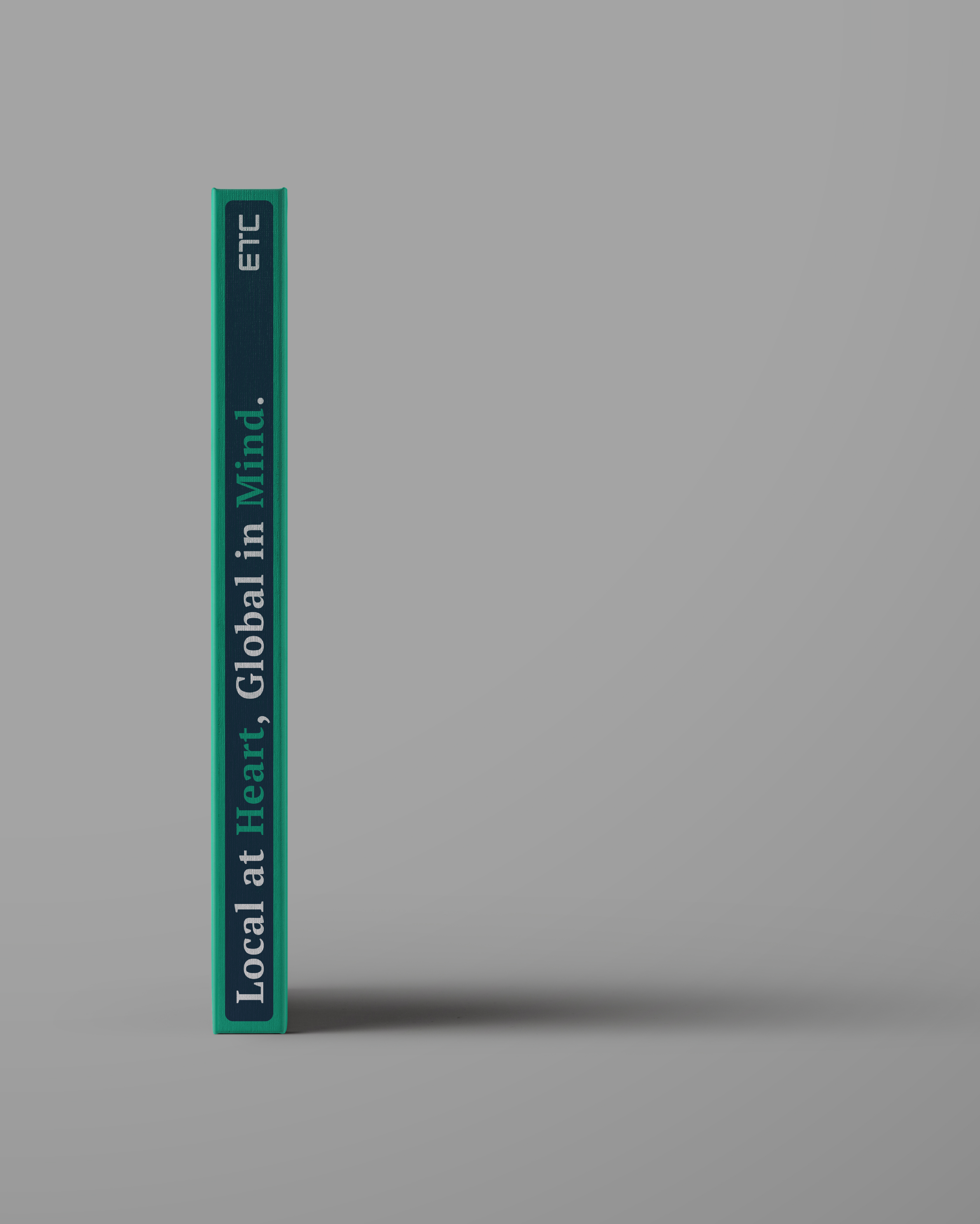
At the heart of the new identity is a customised logotype that balances modern sensibilities with a touch of softness, reinforcing ETC’s commitment to human-centric relationships. The clean, structured design is punctuated by the distinctive “T” sprouting from the middle, symbolizing heritage, growth, and forward momentum. Embodied by their belief of "Local at Heart, Global in Mind", ETC's work immaculately balances between regional expertise and international outlook.
At the heart of the new identity is a customised logotype that balances modern sensibilities with a touch of softness, reinforcing ETC’s commitment to human-centric relationships. The clean, structured design is punctuated by the distinctive “T” sprouting from the middle, symbolizing heritage, growth, and forward momentum. Embodied by their belief of "Local at Heart, Global in Mind", ETC's work immaculately balances between regional expertise and international outlook.
The color palette pays homage to the iconic jade ETC is known for (also found in the Chinese name of the founder 戴玉祥), while introducing a spectrum of analogous tints and complementary hues, ensuring consistency across print, digital, and social platforms.
The rebranding was strategically rolled out in phases, spanning multiple touchpoints and press releases to ensure a seamless transition. Beyond the corporate identity, a touch of playfulness was introduced with custom-designed stickers for internal communication, fostering team bonding and engagement. More than just a rebrand, ETC’s identity is a statement of trust, expertise, and innovation, positioning it as a future-ready leader in the industry.
The rebranding was strategically rolled out in phases, spanning multiple touchpoints and press releases to ensure a seamless transition. Beyond the corporate identity, a touch of playfulness was introduced with custom-designed stickers for internal communication, fostering team bonding and engagement. More than just a rebrand, ETC’s identity is a statement of trust, expertise, and innovation, positioning it as a future-ready leader in the industry.