Fogo Fungi began with a clear intention: to cultivate exceptional exotic mushrooms in Singapore, thoughtfully and at the highest standard. Grown locally using a synthesis of proven global techniques and contemporary agricultural technology, their produce is crafted for discerning chefs and confident home cooks alike.
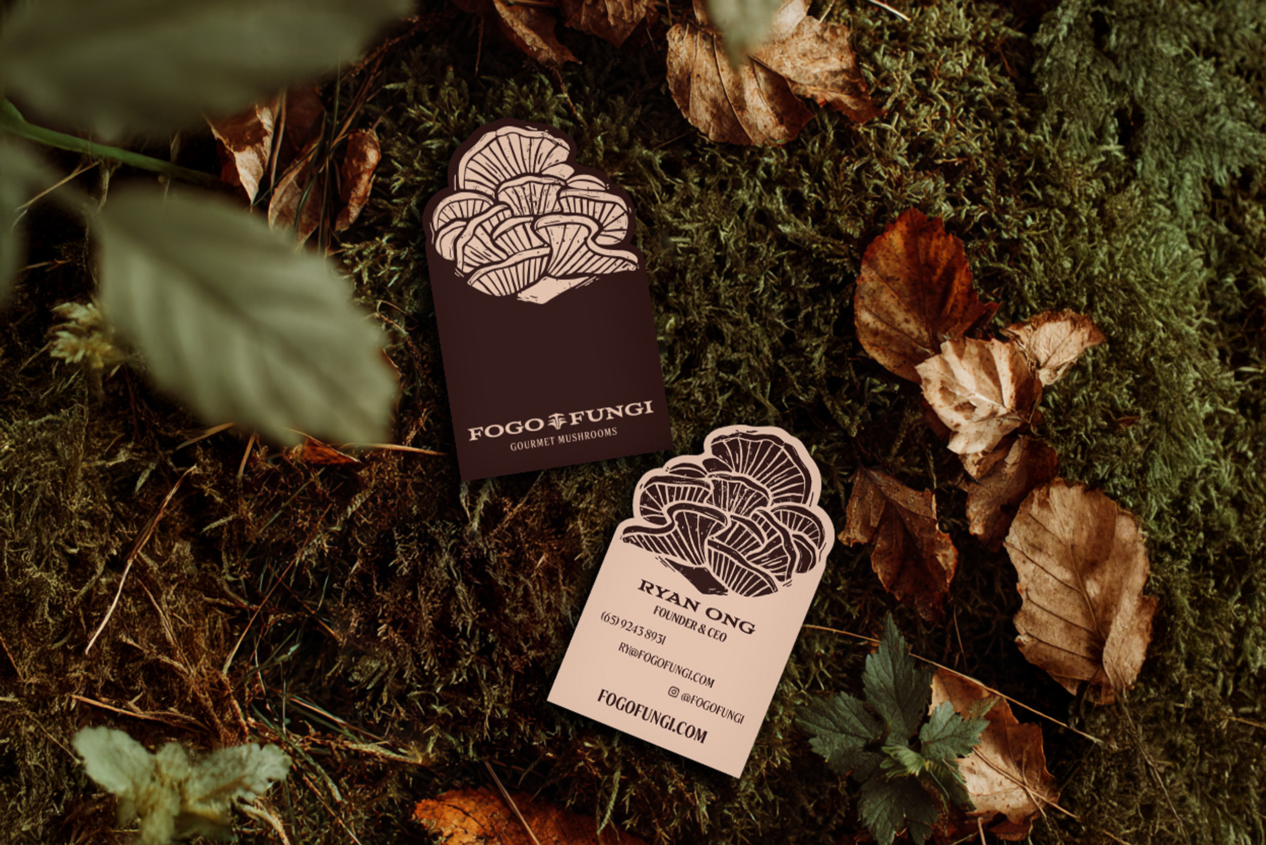
The refreshed visual identity reflects this sensibility. It is grounded in nature yet unmistakably modern—where tactile, organic textures meet a clean, disciplined graphic language. The logomark, formed by a pair of upward-reaching parallel Fs, suggests balance, growth, and continuity, echoing the mushroom’s natural progression from soil to table. The Aviano Wedge typeface adds character without excess—distinctive, cultured, and quietly expressive.
The refreshed visual identity reflects this sensibility. It is grounded in nature yet unmistakably modern—where tactile, organic textures meet a clean, disciplined graphic language. The logomark, formed by a pair of upward-reaching parallel Fs, suggests balance, growth, and continuity, echoing the mushroom’s natural progression from soil to table. The Aviano Wedge typeface adds character without excess—distinctive, cultured, and quietly expressive.
A palette of deep browns, warm neutrals, and measured accents draws inspiration from the forest floor, evoking depth, richness, and restraint. Hand-drawn, interchangeable illustrations of our core mushroom varieties introduce a subtle sense of exploration. They are refined but human—an invitation rather than a flourish—reflecting values of authenticity, curiosity, and care in craft.
At its core, Fogo Fungi is about reframing perception. Mushrooms are not merely ingredients; they are expressive, ingenious gifts from nature. From culture to commerce, Fogo Fungi is poised to elevate Singapore’s culinary landscape—quietly setting a new benchmark, one remarkable harvest at a time.
At its core, Fogo Fungi is about reframing perception. Mushrooms are not merely ingredients; they are expressive, ingenious gifts from nature. From culture to commerce, Fogo Fungi is poised to elevate Singapore’s culinary landscape—quietly setting a new benchmark, one remarkable harvest at a time.