Fruce is a well-loved and established beverage company that is steadily expanding its operations across more outlets in Singapore. A business that maintains dependability and credibility in the expertise of avocados, Fruce prides itself with immense knowledge of avocados and fresh fusion beverage treats. Apart from the favorite staples, ingenious pairings are often created to tease the taste buds of many.
We were commissioned to give it a refreshed identity that is fun, fresh, and timeless. While radiating optimism and lightheartedness, we refrained from being frivolous and boisterous in execution.

The logotype dynamically works with and without the outer rings inspired by the avocado exocarp and mesocarp. Depending on application, it can multiply in ring numbers and also work in motion graphics to amp up the dynamism.
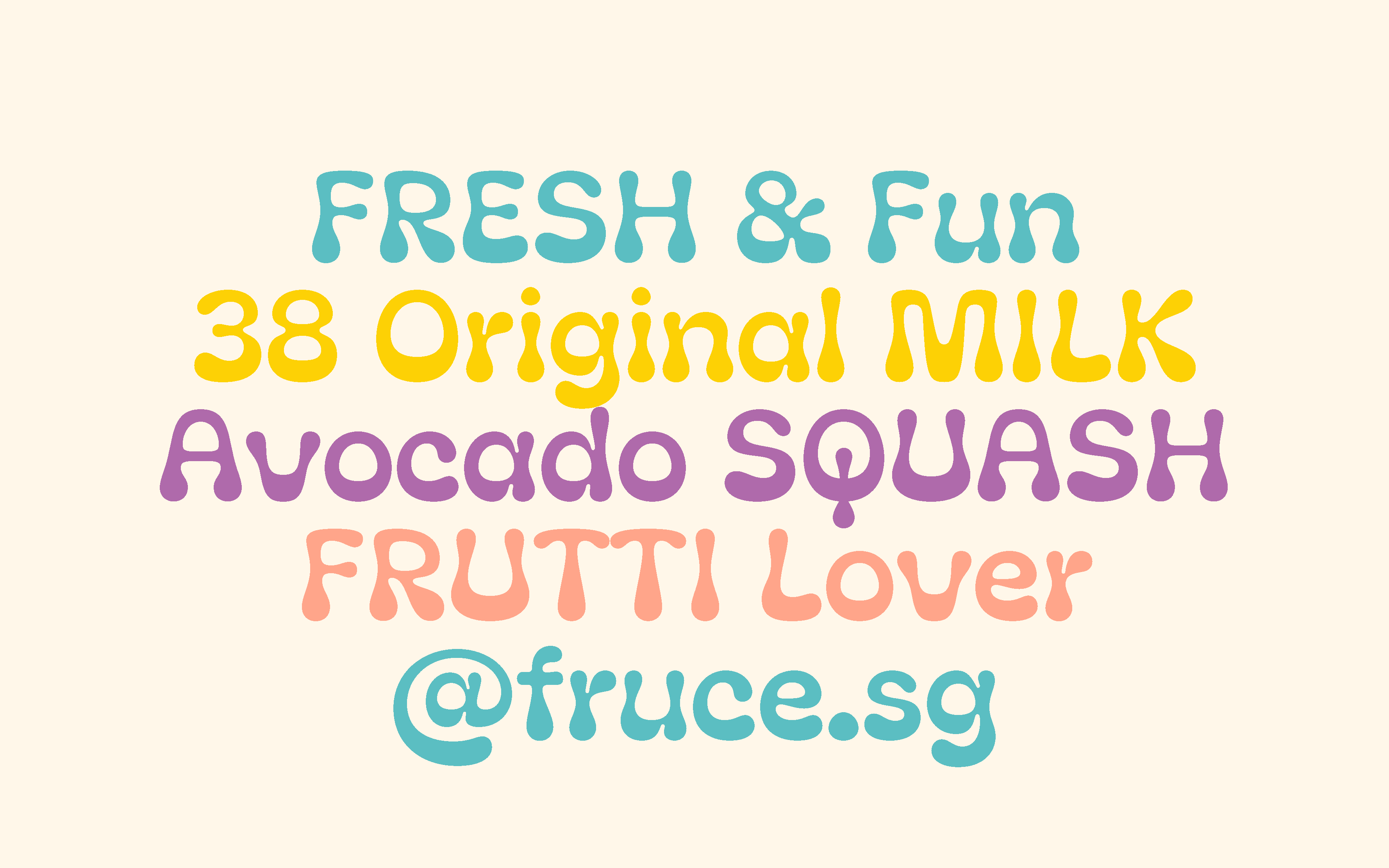
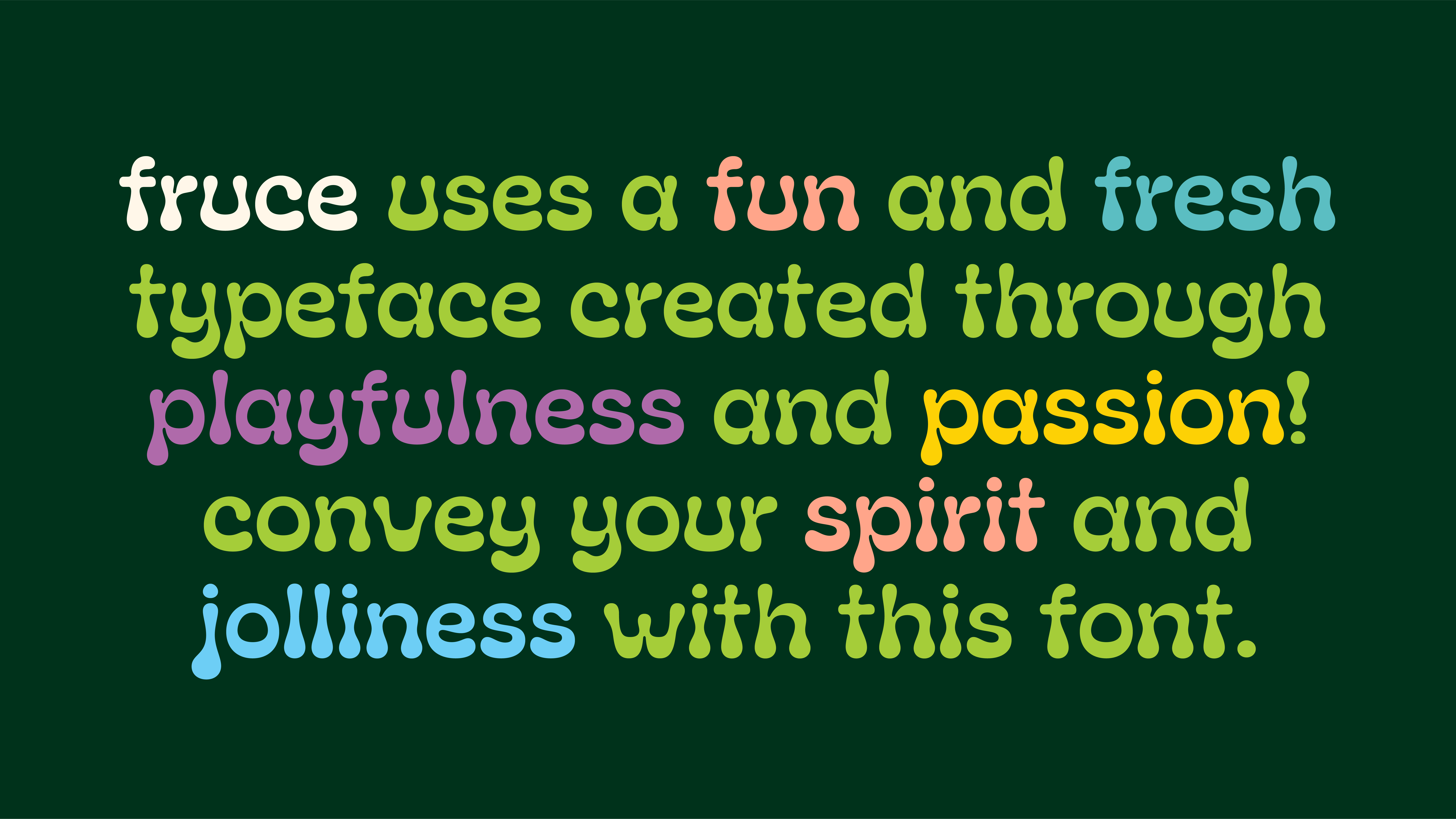
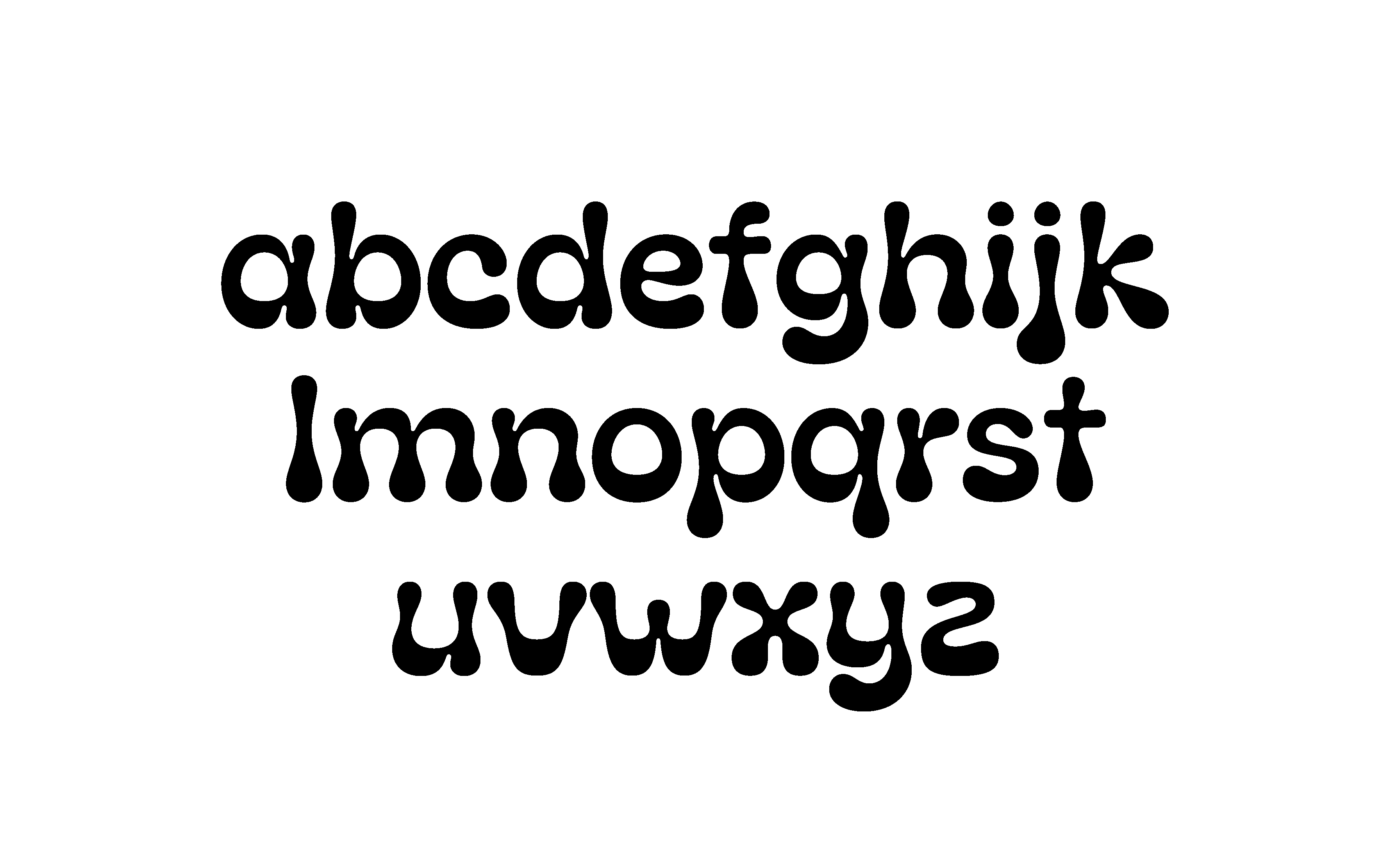
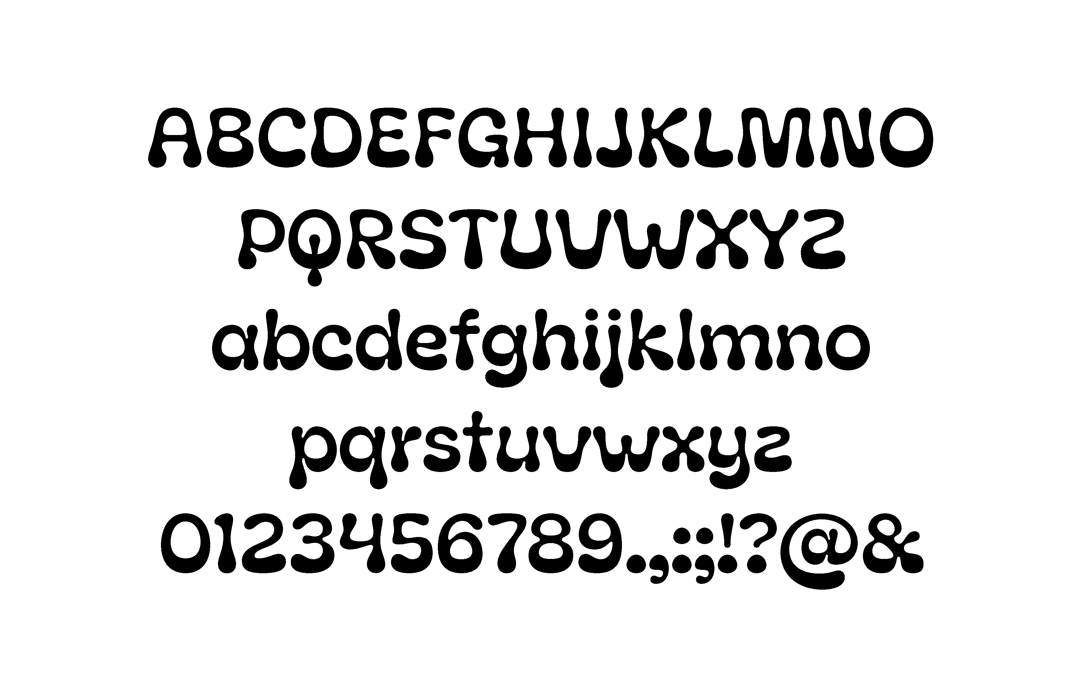
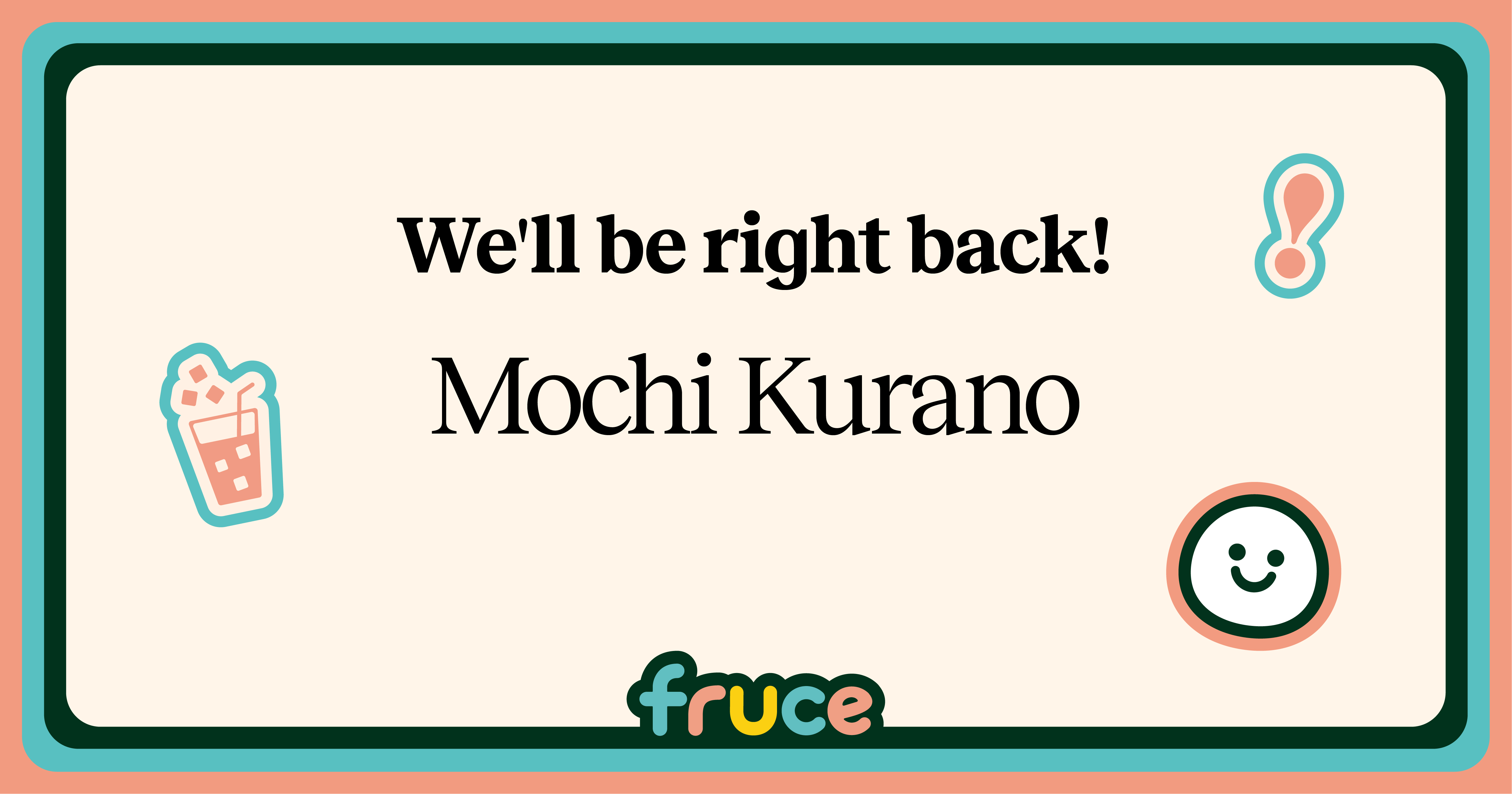
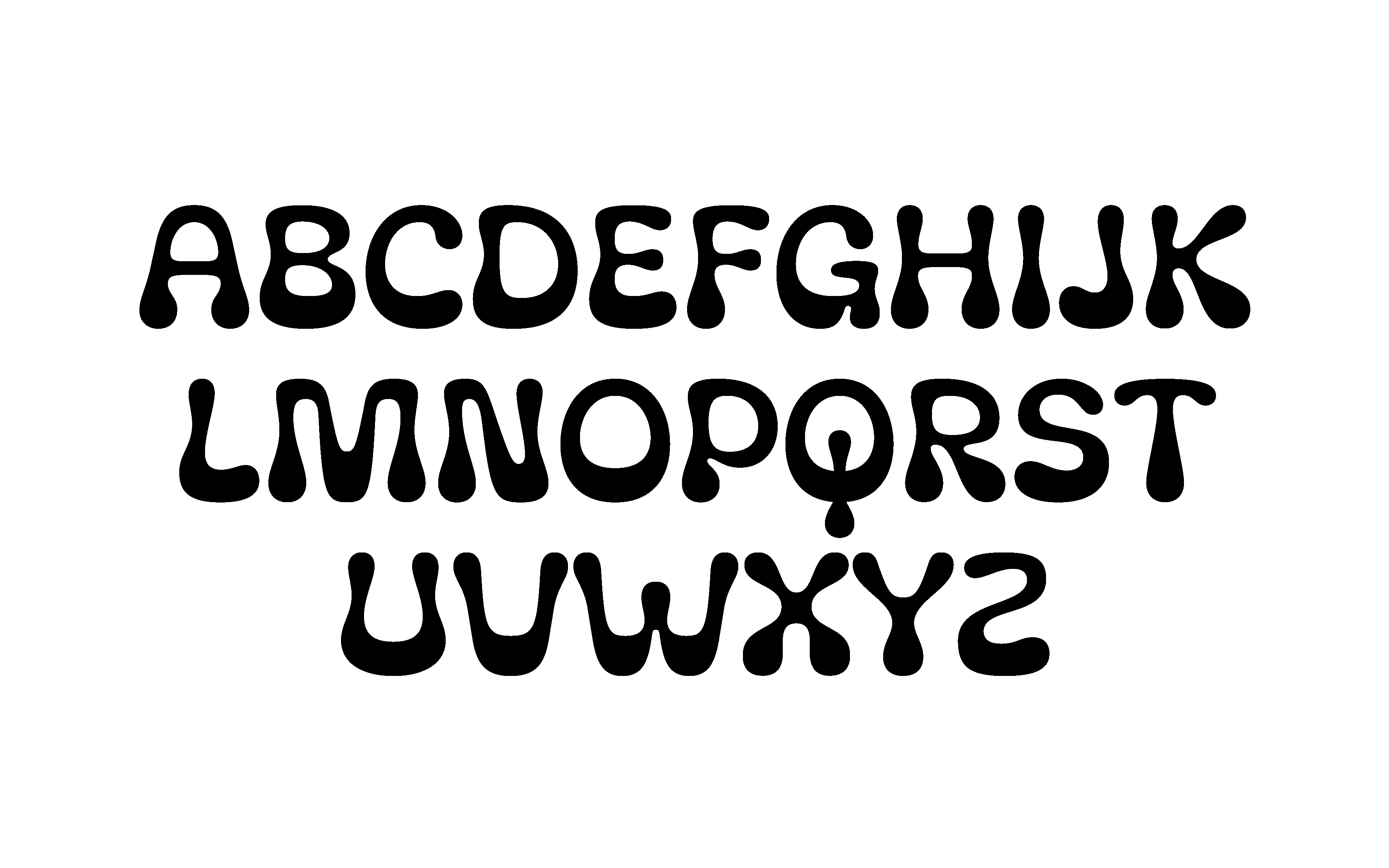
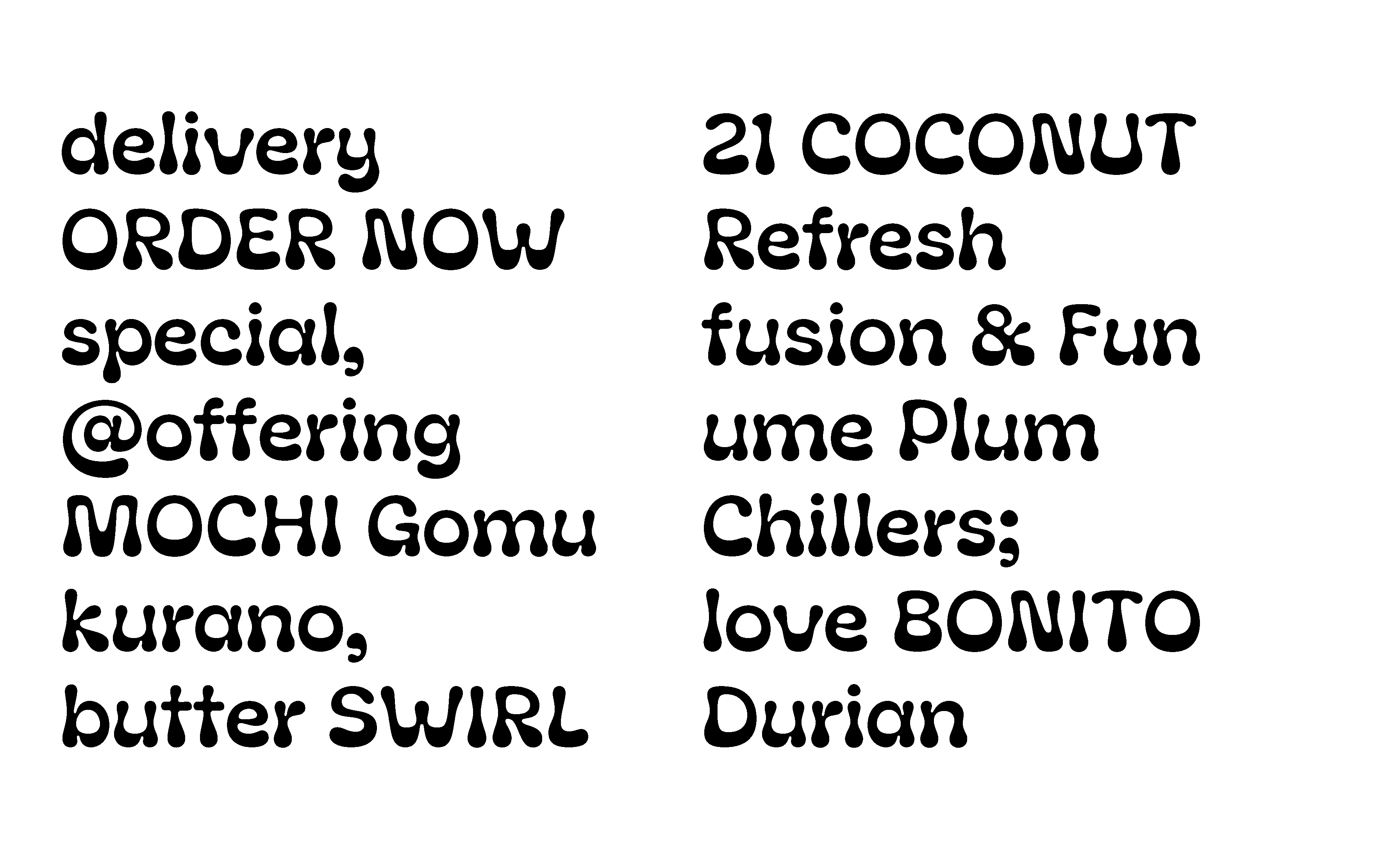
Inspired by fresh fruits, the bright colours emphasise Fruce’s pride as avocado experts. Creating a custom typeface to occasionally work with a serif typeface to variate between fun and clarity, the refreshed identity makes Fruce, witty, optimistic, and bold in its claim about being the avocado experts in the dessert beverage category.
Inspired by fresh fruits, the bright colours emphasise Fruce’s pride as avocado experts. Creating a custom typeface to occasionally work with a serif typeface to variate between fun and clarity, the refreshed identity makes Fruce, witty, optimistic, and bold in its claim about being the avocado experts in the dessert beverage category.


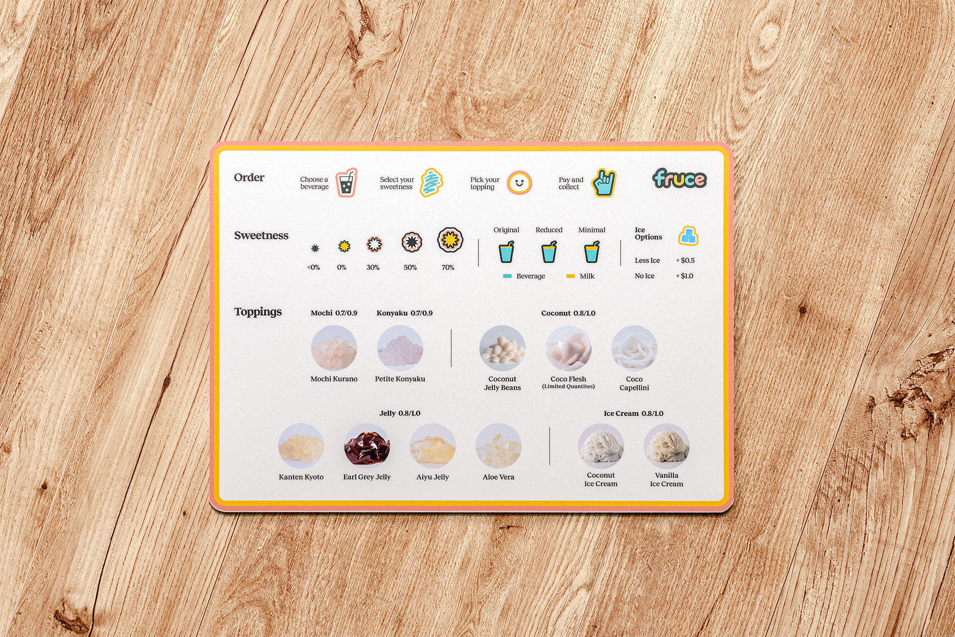

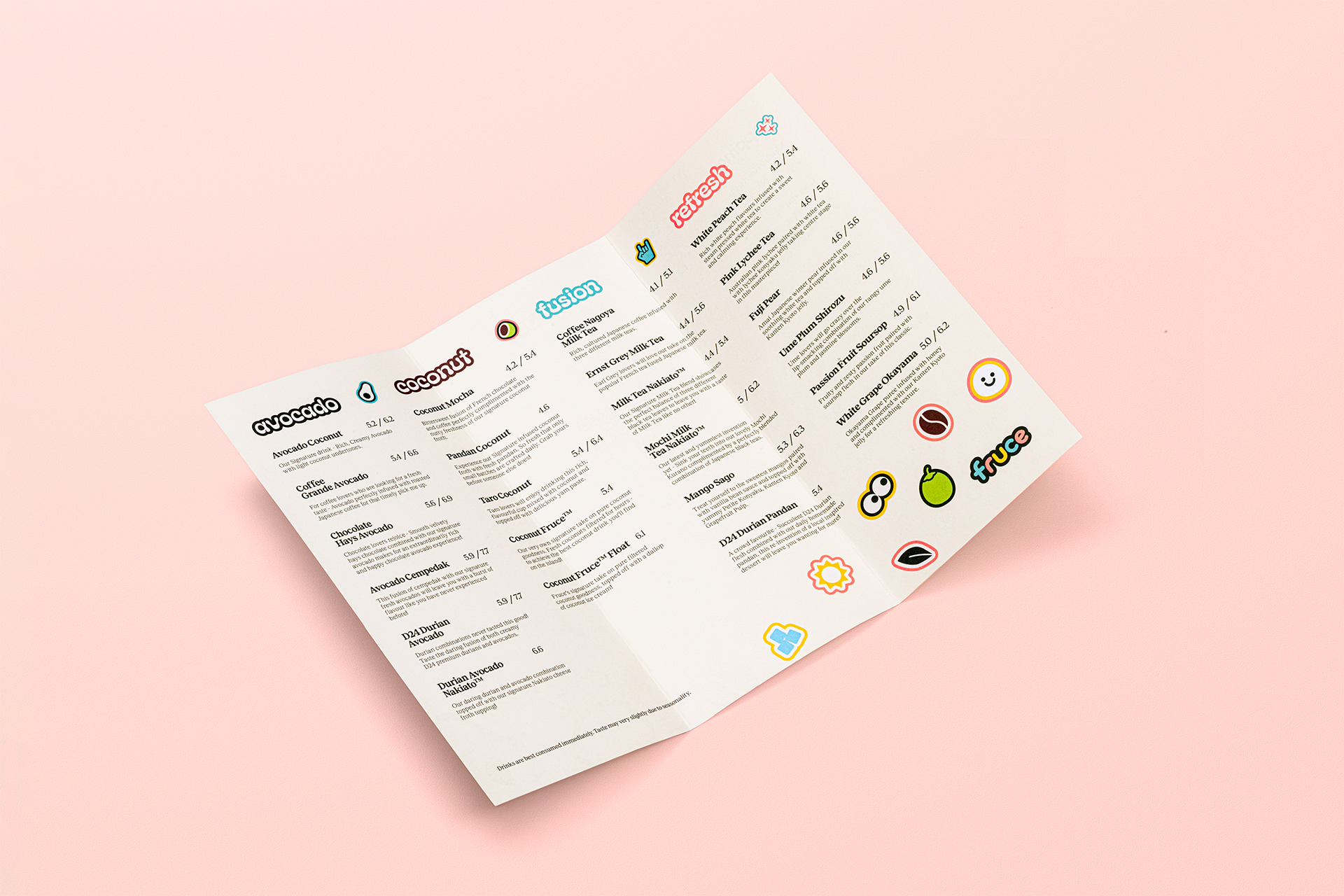
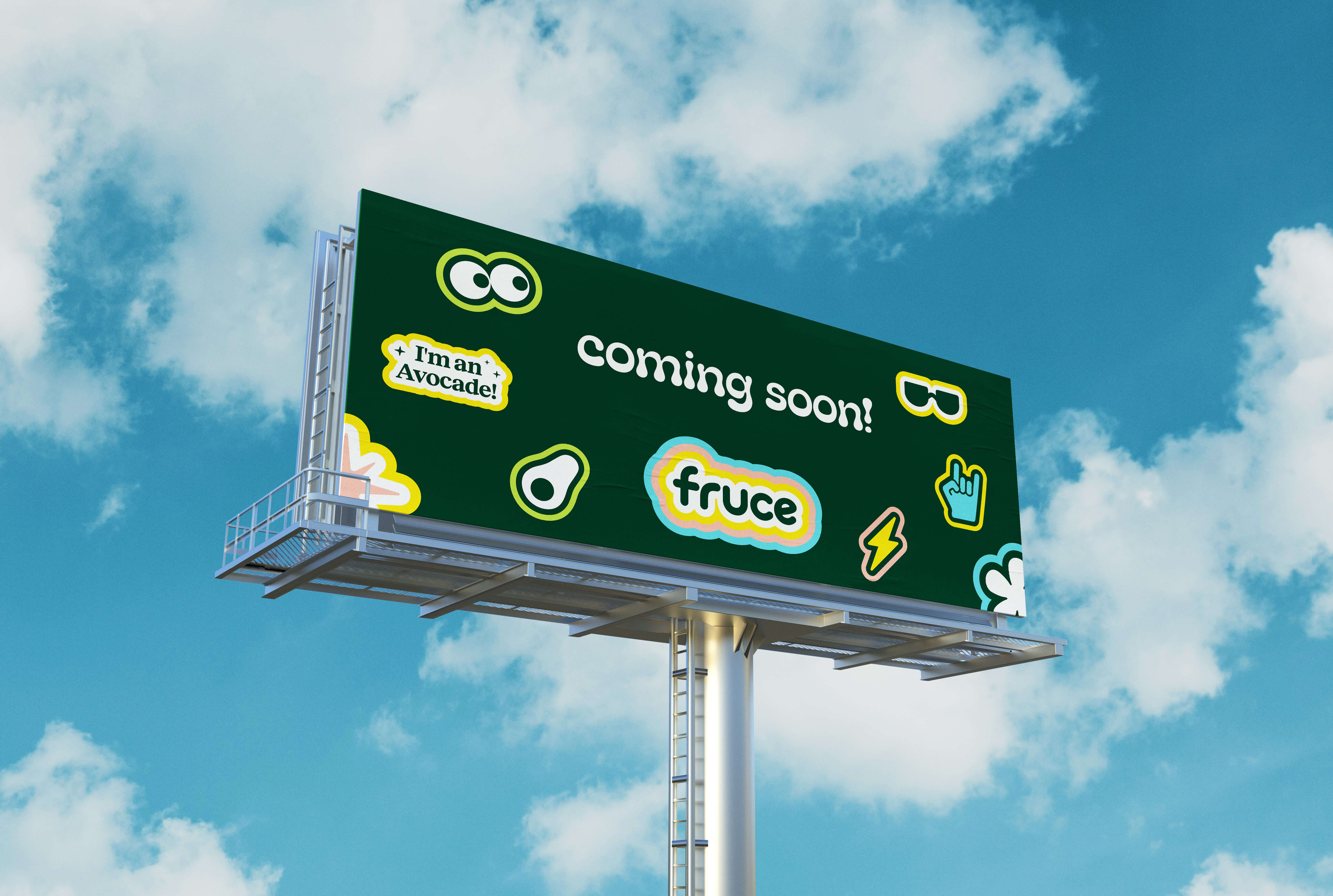
Keeping in mind the saturated landscape and cookie-cluttered visual approach of competition, we made sure to further develop icons, stickers, and expanded brand graphics to add an organic personality to the brand and drive greater brand recall.