Geniebook is a Singapore-based leading EdTech company with a purpose to accelerate students’ learning much faster and is today Singapore’s largest online learning platform for the academic syllabus.
The brand mark was designed to resemble an arrow, a book, and a rocket. Pointing at an upward 45° angle – it symbolises progress, acceleration, and improvement. The sharp 90° angle at the top right corner spells out the brand story of working towards a sharper performance through Geniebook. The G is also customised and when in motion, it represents constant progress through practice.
The brand mark was designed to resemble an arrow, a book, and a rocket. Pointing at an upward 45° angle – it symbolises progress, acceleration, and improvement. The sharp 90° angle at the top right corner spells out the brand story of working towards a sharper performance through Geniebook. The G is also customised and when in motion, it represents constant progress through practice.
Today, Geniebook is a familiar name serving over 150,000 users regionally and houses a diverse team of over 300 employees across different offices in Singapore, Malaysia, Indonesia, Vietnam, and around the world.
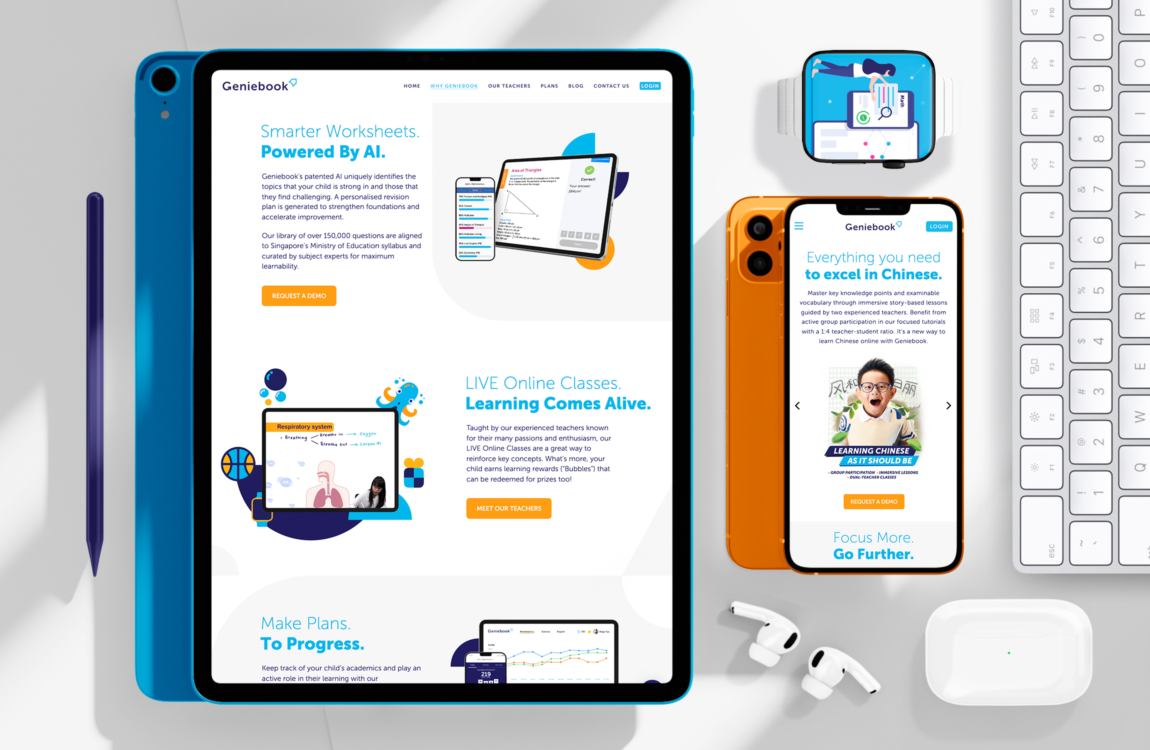
Various brand language and graphics take cue from the logo marque’s shape and angle. They represent blocks of learning and building one’s knowledge.
Imagery, colours, and applications are carefully considered and curated to bring out the essence of edu-tech learning, and how Geniebook is the rainmaker in this progressive change.