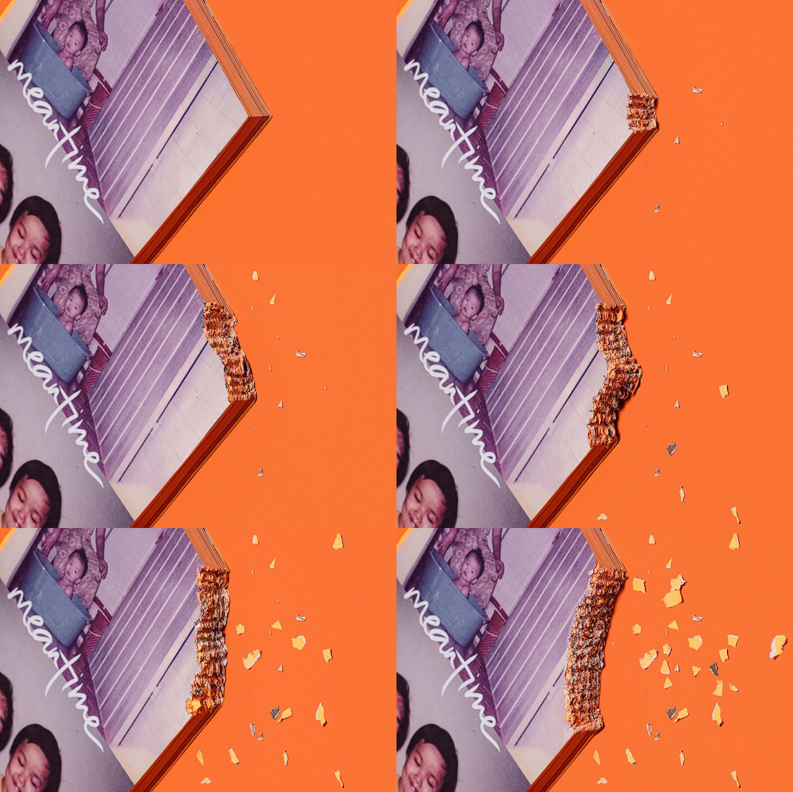
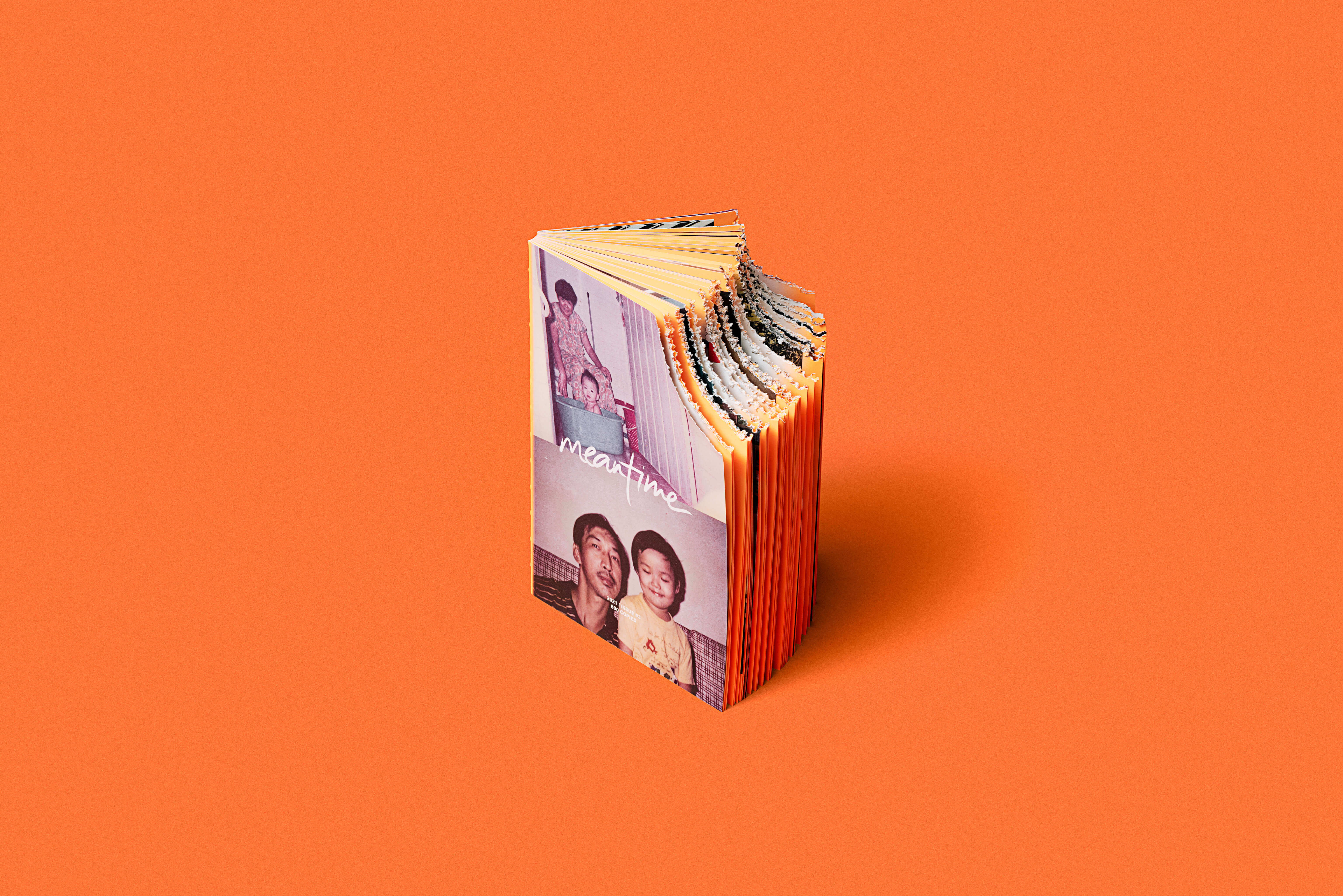
What if a book broke and cracked like glass or concrete? In the new issue of Meantime, we are reimagining the materiality of a book. Imagine holding a publication so precious and fragile that it slipped through your fingers, fell to the ground, and shattered into pieces like glass or porcelain? Its value is not diminished just because it is broken. The art of kintsugi teaches us that things broken can be repaired with gold. The imperfect, new piece in turn becomes more exquisite than it was before the break.
Inspired by this, we designed the magazine in the style of kintsugi. With cracks on the cover embellished with gold foil using hot stamping, and two chipped book corners done by hand, design and storytelling go hand in hand, as the issue explores stories of heartbreak, separation and broken relationships. Saturated in the magazine’s signature Pantone neon, the design of the cracks extends into the inside pages using an additional Pantone metallic ink.
Inspired by this, we designed the magazine in the style of kintsugi. With cracks on the cover embellished with gold foil using hot stamping, and two chipped book corners done by hand, design and storytelling go hand in hand, as the issue explores stories of heartbreak, separation and broken relationships. Saturated in the magazine’s signature Pantone neon, the design of the cracks extends into the inside pages using an additional Pantone metallic ink.
It’s a piece of work created to be owned—touched, turned, placed on your table, displayed on your bookshelf, or passed through hands. It’s a product that exists and takes form, and its weight gives meaning and truth. It’s a labour of love (yes, breakups too are a form of love. Sometimes, to leave and to let go is to love).
Nice to see. Nice to touch. Once broken considered sold.
Nice to see. Nice to touch. Once broken considered sold.
Typeset in FLARA & TENET


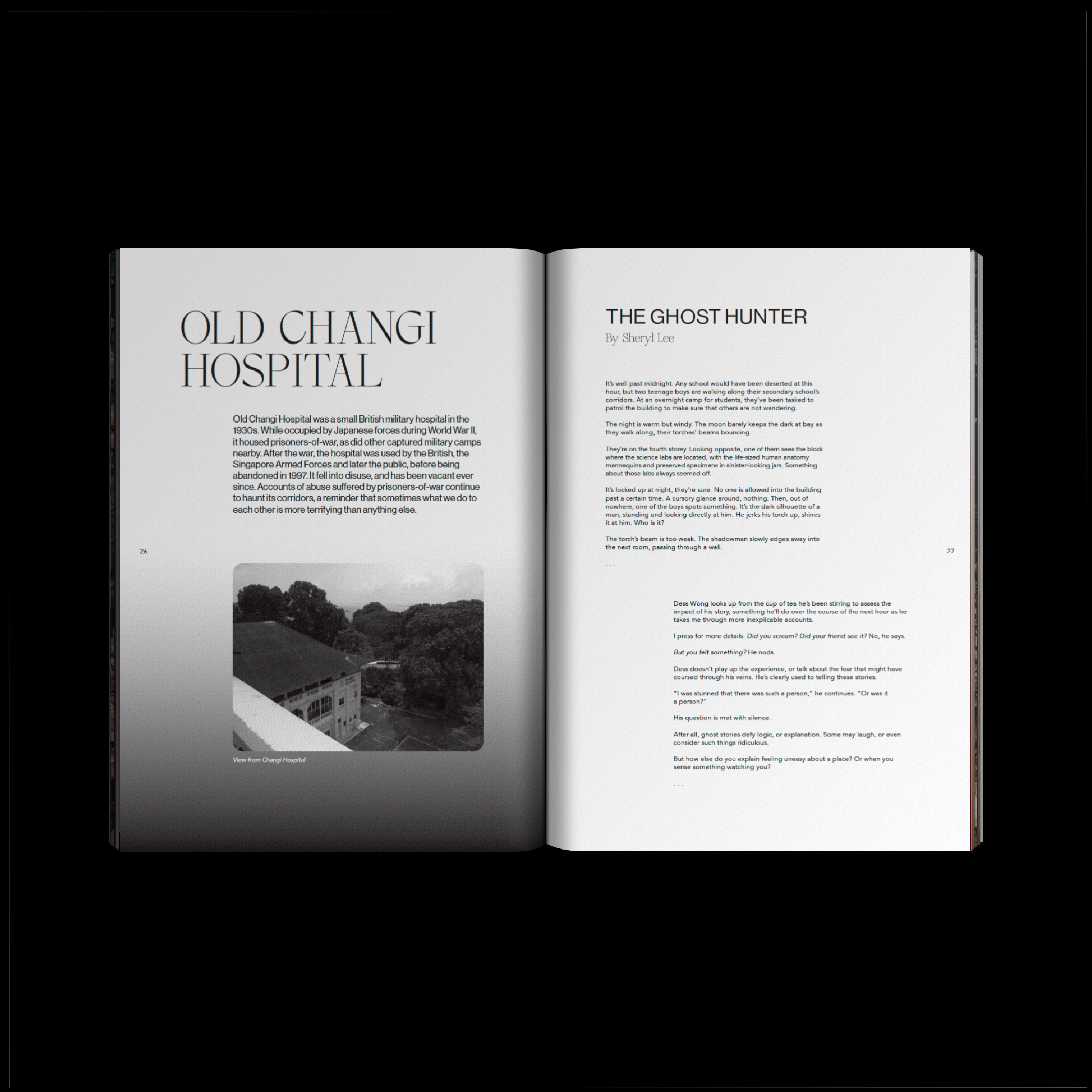
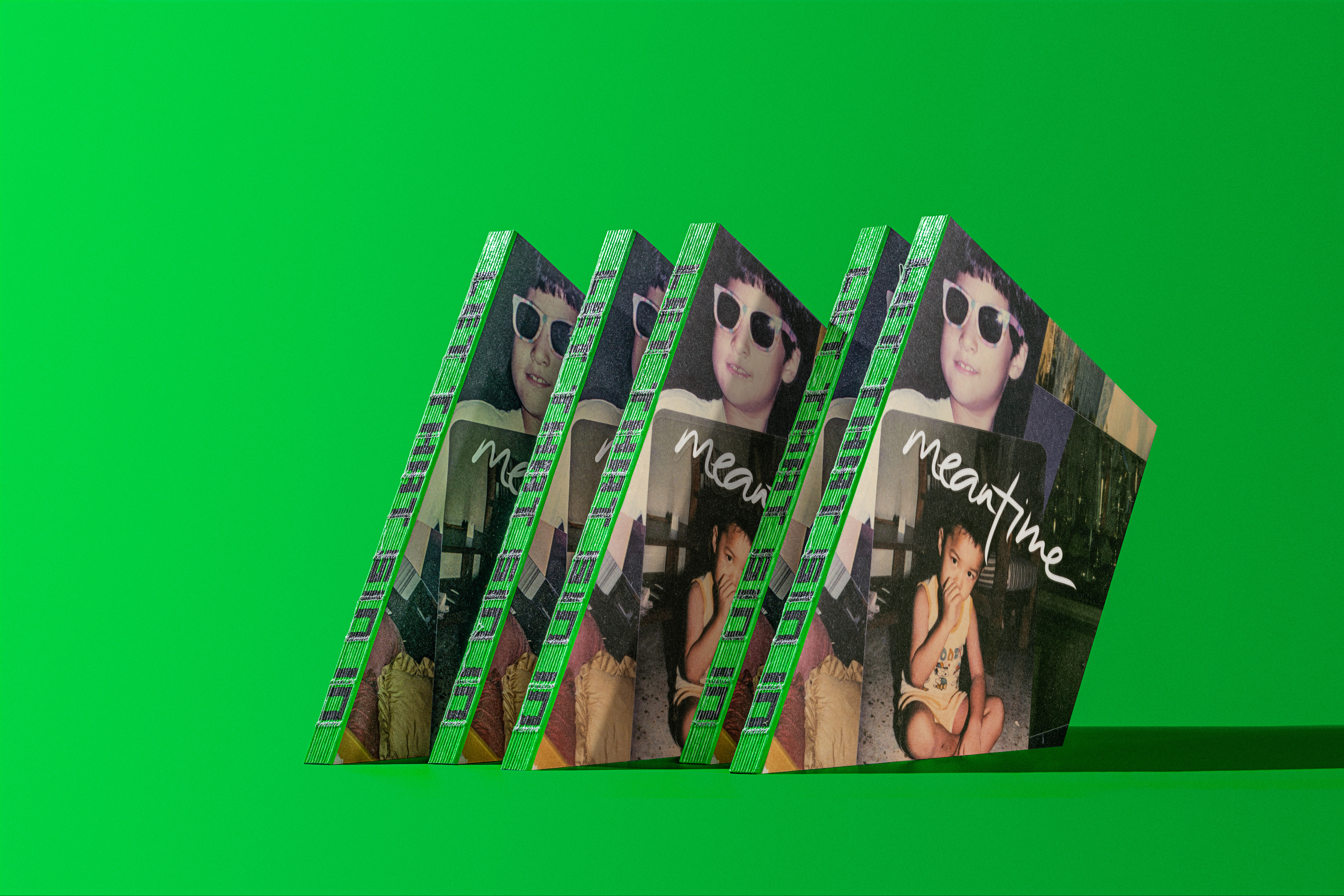
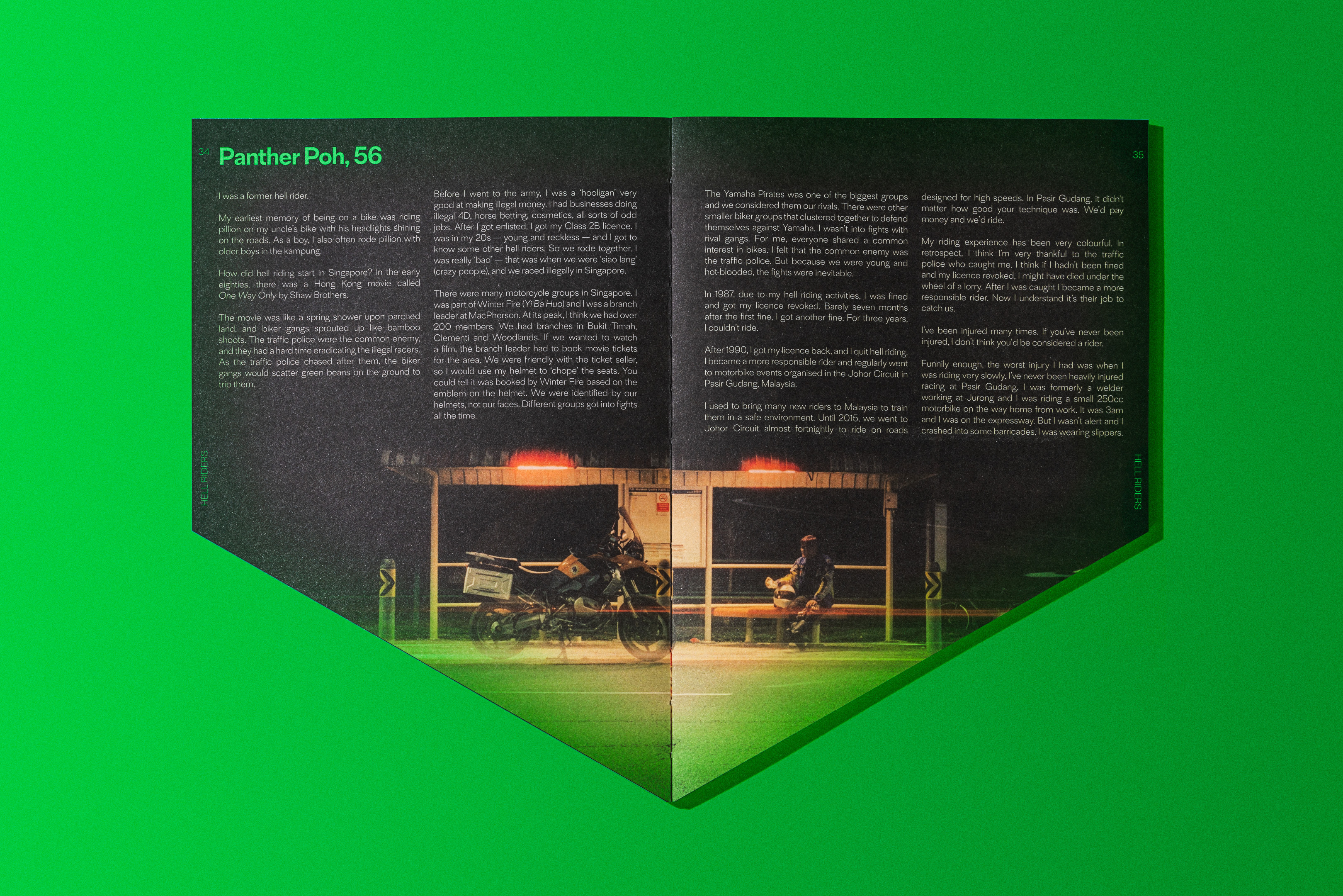
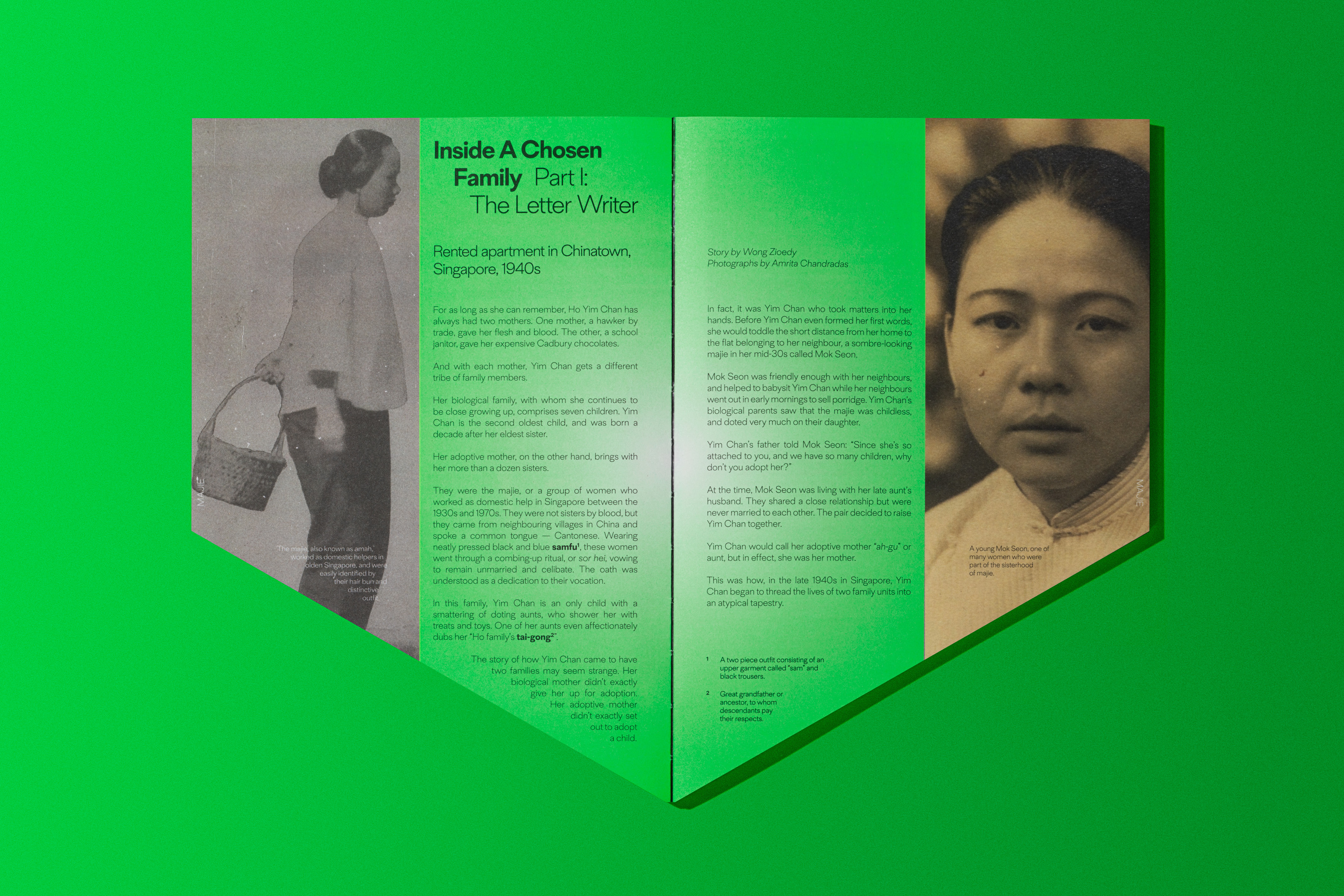
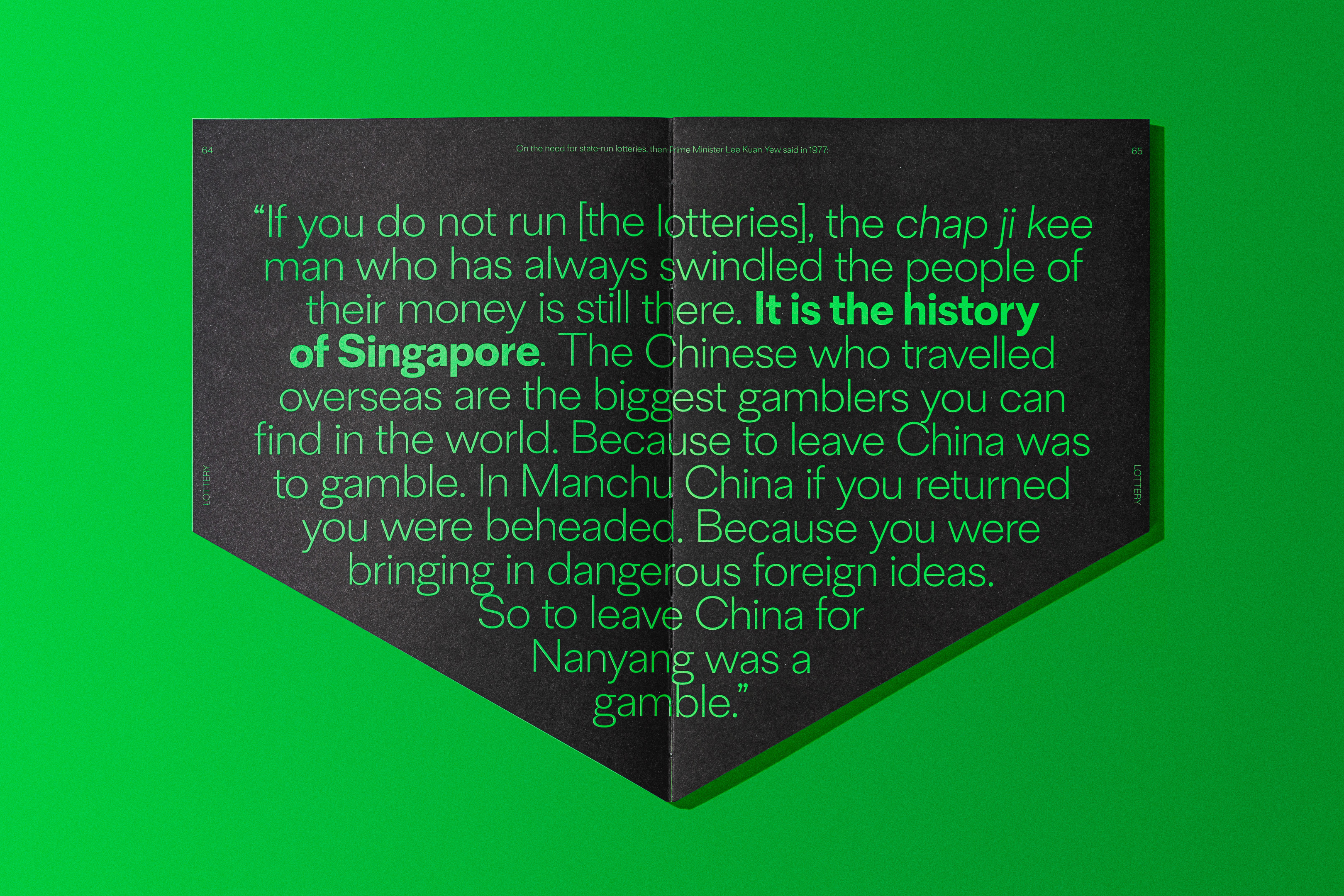
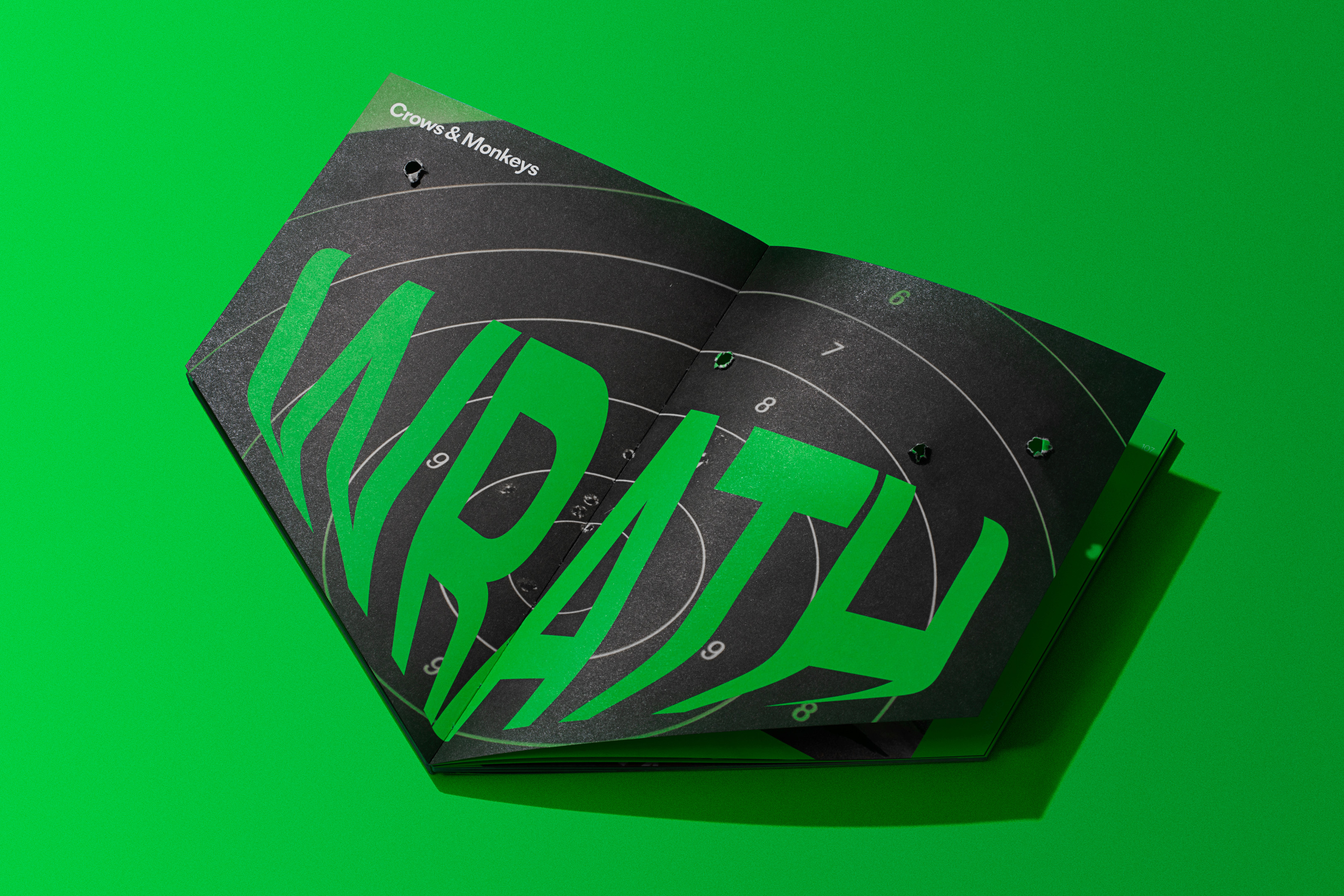
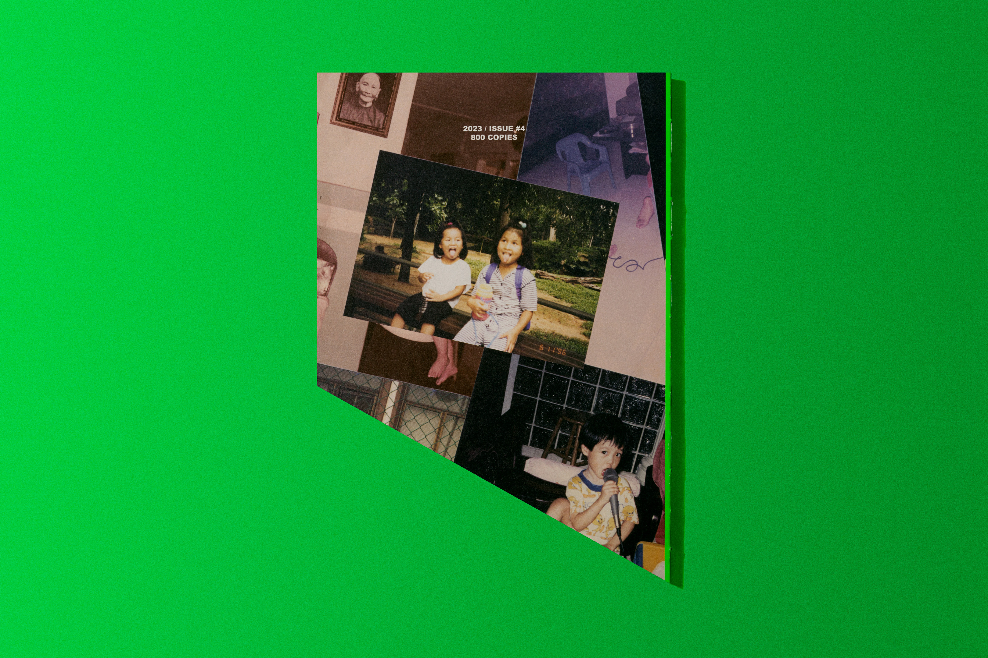
Every issue of Meantime encapsulates a theme, and this round it is about “Bad Stories”. As the theme circumnavigated around the seven sins, we designed it with a deep die-cut across the entire publication, akin to our sins sinking us. Printed in Pantone 803, the boomZx neon is reminiscent of toxins and poisons.
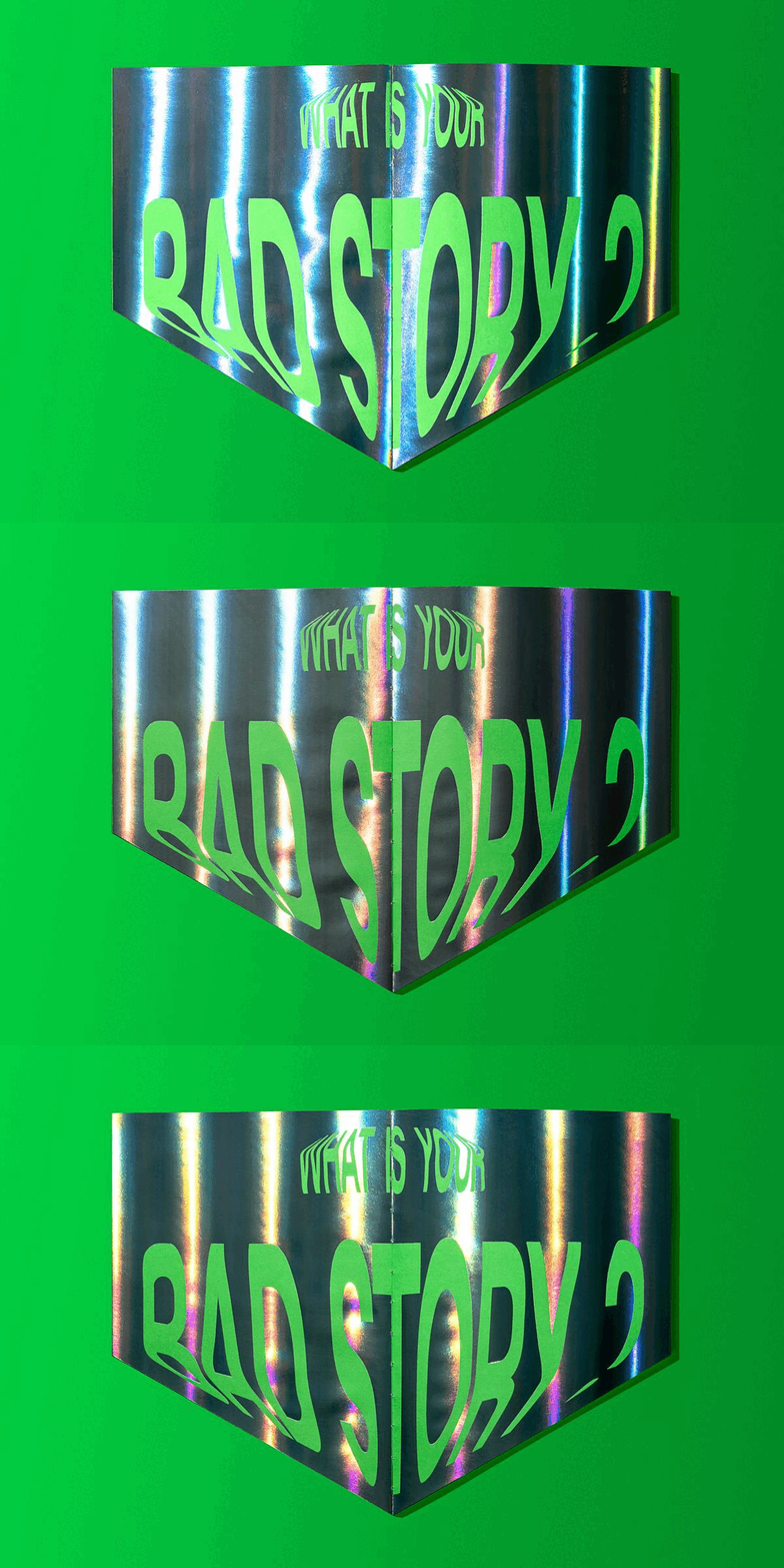
Each chapter begins with the title of the sin melting into the ground. With the shape of the publication, we sinfully broke all kinds of typesetting rules — orphans, rivers, widows, and horrible rags are aplenty. Oops and sorry 😘😘…!!! Hidden print effects are also included — bullet holes (a nod to a crow culling campaign), foiled spread (representing self-reflection), and more.
Each chapter begins with the title of the sin melting into the ground. With the shape of the publication, we sinfully broke all kinds of typesetting rules — orphans, rivers, widows, and horrible rags are aplenty. Oops and sorry 😘😘…!!! Hidden print effects are also included — bullet holes (a nod to a crow culling campaign), foiled spread (representing self-reflection), and more.
The exposed stitched spine is emblazoned with the words LET THAT SIN IN — a parodical localised reference to Elon Musk the time he carried a physical sink as he entered Twitter for the takeover.
Typeset in TENET


Meantime #3 Funny Stories
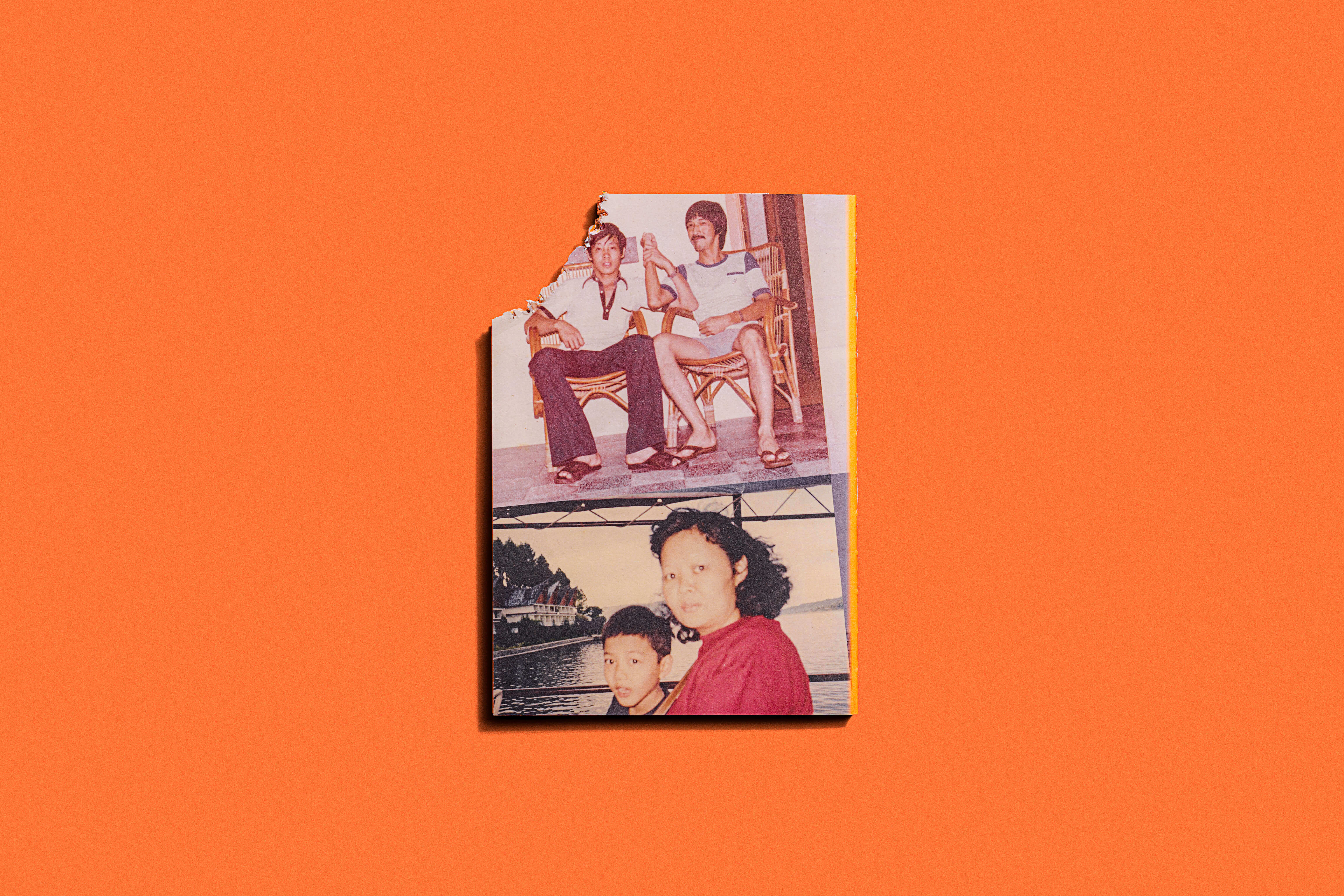
Find another project that lets you put these things together: An unconventional bitten cover, neon dreams, custom emojis, augmented reality, and flying poop.
Yes, flying poop. Misbehaving clients, check your phones please.
Find another project that lets you put these things together: An unconventional bitten cover, neon dreams, custom emojis, augmented reality, and flying poop.
Yes, flying poop. Misbehaving clients, check your phones please.
