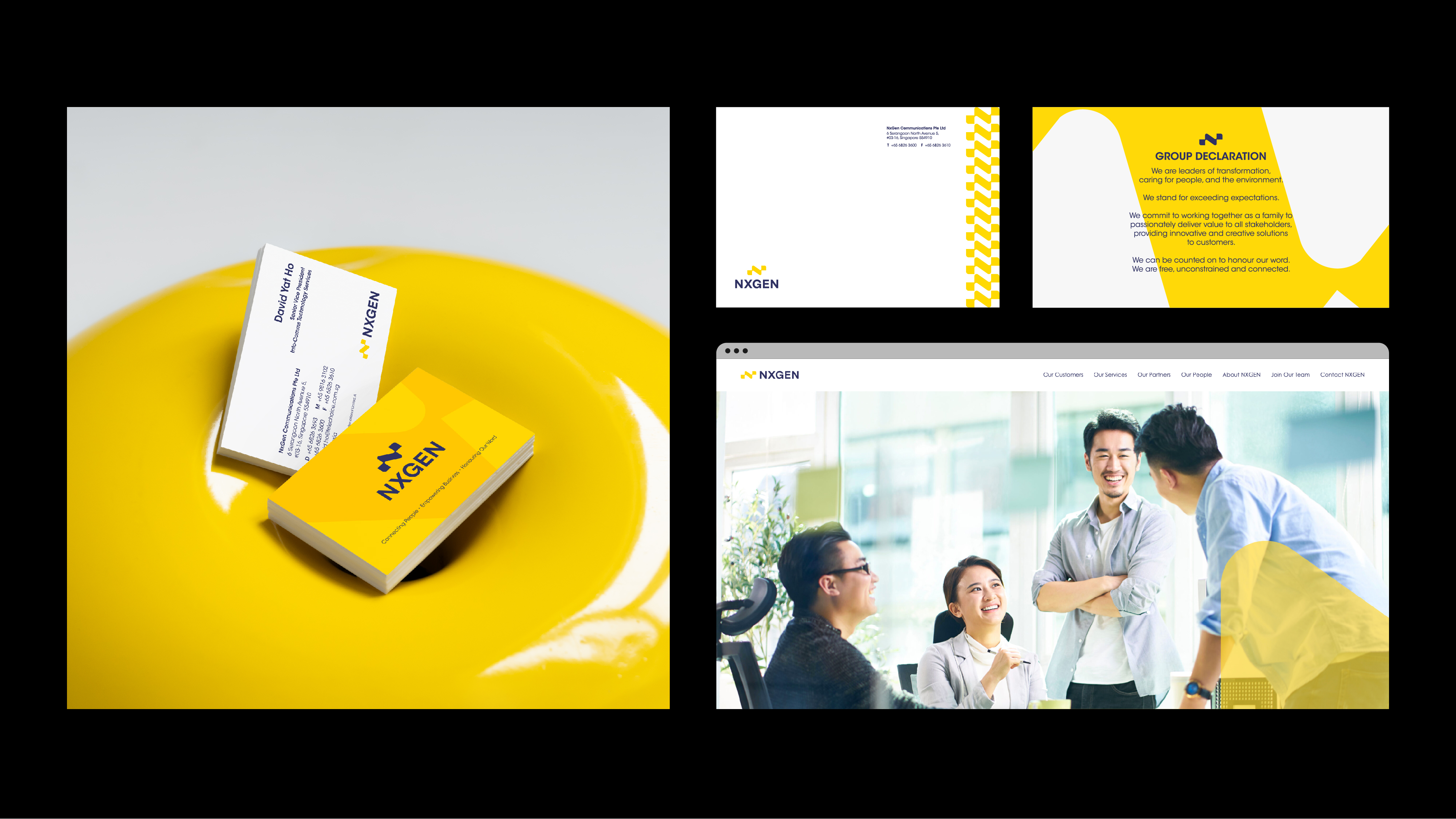
NXGEN, a leading regional provider of integrated infocommunications solutions, is renowned for its innovative services. The objective was to craft a reinvigorated corporate identity that embodies NXGEN’s core values: innovation, reliability and excellence.
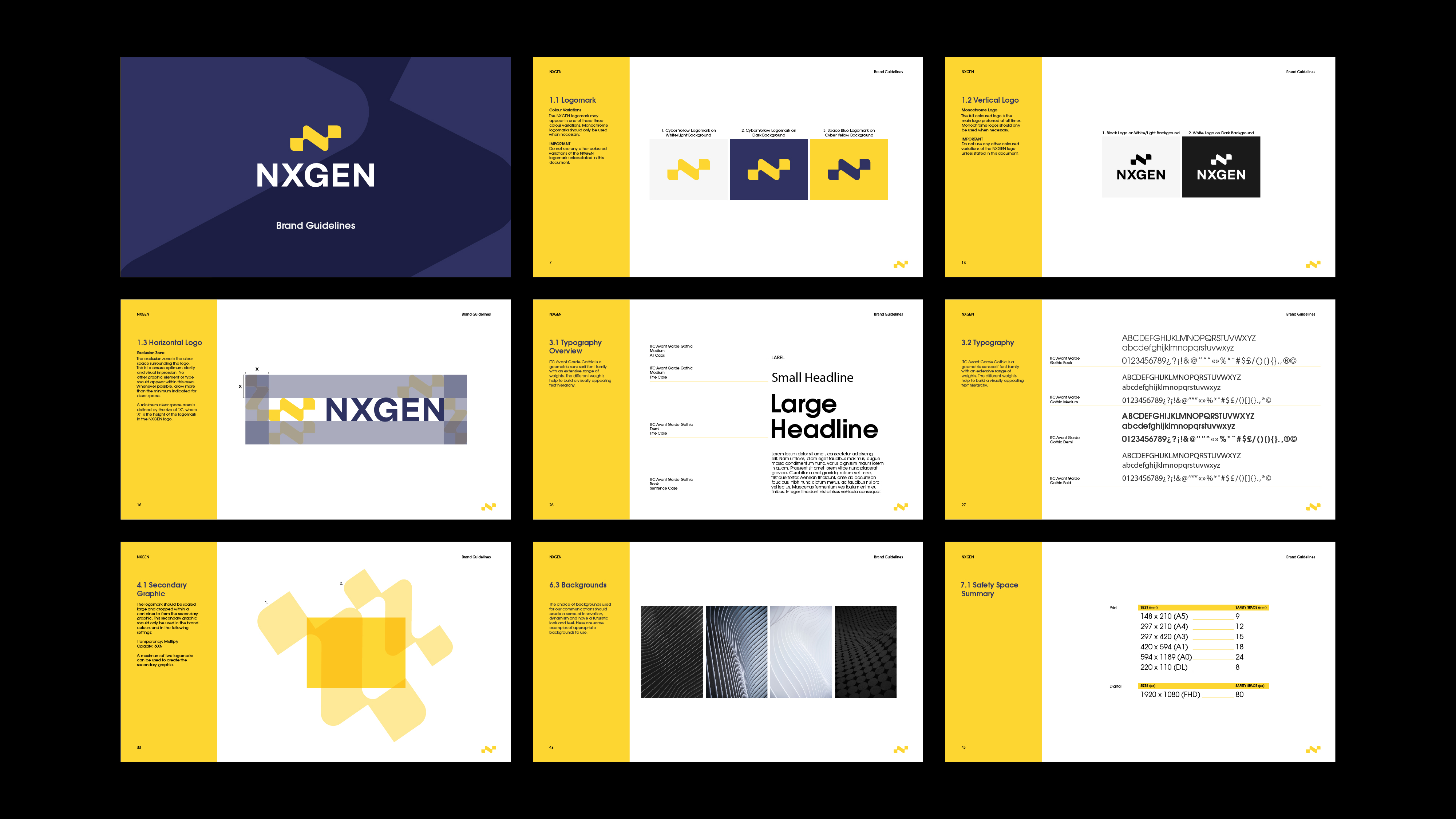
The logomark, abstractly representing “N” and “X,” symbolises NXGEN’s trailblazing solutions which are focused on connectivity, fluidity and seamless integration. Accompanied by a suite of sleek icons, the logomark is further expanded into a comprehensive identity suite via various secondary graphic elements and touchpoints.