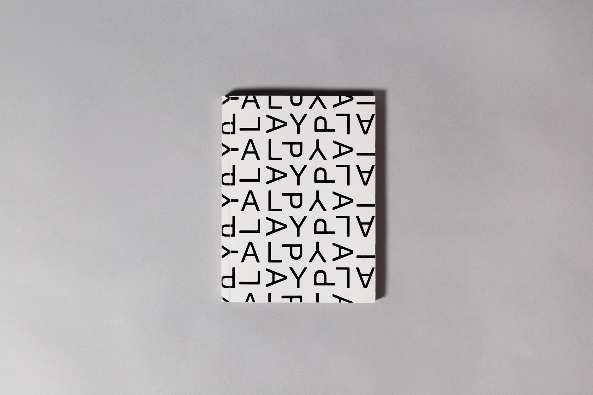
PLAY @ OMTJ is centered on the concept of interconnectedness across time and space. Despite predominantly being a feature on recreational spaces in Taman Jurong and its heritage, the timeless theme of PLAY and recreation help bridge both the past and present.
The cascading alphabets in the PLAY visual are inspired by DNA strands, the fundamental building blocks of life and common threads between each and every individual.


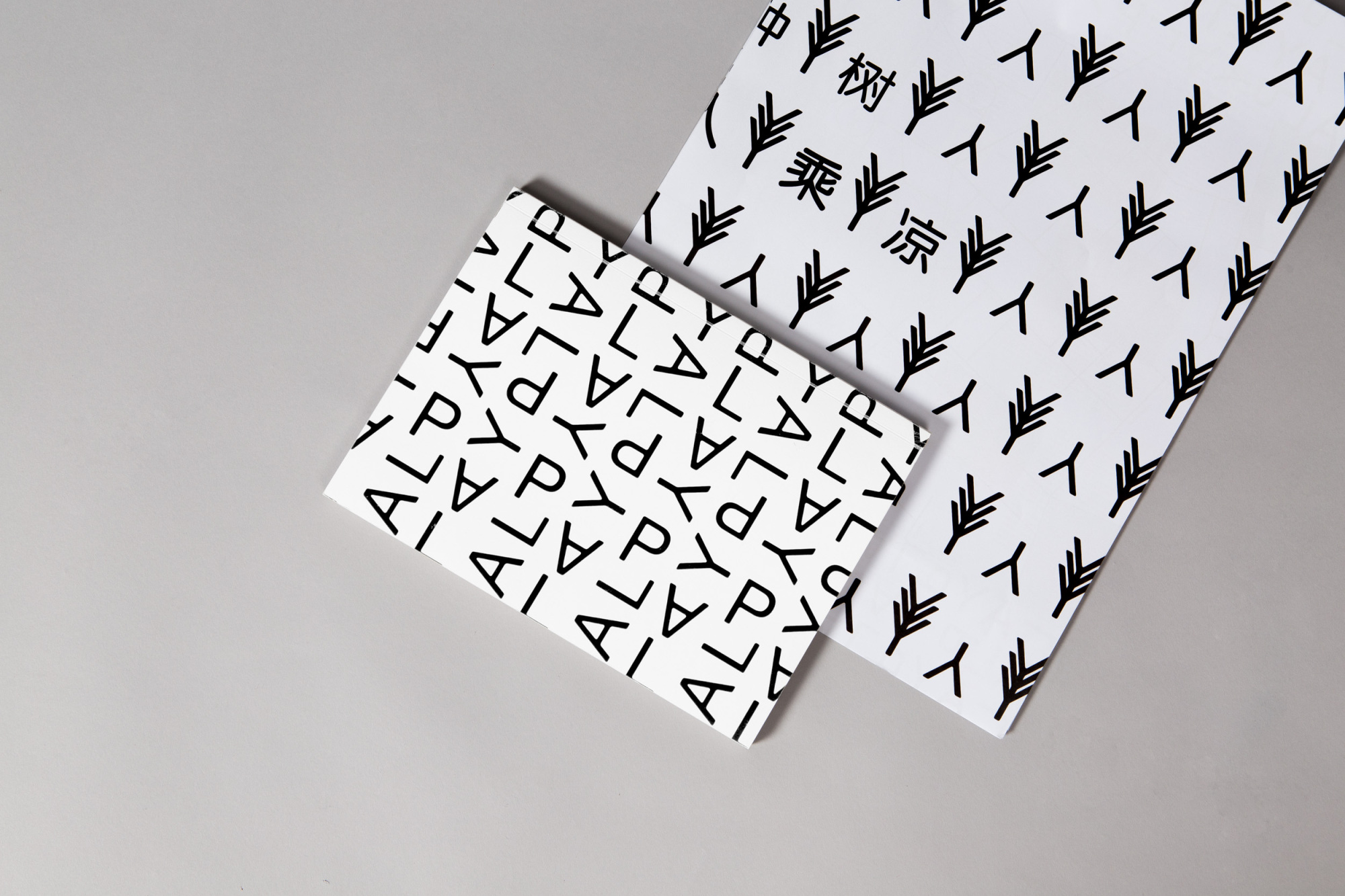
An accompaniment visual concept revolves around a Chinese idiom: ‘前人种树, 后人乘凉’. The alphabet ‘Y’ is utilized to form the Chinese character 人 (‘man’, or ‘people’). It is also used to represent casuarina trees, a natural feature unique to Taman Jurong.
When put together, both form the motif of a man resting under the shade of a tree, an ode to the idiom, which encourages people to appreciate their predecessors’ efforts in providing for the comforts they enjoy today.
When put together, both form the motif of a man resting under the shade of a tree, an ode to the idiom, which encourages people to appreciate their predecessors’ efforts in providing for the comforts they enjoy today.
The book contains inserts of random yet nostalgic old and archived photographs that were collected from elderly residents. Each segment is also separated by a unique paper stock that represented each heritage site by its special texture.


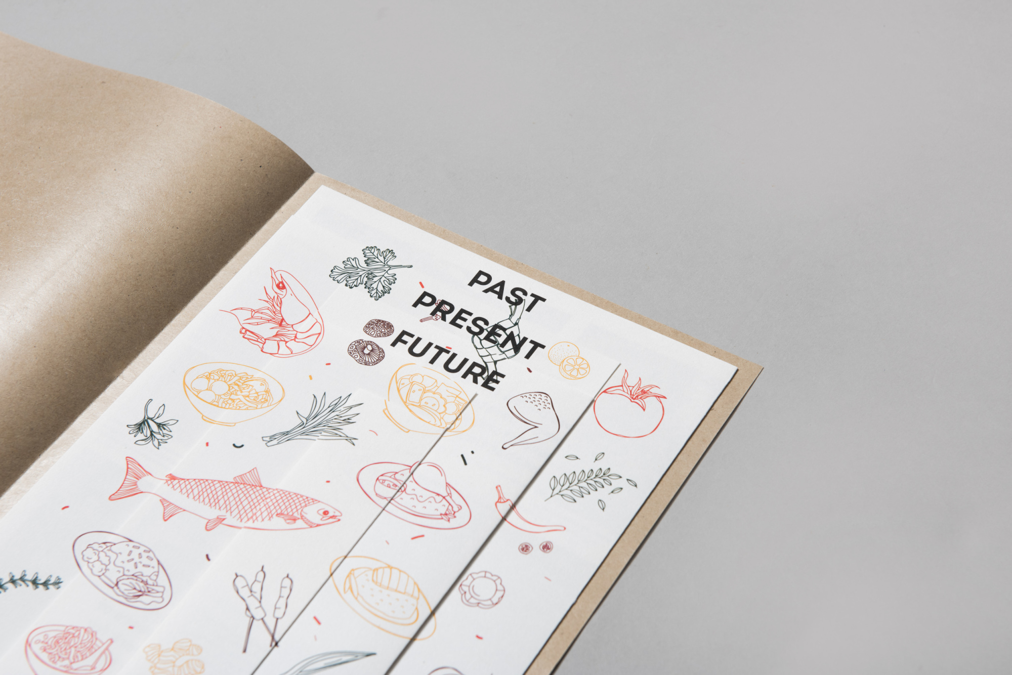
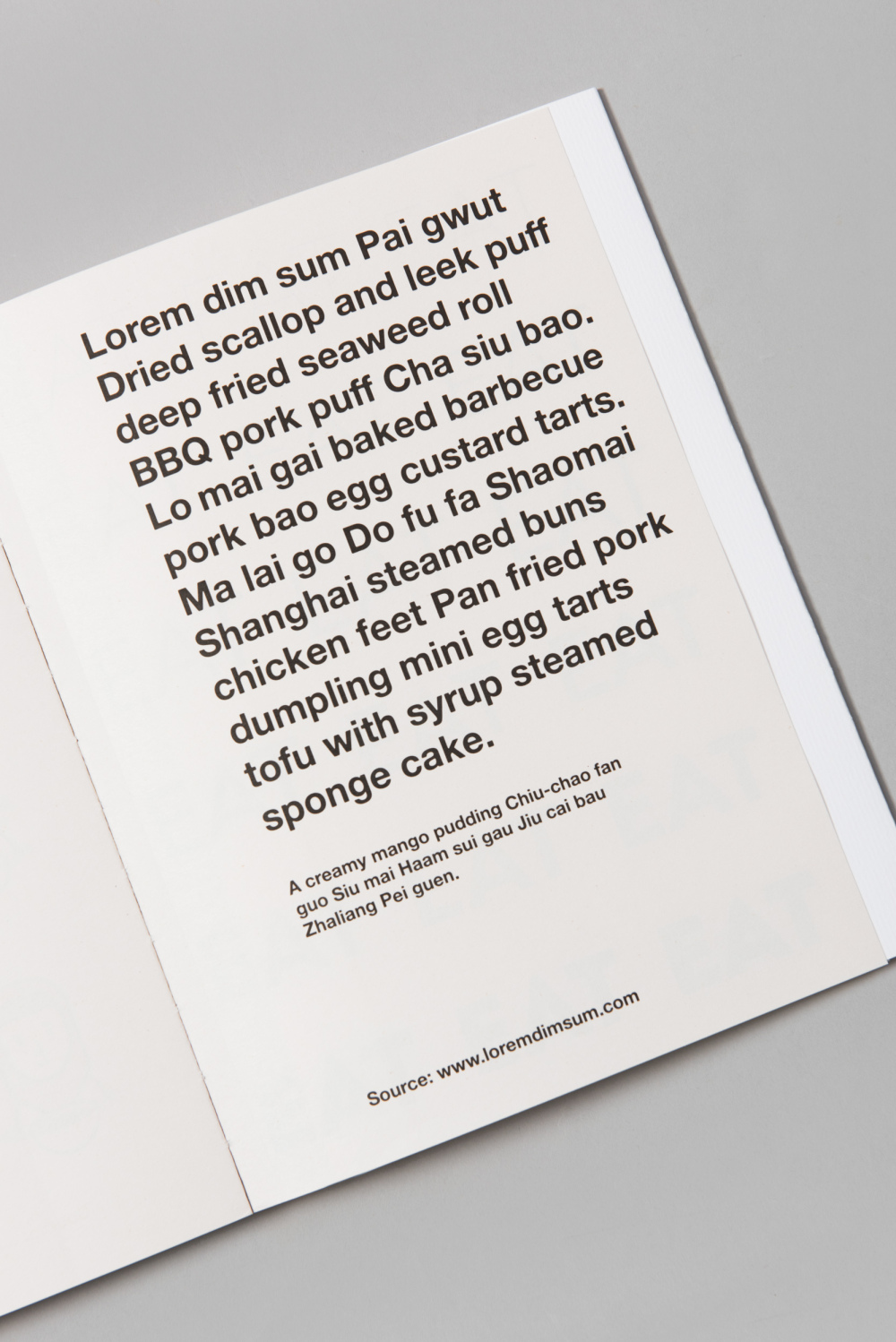
“Have you eaten?” would be the top of the list of any greetings from any Singaporean you encounter. Guidebooks unanimously declare eating our favourite past time, and food our national pride.
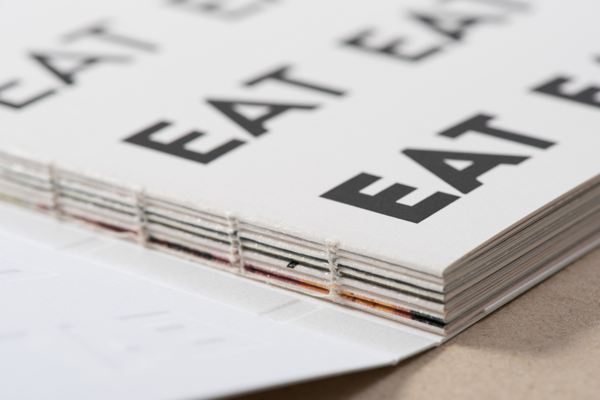
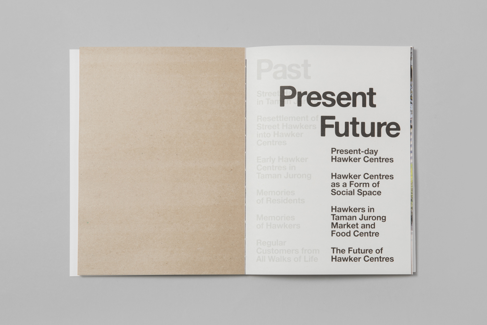
EAT is the second installation of a two-year long series of exhibitions which highlight memories of residents from Jurong. Reminiscent of the once-widely popular arcade games by Atari, the identity font type EAT becomes fatter as it is constantly fed. The transition from Light to Regular, to Semibold, to Bold, and finally to Black encapsulates the process of one gaining weight.


Filled with illustrations, photographs, narratives and interviews, the content is filled with memories from the first generation decades ago to the current third generation, with many taking over their parents’ stall whilst injecting a modern twist.
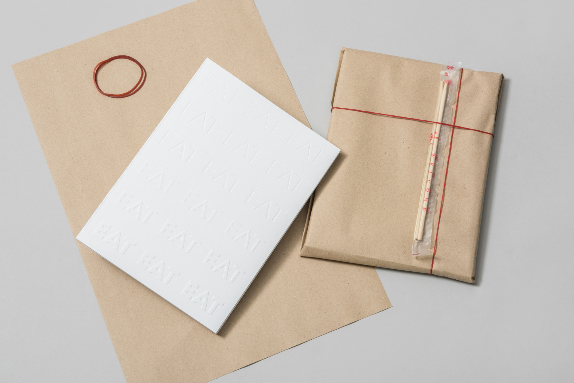
Like its predecessor PLAY, inserts can be found amongst the pages, this time separating the different sections and timelines with none other than everyone’s favourite brown wax paper.
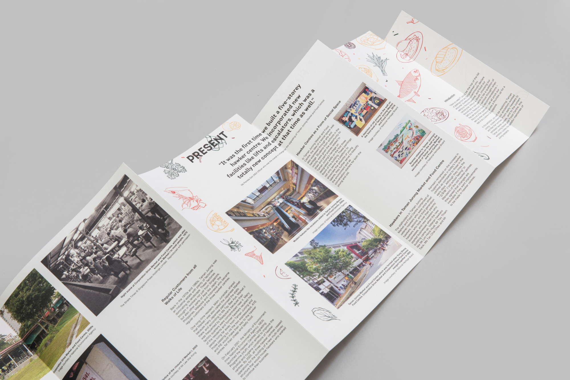
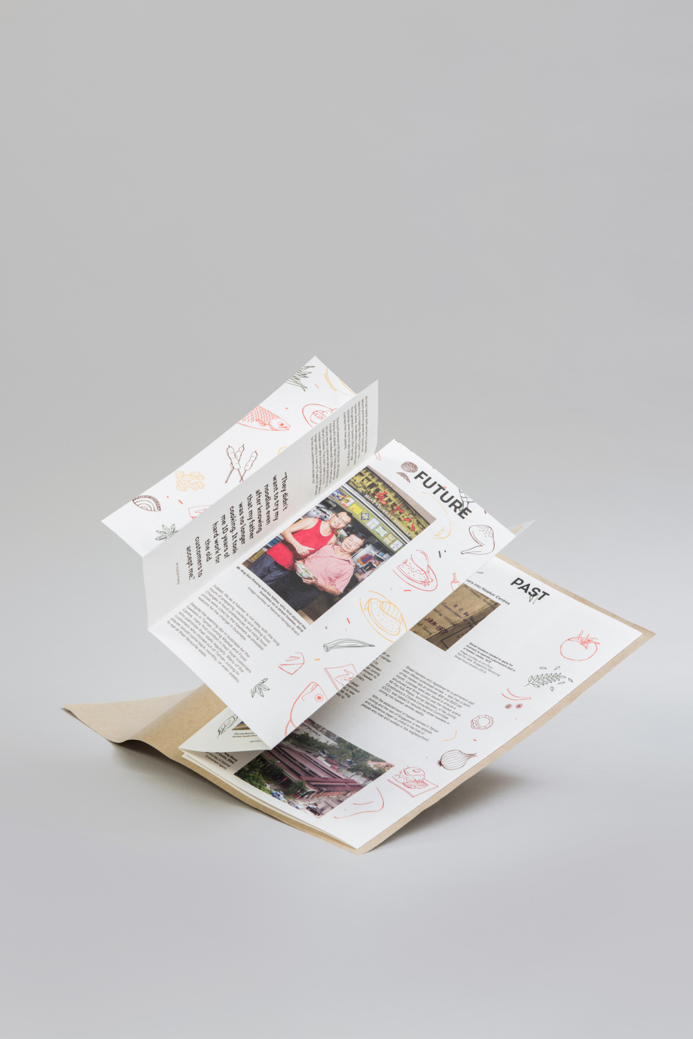
Complementing the key visual is the accompanying brochure, which follows an accordion-styled arrangement. The cover is the symbolic brown wax paper, commonly used by hawkers when packing food. Whatever race or background you come from, you are bound to have used it before (and gained weight like the font). From chwee kuey to roti prata, it is one of the most understated yet commonly used food objects.
The various text panels are adapted into this accordion, and labeled accordingly by the header tabs. One will notice that the text panels become increasingly wider, a parallel observation with the bolding of the key visuals. Illustrations and accompanying graphics representing various food elements form the transition graphic panels, which are also adapted to the exhibition display panels.

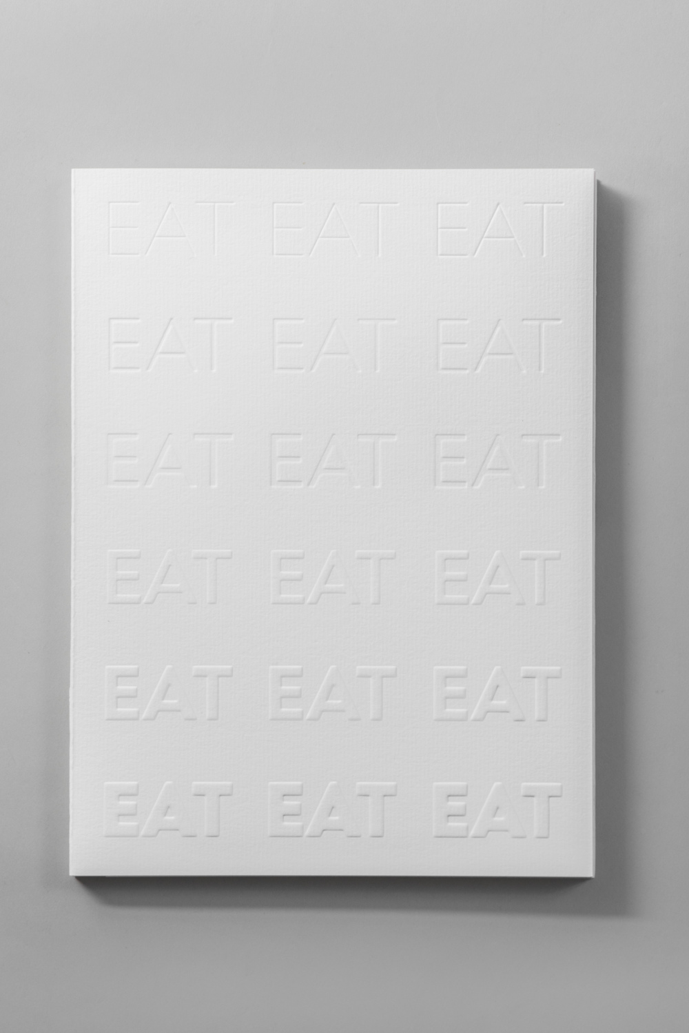
The EAT book takes on an abstract approach of one’s perception towards how every individual begins his meal. Whether having a meal alone or dining with a group, both the mind and palette come together in anticipation, forming a clean slate, keenly awaiting what is in store.
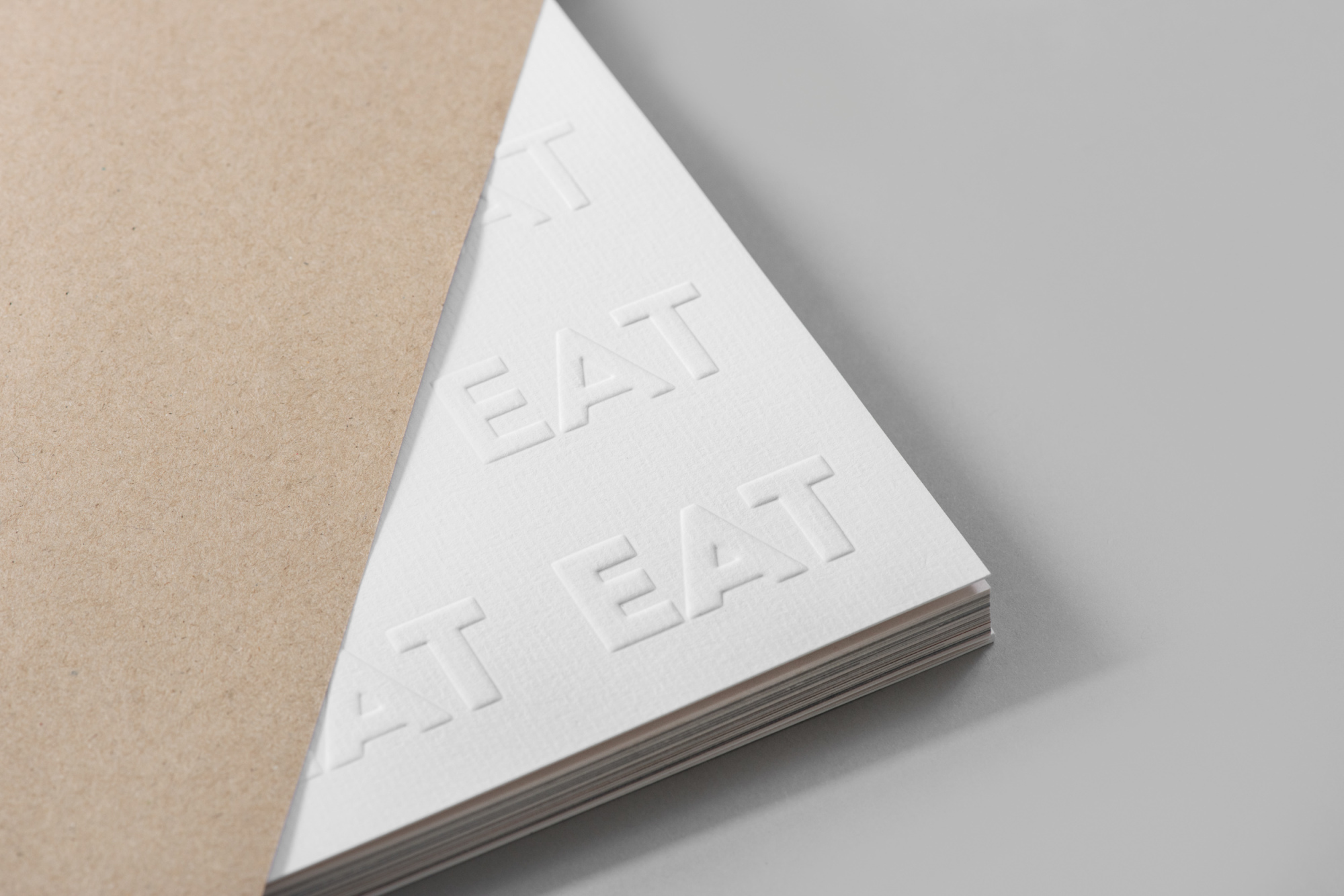
This is represented in the book cover, where the thinnest EAT word to the EAT typeset in black goes from blind triple deboss, double deboss, single deboss, single emboss, double emboss to triple emboss.
This is represented in the book cover, where the thinnest EAT word to the EAT typeset in black goes from blind triple deboss, double deboss, single deboss, single emboss, double emboss to triple emboss.
As the experience of eating goes beyond the visual senses, readers are encouraged to feel the paper to see how the word EAT fills up from the thinnest to boldest using the sense of touch—likened to how our belly bulges after a filling meal.

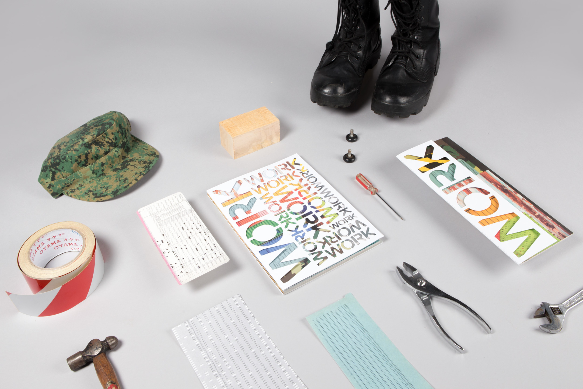
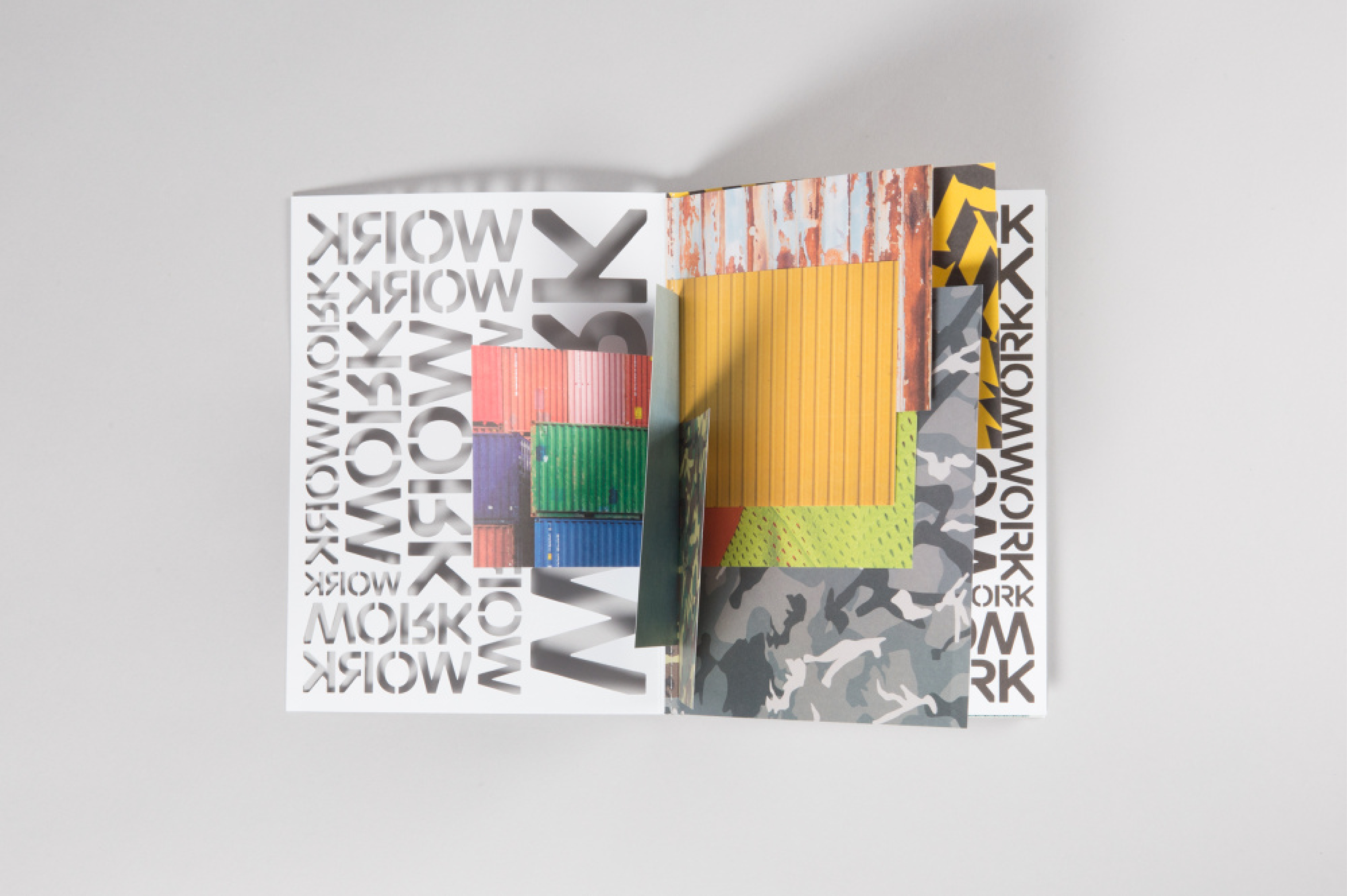
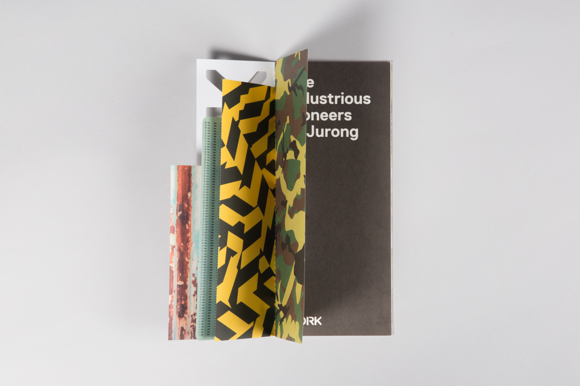
The last installation of the three-part series that documented the memories of residents in Taman Jurong, WORK is an archival effort to record the past and present occupations in the precinct.
The creative direction is an amalgamation of the
four major work industries in Jurong, namely the army, blue-collared industries, shipyards, and hawker centres. We took cue from a unique habit of Singaporeans, both old and older, who often verbally repeat the mantra of “work, work, work, work, work”.
four major work industries in Jurong, namely the army, blue-collared industries, shipyards, and hawker centres. We took cue from a unique habit of Singaporeans, both old and older, who often verbally repeat the mantra of “work, work, work, work, work”.

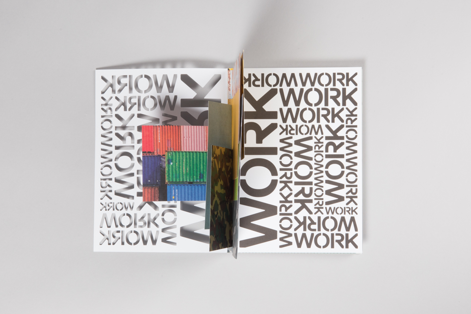
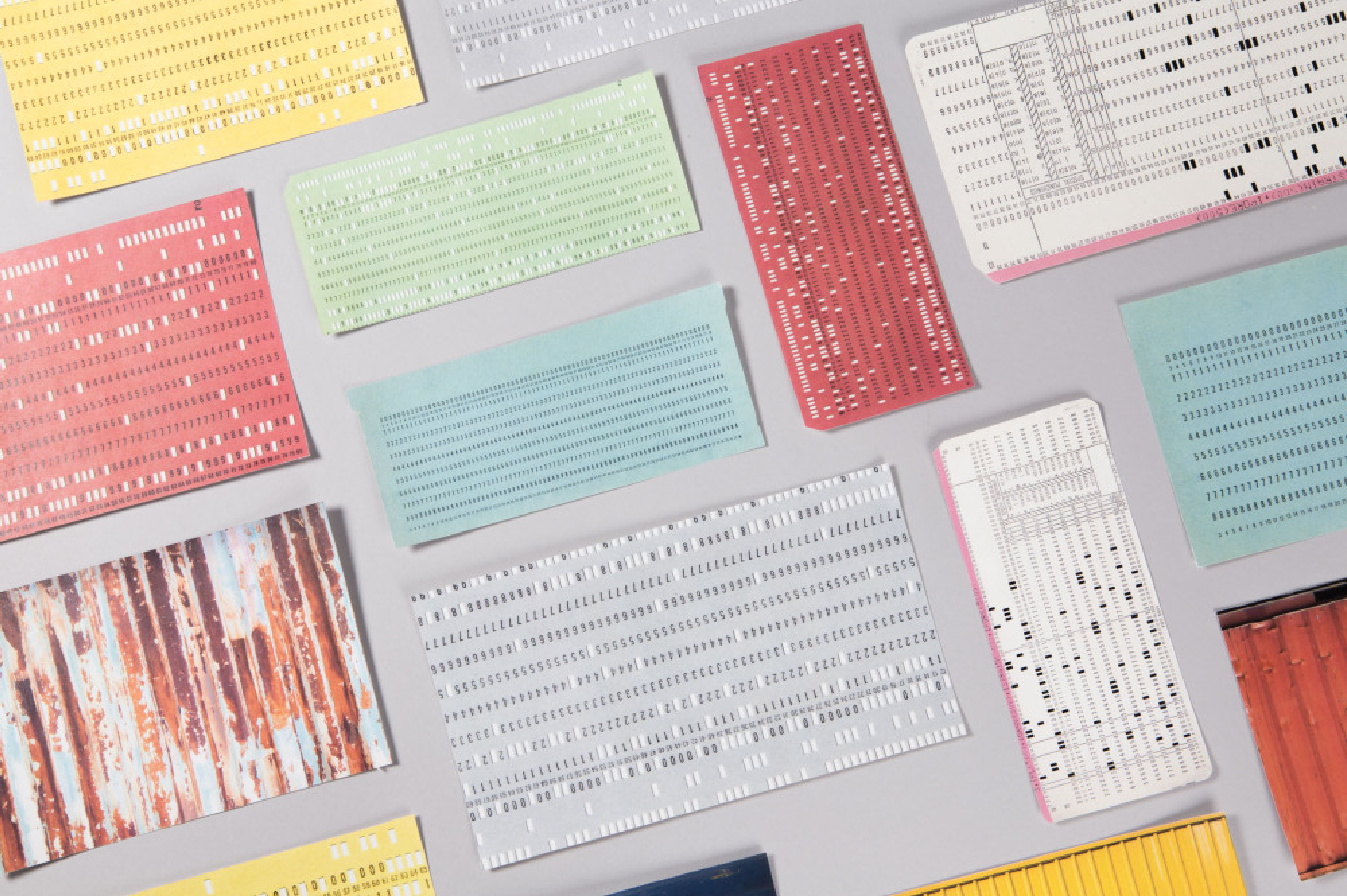
Familiar visual ephemera include punch cards, shipyard containers, military patterns and more. Work, like a consistent yet existential part of adulthood, is put together haphazardly and randomly, showing the interweaving cultures of various industries. This carries through for both collaterals that we developed in line with the exhibition—the brochure and the book.
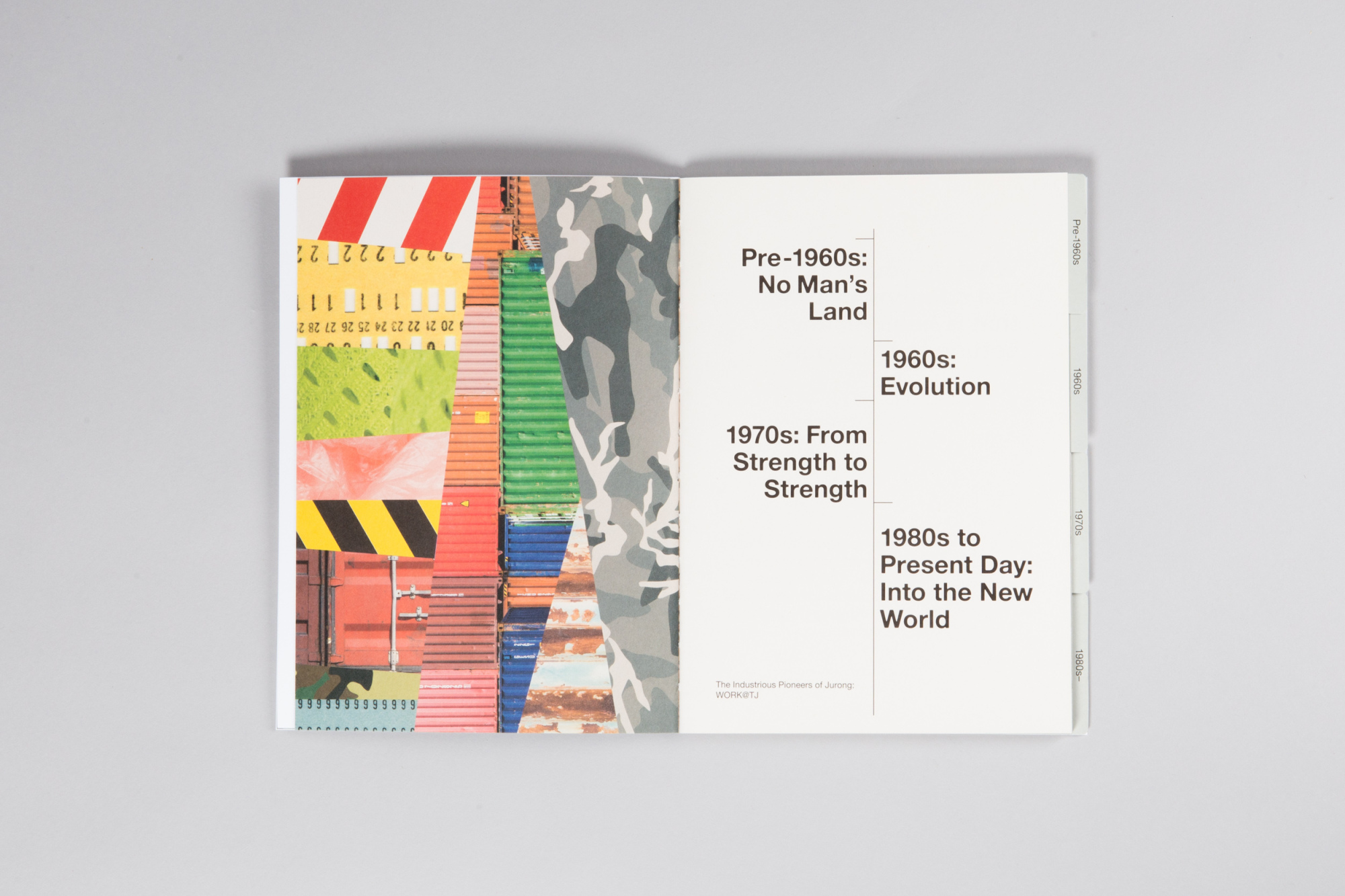
The book, similar to the previous projects in the series, is chaptered with dividers made from old-school textured construction paper files, separating the different generations and timelines.