Based on the same concept as Call For Entry, the theme ‘Uncharted Territories’ represents how an unknown lies ahead with the exciting lineup of films — non-mainstream films that are beautifully melancholic and evocative.
The graphic expression is further developed in the Main Festival by keeping the anchor terrain forms, but shifting the angles to mimic our eyes and camera movements. The leap into the unknown makes way for new possibilities that bring about a fresh appetite of curiosities due to new perspectives. These inclusive perspectives can be angular, geometric, spherical, etc — depending on the viewer’s interpretation of emotions and cinema.
The graphic expression is further developed in the Main Festival by keeping the anchor terrain forms, but shifting the angles to mimic our eyes and camera movements. The leap into the unknown makes way for new possibilities that bring about a fresh appetite of curiosities due to new perspectives. These inclusive perspectives can be angular, geometric, spherical, etc — depending on the viewer’s interpretation of emotions and cinema.
Applied to both print and digital touchpoints, we interspersed kinetic typography with patterns that are dramatic yet controlled, chaotic, prescribed, and emotive.
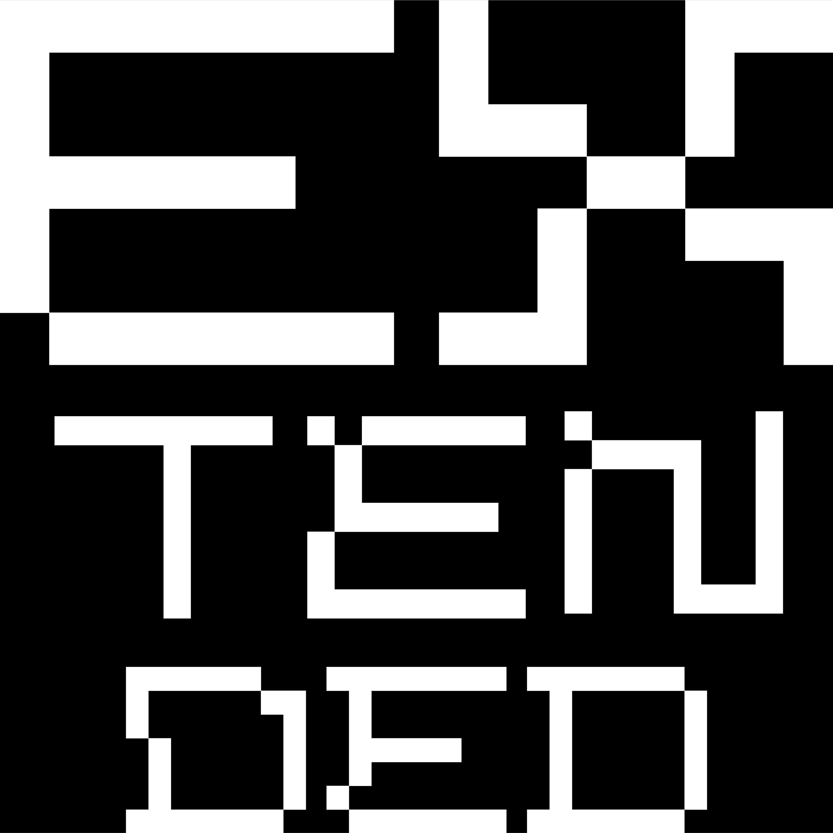
Festival Typeface: TENET


To celebrate SGIFF’s direction towards the exploration of new terrains and viewpoints, the direction for Call for Entry is a leap into the unknown to make way for new discoveries and possibilities that brings in an appetite of curiosity to explore new perspectives towards filmmaking and cinema.
Based on the theme New Curiosities, the design represents various entry points in a film-goer's journey. The different shifting and malleable forms represent different perspectives that cinema gives various people – celebrating a plethora of diverse conversations, thoughts, and emotions.


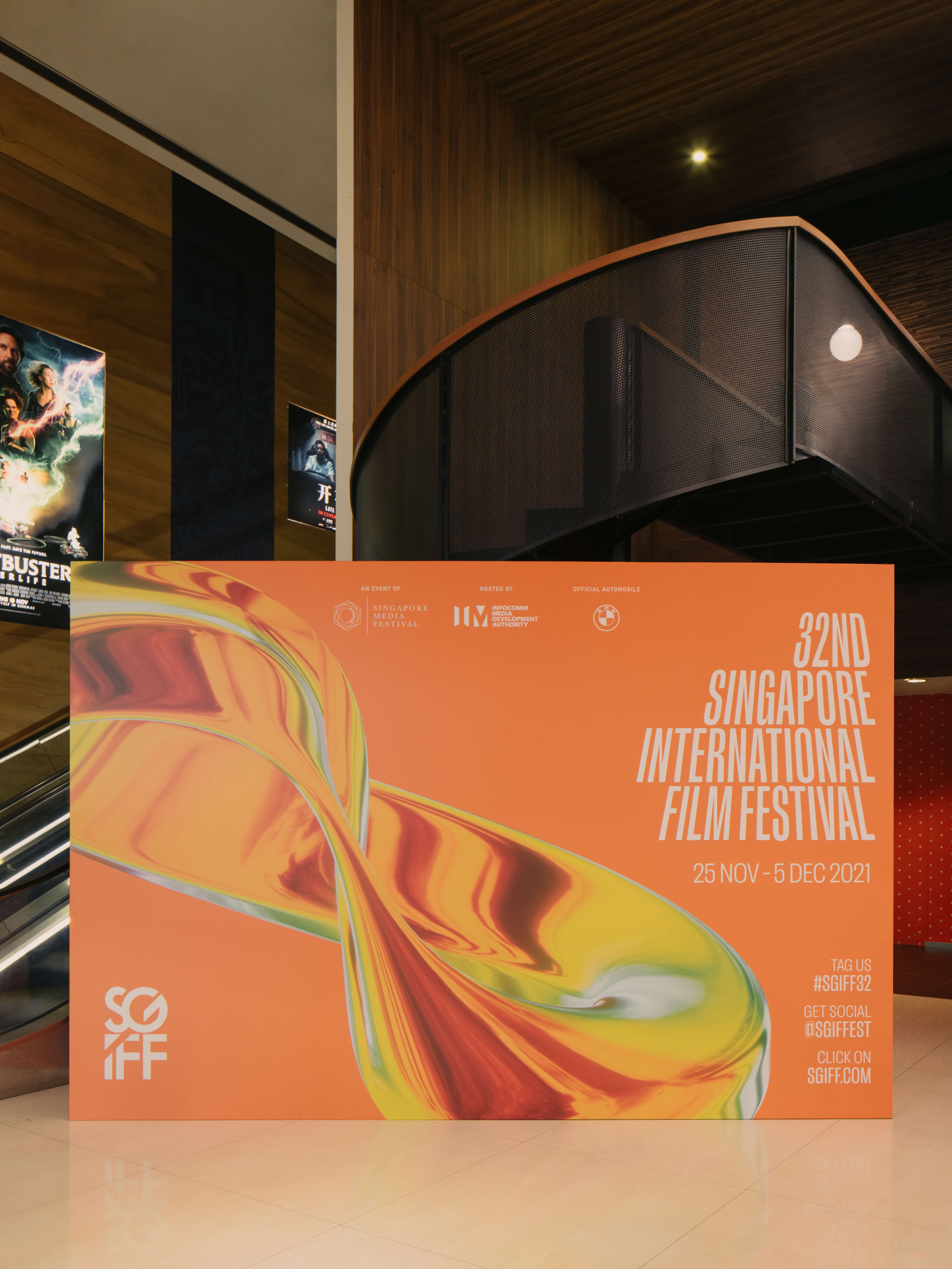
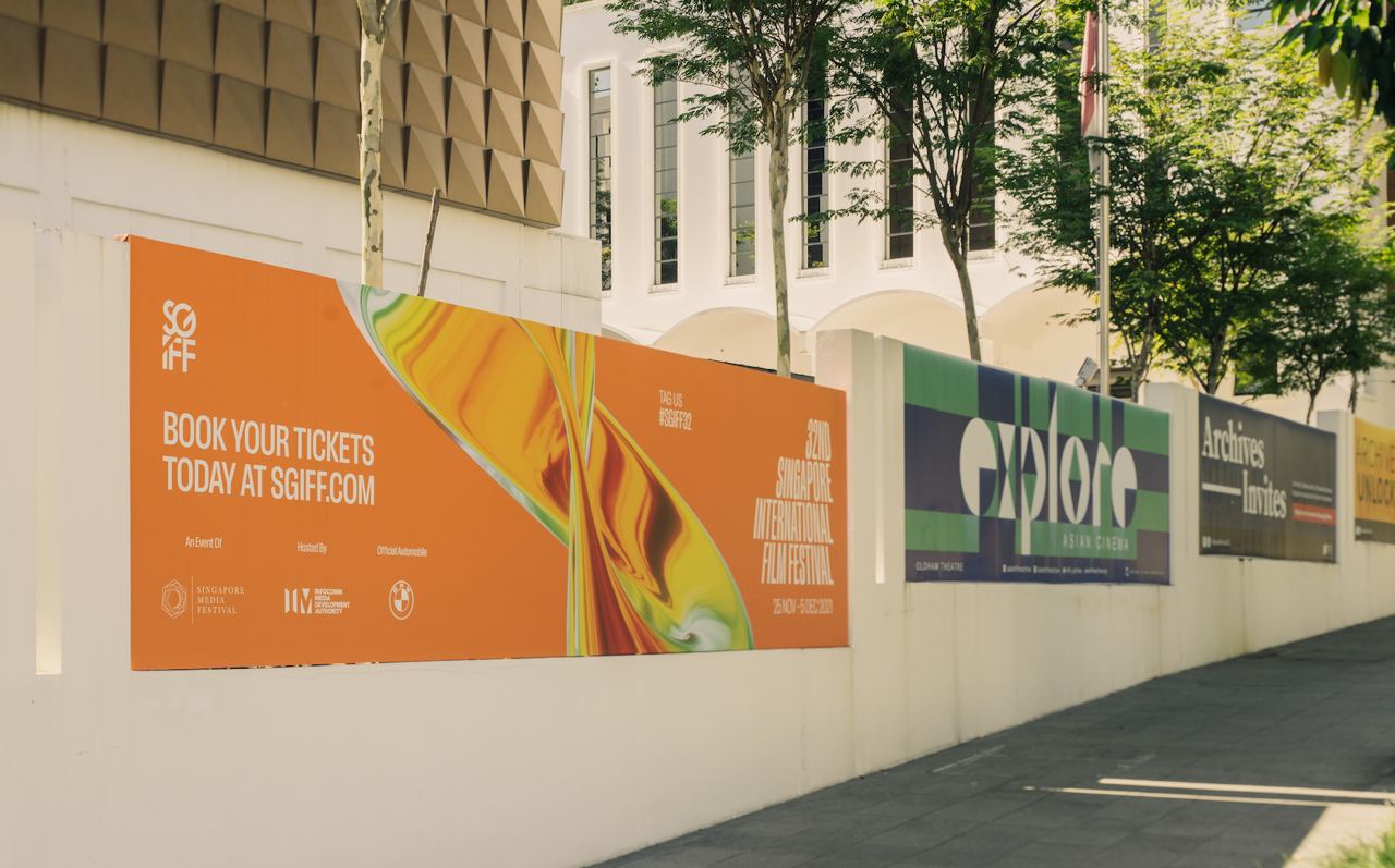
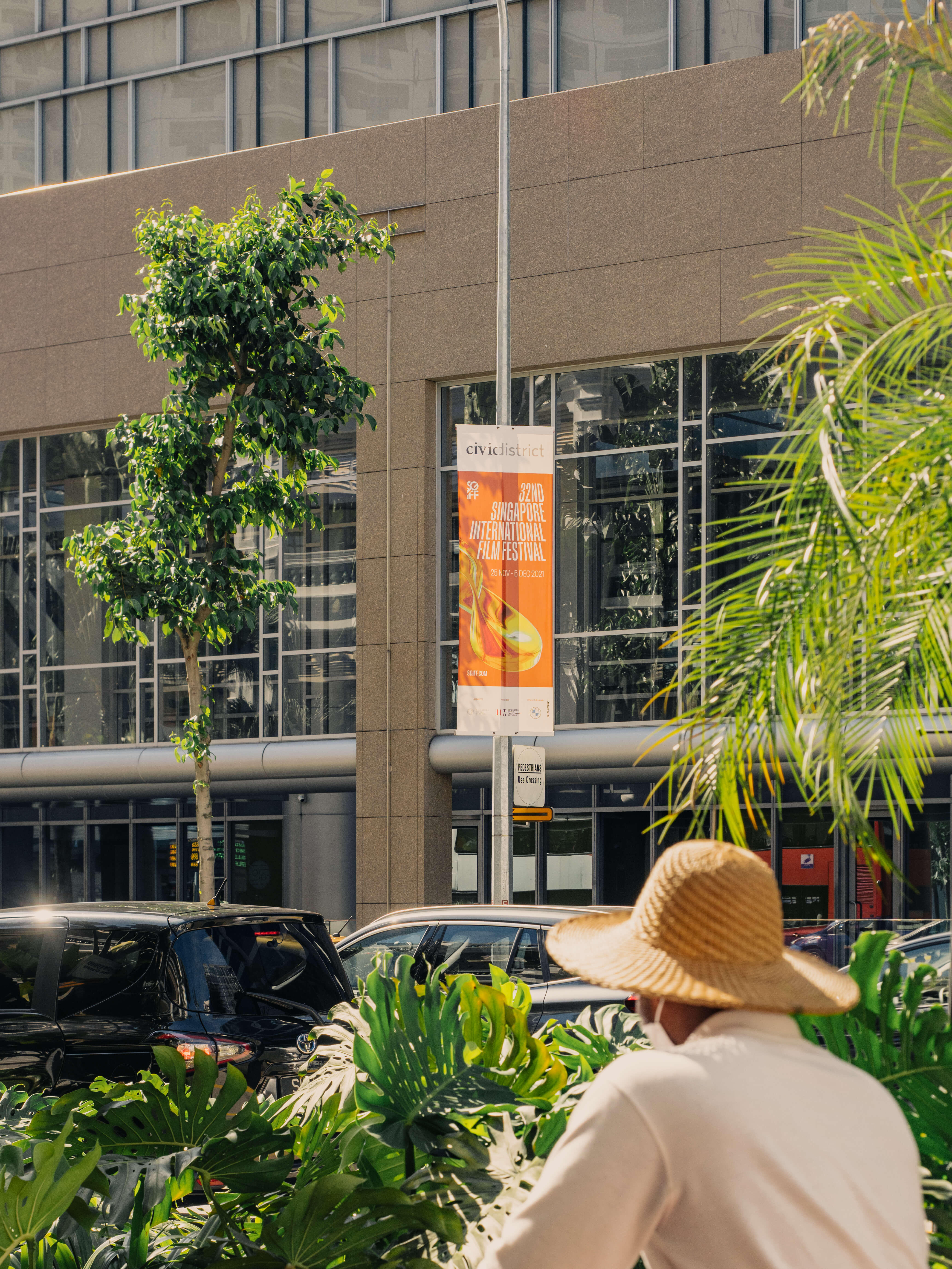
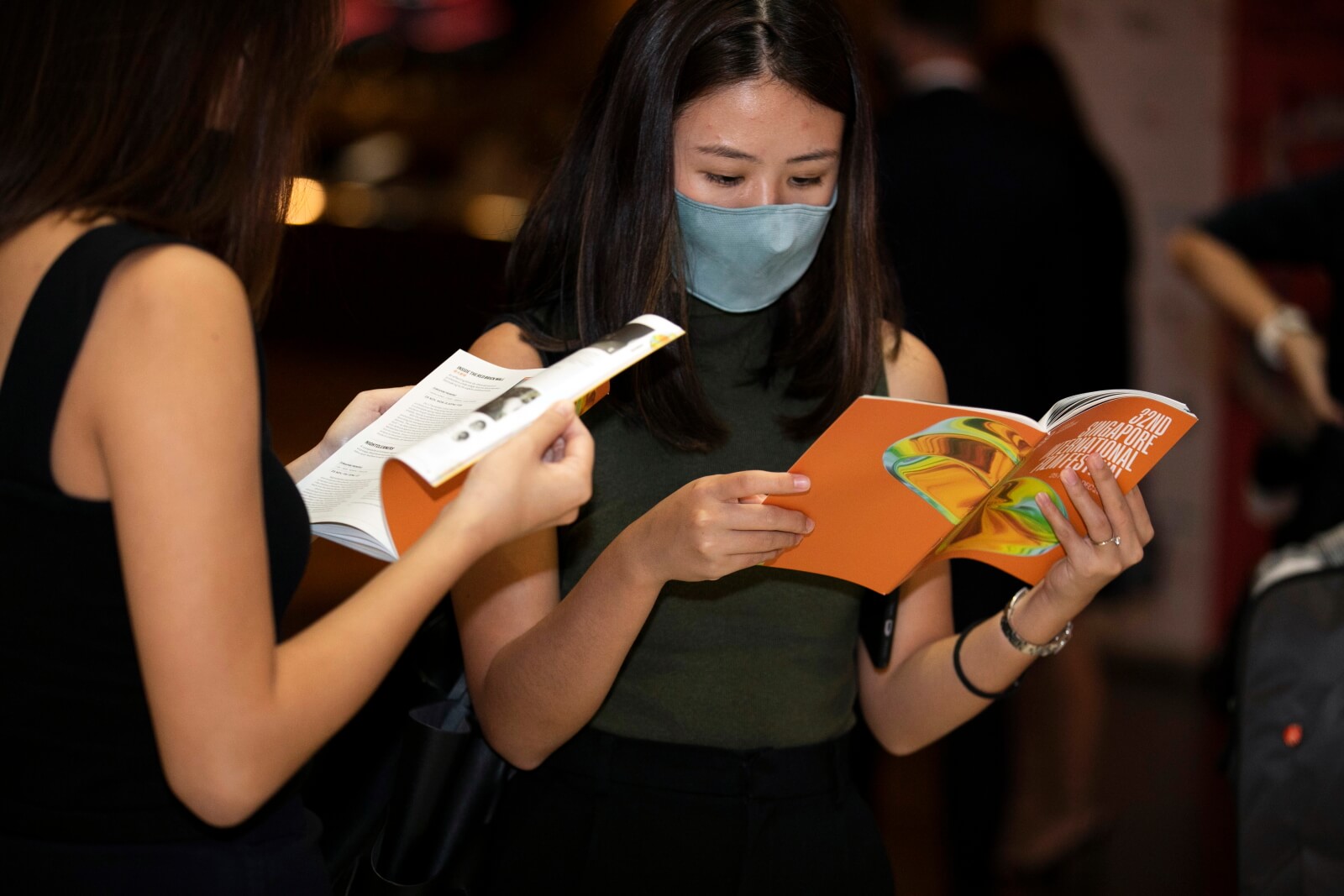
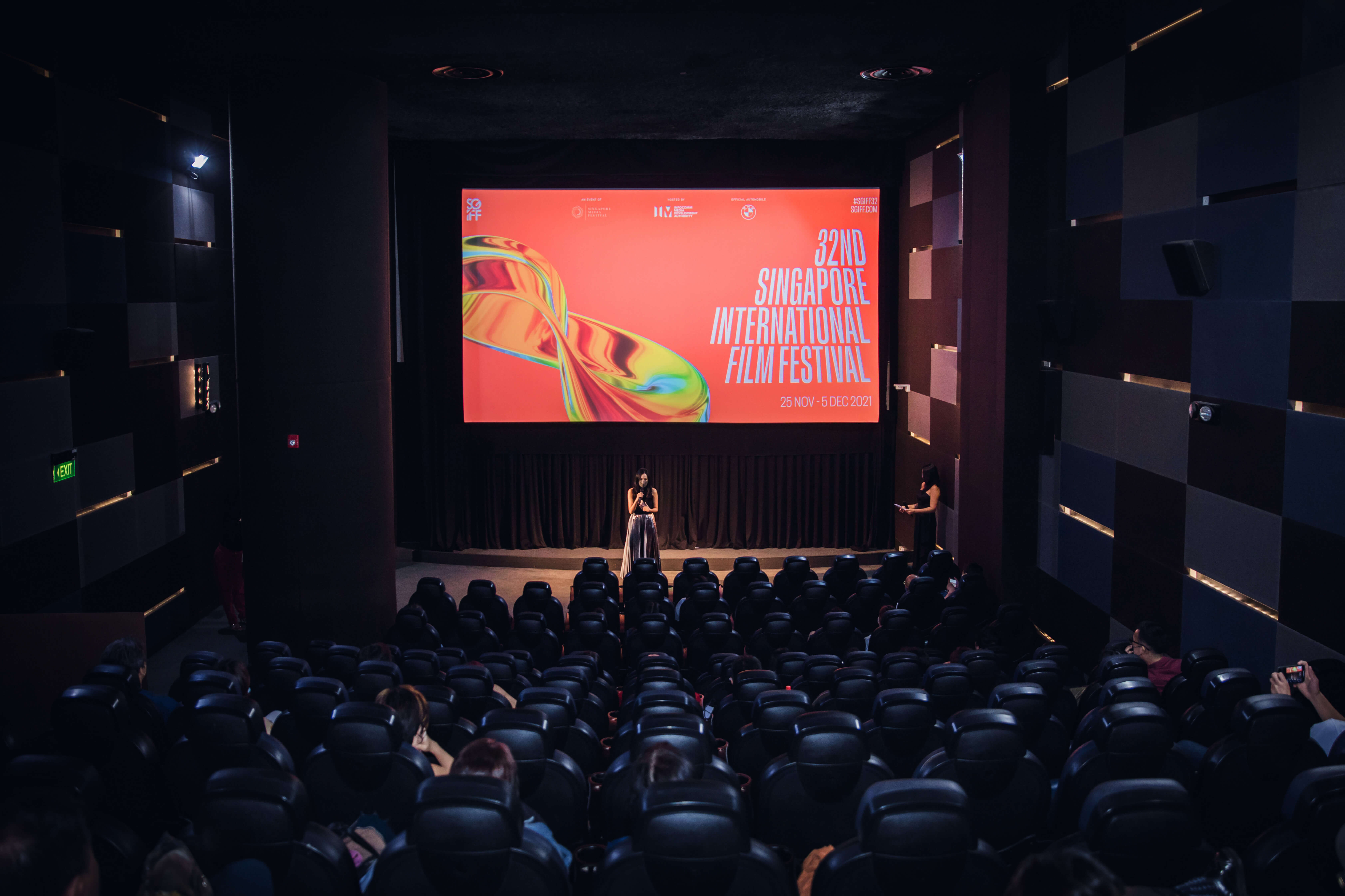
Held during the pandemic, we created the theme 'CINEMA FOREVER' for the 32nd Singapore International Film Festival—a gentle reminder that no matter the times, great cinema is indefinitely here to stay.
Designed in an uplifting and eye-catching neon orange, the theme translates into graphic elements such as a three-dimensional infinity symbol combined with an infinity film credits typographic scroll.
Designed in an uplifting and eye-catching neon orange, the theme translates into graphic elements such as a three-dimensional infinity symbol combined with an infinity film credits typographic scroll.


Presenting the identity for Moonlight Cinema, a programme that celebrates storytelling through film. Through a star-studded selection of Singapore films organised by Singapore International Film Festival in partnership with Gardens by the Bay, audiences can enjoy film screenings literally ‘under’ the stars.
The logotype is a customised bold san serif typeface that is inspired from the geometry of a star, completed with various ambient-centric coloured gradients to represent the hues of dusk.


The identity for Singapore International Film Festival 2021’s Call For Entry takes cue from the raw, emotive passion of filmmaking. The motion graphic ends with the spinning of various aperture circles to mimic the focusing of camera lenses, a nod to the exquisite craft of cinematography.
Finished off with a striking neon green, the type-centric visual exudes rhythm and excitement whilst keeping in mind the importance of adaptability to print, digital, and social touchpoints.


SGIFF Extended presents a selection of short films from the Southeast Asian Short Film Competition, Singapore Panorama and Festival Opening sections of the 32nd Singapore International Film Festival (2021).
Extending into the virtual sphere, the programme offers another opportunity for our audience to experience the festival programme from the comforts of home.
Extending into the virtual sphere, the programme offers another opportunity for our audience to experience the festival programme from the comforts of home.
Inspired by continuity, the visuals feature continuous movement and consistent details that represent the evolution of cinematography and the film community.
To compliment this direction, we also created a custom typeface for the project (to be released in the future as a retail typeface). The typeface can be stretched and work as abstract shapes act as borders to contain images, as well as across a multitude of other touch points on various publicity materials. This also represents the concept of ‘extended’ in a straightforward manner.
To compliment this direction, we also created a custom typeface for the project (to be released in the future as a retail typeface). The typeface can be stretched and work as abstract shapes act as borders to contain images, as well as across a multitude of other touch points on various publicity materials. This also represents the concept of ‘extended’ in a straightforward manner.