What was the core inspiration/idea behind your notebook?
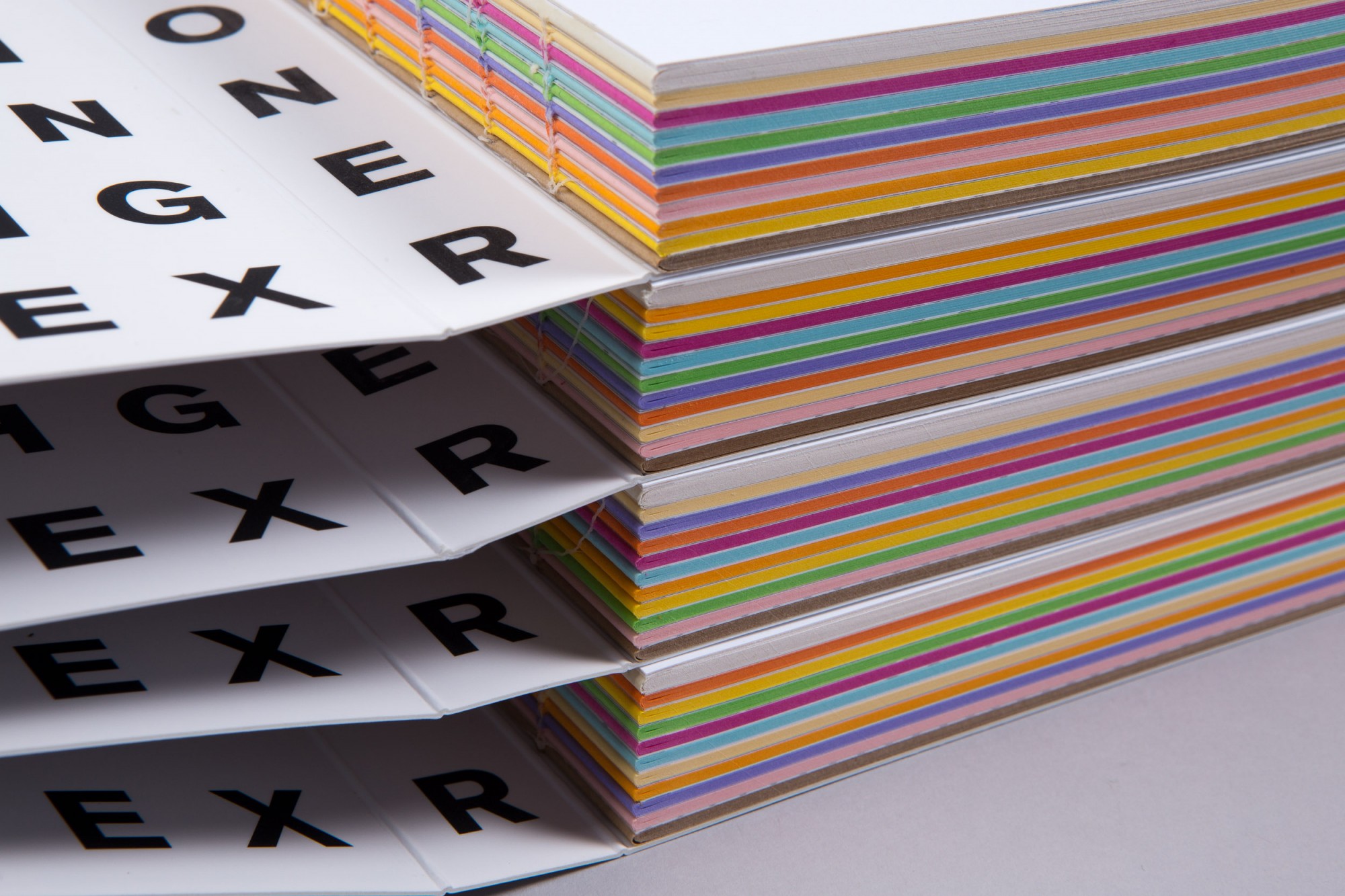
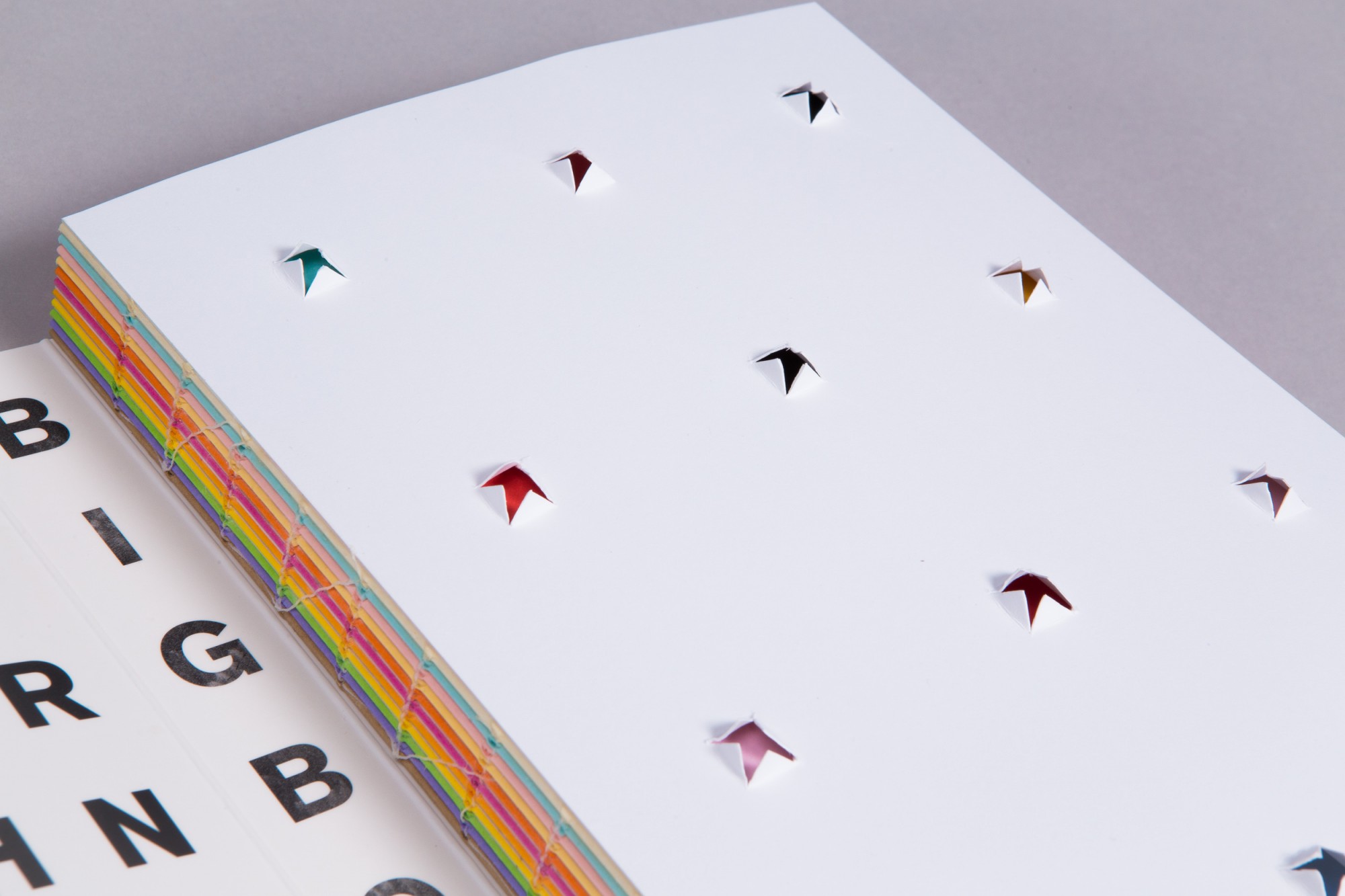
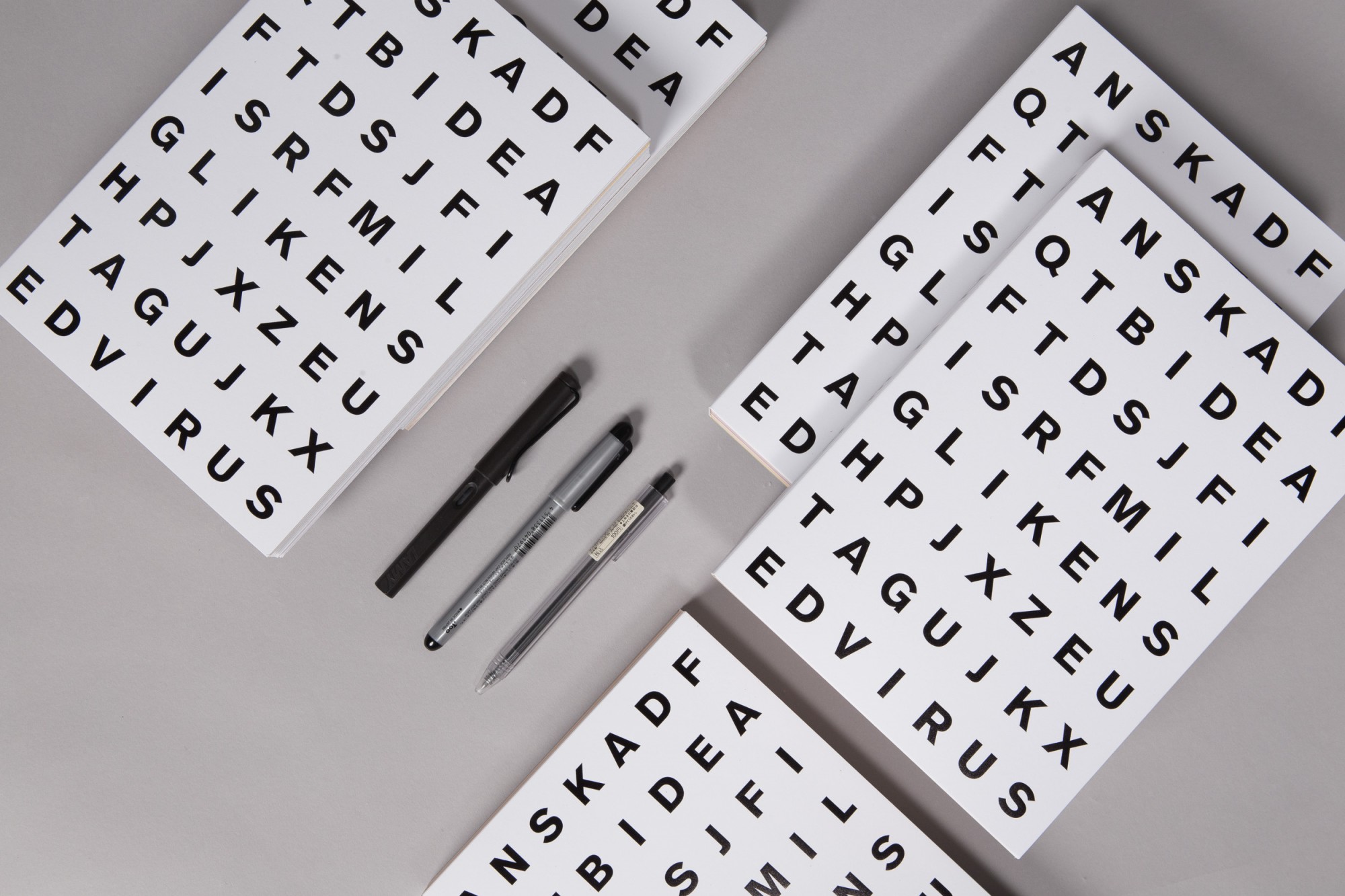
I have always been drawn to typography. I have read heavily on how different brains interpret language, visuals, and text differently and also at different speed. Hence by designing a crossword puzzle, I would like people to try to find as many words (and phrases) if possible and find out which words / phrases they see. I name it “The Road So Far”. It consists of many different colour papers per signature, with each signature beginning with a french fold that contains one work that people haven’t seen before. I get asked by people quite a lot, or meet younger designers who say they only want to work on “sexy” projects. I get extremely turned off because: (1) we should try to work on every project to the best of our ability—creating a tiered approach is only unfair to the client (2) sometimes the outcome is not truly award winning or to everyone’s taste, but it is important to understand every project counts. They help pay the bills; buy us a new office chair; pay for our studio holiday. I have chosen those projects to be inside the french folds for people to take a peek at those projects that are as important to us as those shown on our website. I have chosen 2 from each year (we are just passed 5 years old) so there are 10. Every step of the journey has grown us and taught us many things and it has been a exciting journey full of colorful and dull moments—hence explaining the various colors and paper stock.
Why this pattern of alphabets?
I went through many iterations—this one has the most number of words (that I wanted to have) inside for people to find.
Are there any technical difficulties that you envision in its production?
Haha many! Junny and I have discussed many possibilities and I must have been so hard to entertain!
What are your hopes for your notebook?
I had many crazy ideas but I decided to create something usable, with a tinge of discovery. I don’t like to make things that are design for design’s sake. They don’t withstand time, serve any purpose, and they are just “fun” to look at.


What do you consider a good notebook design?
It should open up properly for people to write on. So perfect bind is out for me. It should have smooth edges, if not your fingers will be knocking on every awkward edge for no reasons and getting paper cuts everywhere. A notebook should be invite people to utilise and enjoy the sense of touch. Places that are not meant to be written on can be made with interesting paper stocks. For the insides, I believe in functionality and it does not function well as a place to scribble if the paper stock does not take ink well or it subconsciously feels too expensive a paper stock and the user needs to think twice before writing an idea down (which is a big pity). It would be nice to have some hidden messages for people to find out. Of course, an interesting cover would get people to take a second look.


Read original article here.