As part of RWS 2.0, Resorts World Sentosa is shifting from an attraction-led model to an experience-focused destination to encourage repeat visits and longer stays. Part of the grand $6.8 billion masterplan is the addition of their newest retail mall — WEAVE.
We started tackling the project with the naming concept and market positioning. Named WEAVE, it represents the confluence of different nationalities, cultures, stories, and more, signifying the vibrant retail offerings and traffic flow one can experience only in RWS and the extended Sentosa island region.
The logotype is set in Flara — supported by Tenet and custom type families from Fable Type Foundry — that establishes an identity that redefines its market positioning to be one of refinement, quiet confidence, and contemporary sophistication, while maintaining harmony within the broader integrated RWS ecosystem.
Beyond the main visual identity, FEAST at WEAVE — an Asian food hall within the mall — was also branded as part of the experience. Both the logotype and stall names are typeset in Flara, blending seamlessly with the overarching branding to create a cohesive and elevated typographic language that flows consistently throughout the space.
The scope extended into strategy, brand storytelling, landscaping, and lifestyle narratives — developed in close collaboration with the client to ensure the brand lives intuitively within the spatial and tenant experience, not merely as an identity system, but as a fully realised destination environment.
The scope extended into strategy, brand storytelling, landscaping, and lifestyle narratives — developed in close collaboration with the client to ensure the brand lives intuitively within the spatial and tenant experience, not merely as an identity system, but as a fully realised destination environment.


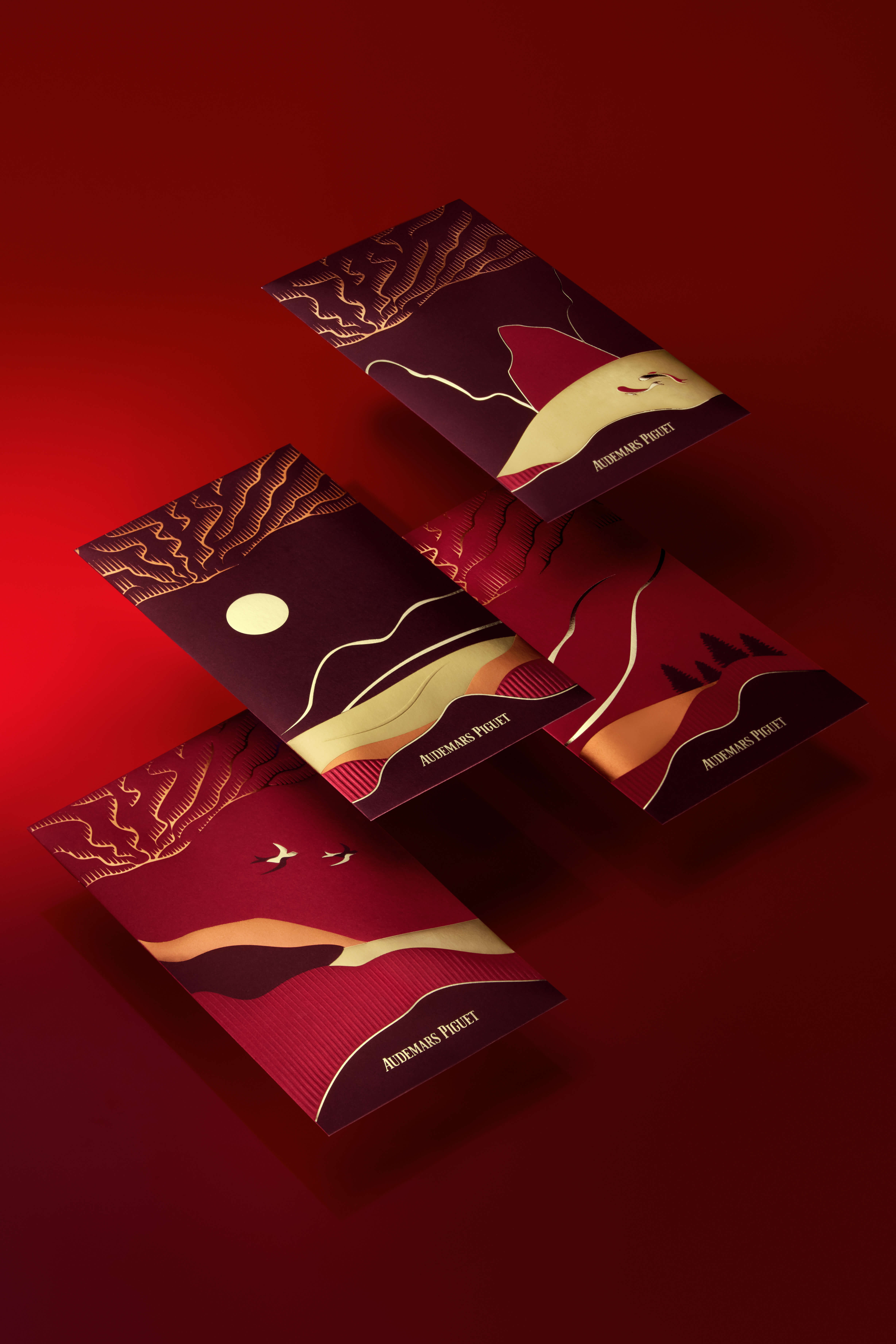
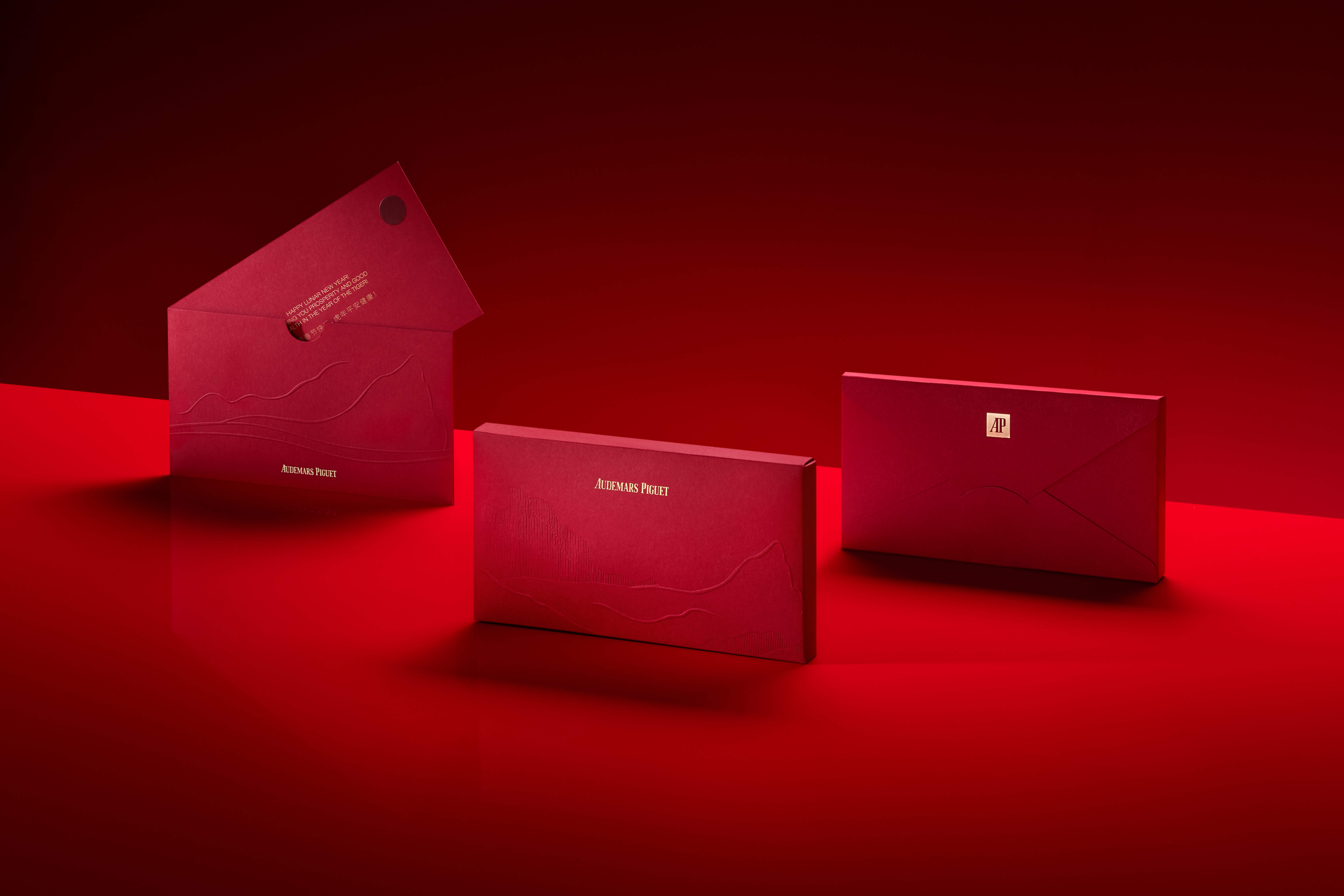
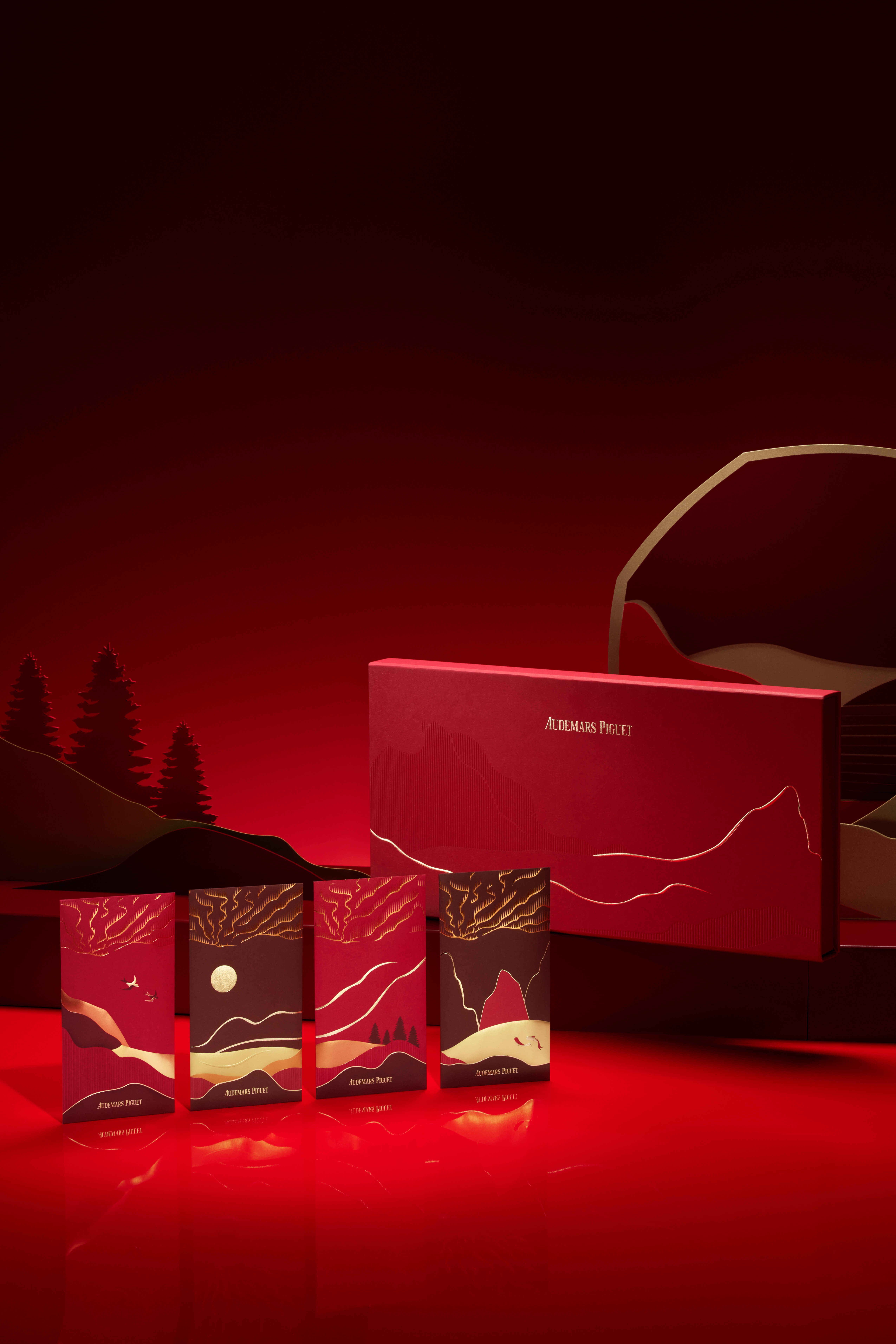
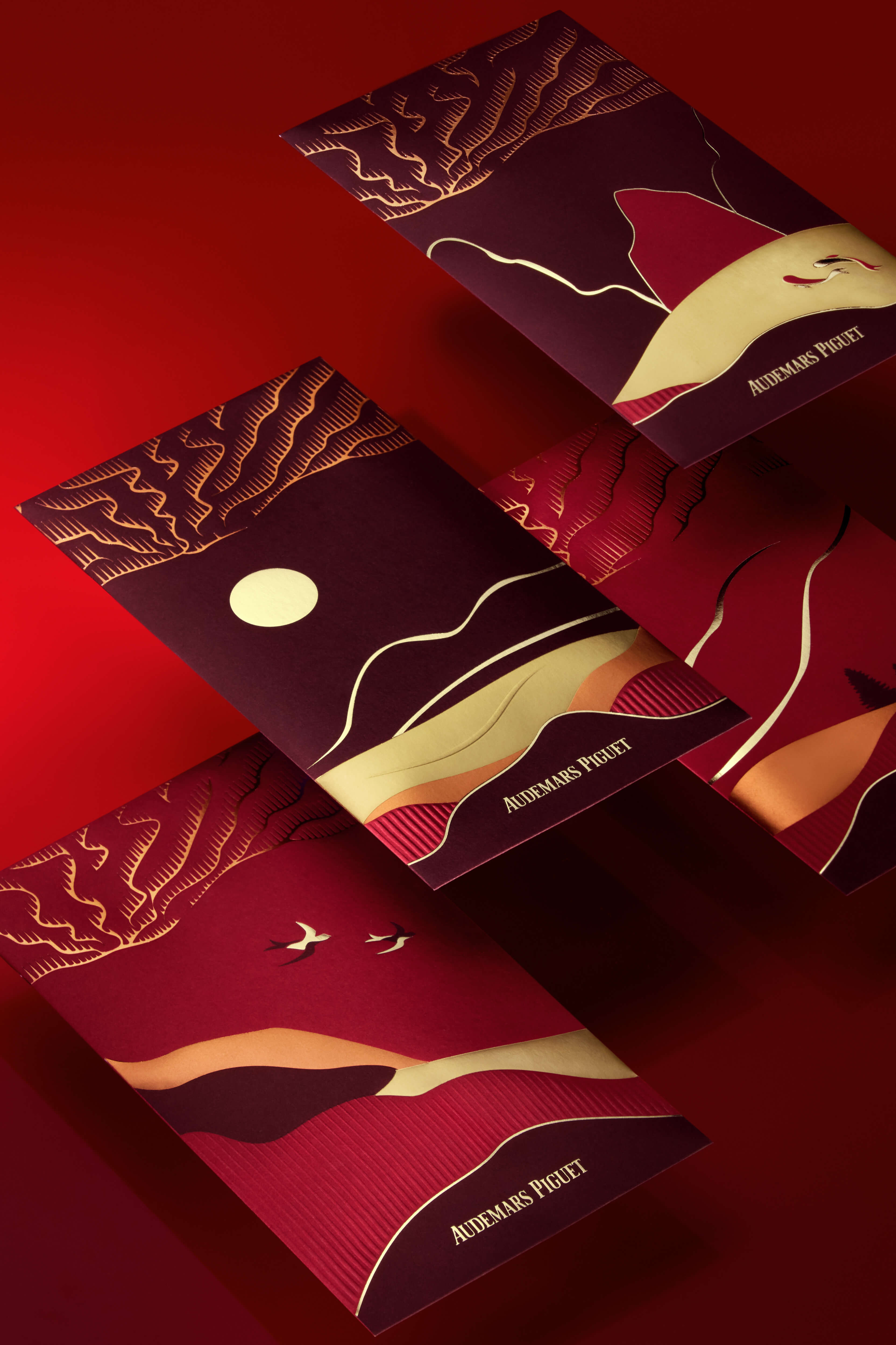
We were commissioned to work on the annual Asia and Americas campaign for the Lunar New Year festivities and gifting for Audemars Piguet.
Based on the concept ‘A New Light’, we used patterns and graphics both inspired by light waves and sound waves to pay tribute to Audemars Piguet’s home at Le Brassus. The abstract landscape visual composition exudes elegance and timelessness, while keeping the textural execution captivating at the same time.
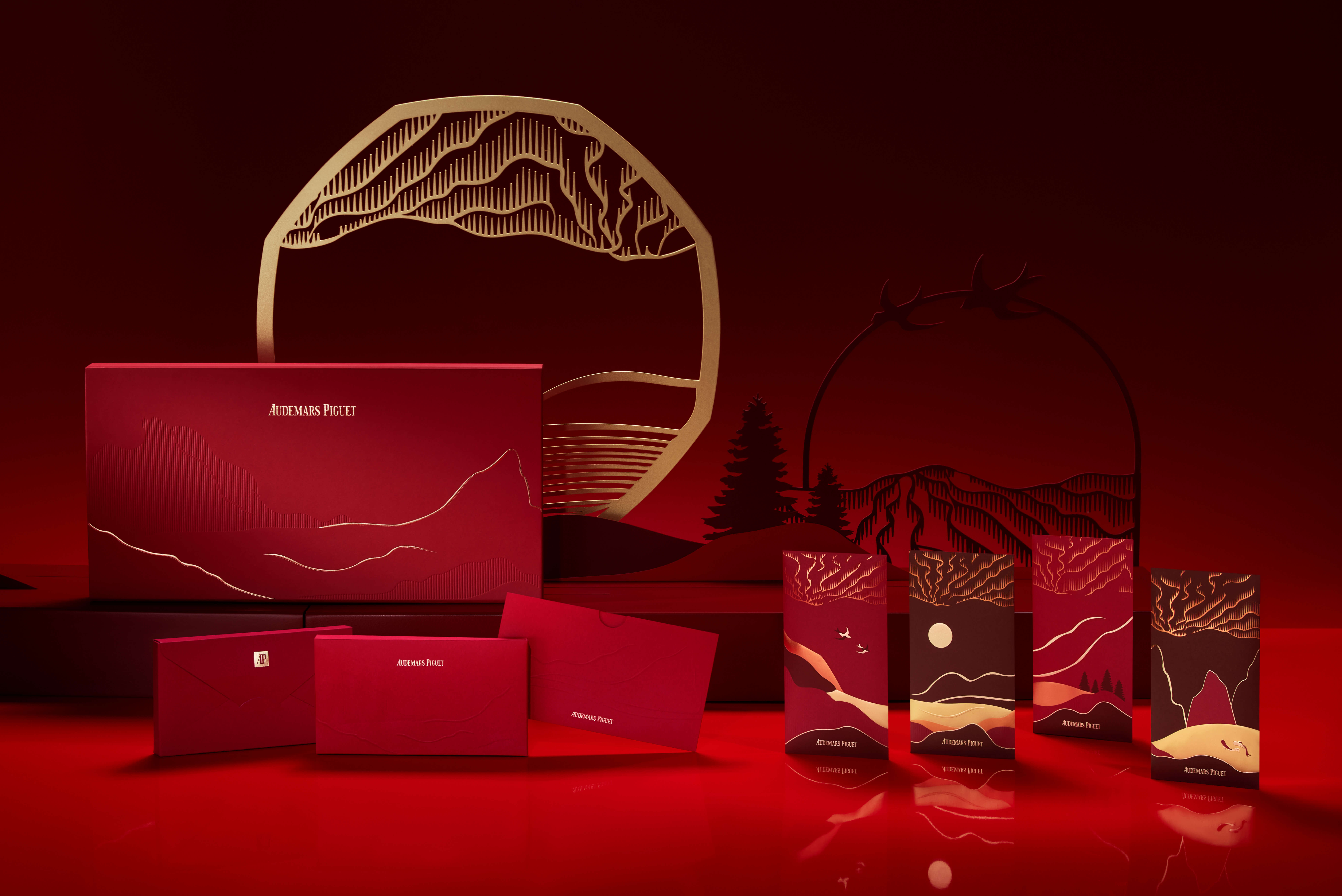

This concept features the sky heavily – a tribute to imagination and looking up for inspiration to create. Nuances of ‘East meets West’ are highlighted here with the sparrows, mountains, rivers, and more. Various print effects and paper stock were used to elevate the experience and to exude the brand.
The window animation display features the classic design of the Royal Oak in both a prominent yet subtle manner as various elements were also adapted across digital, motion, packaging, and print touchpoints.


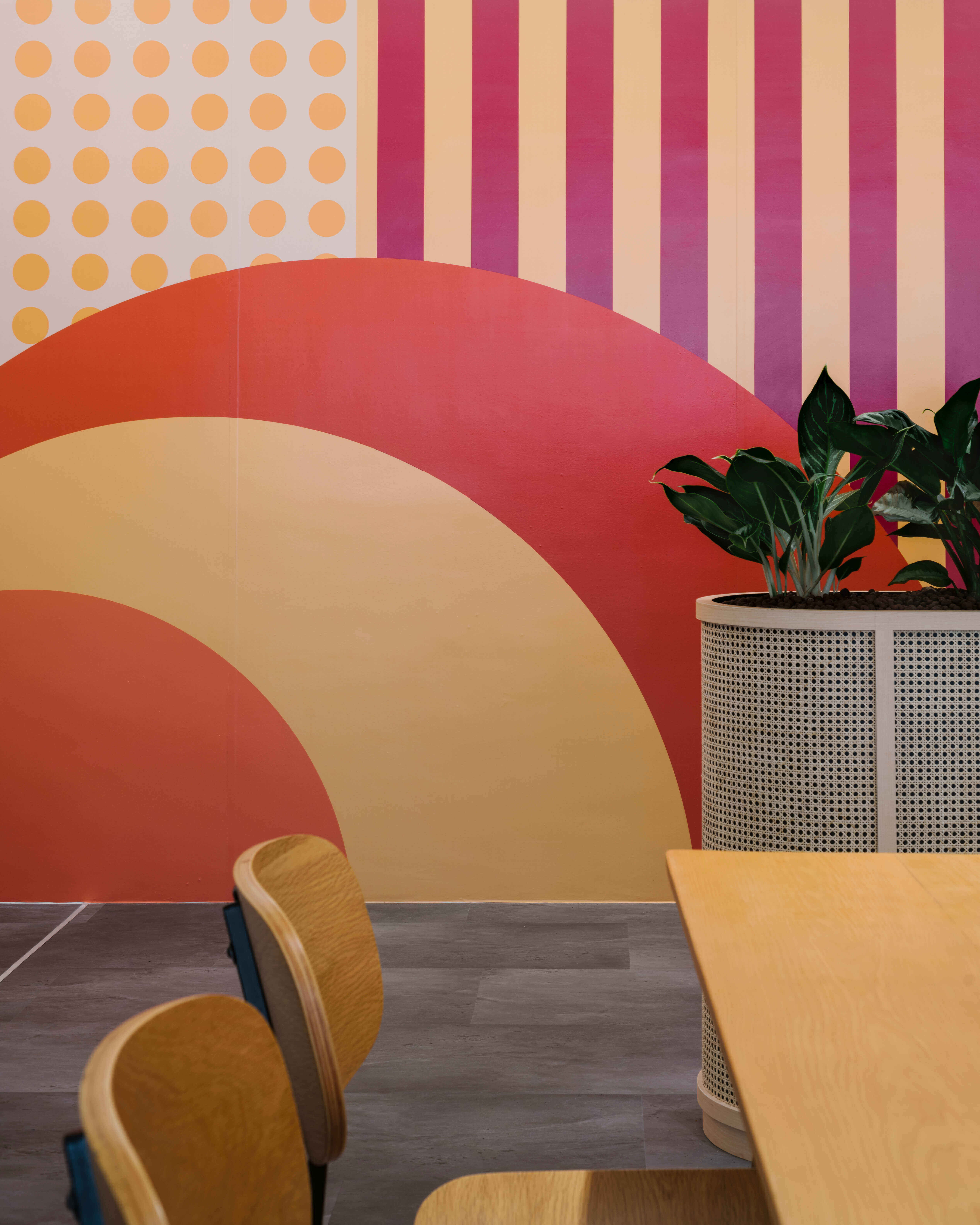
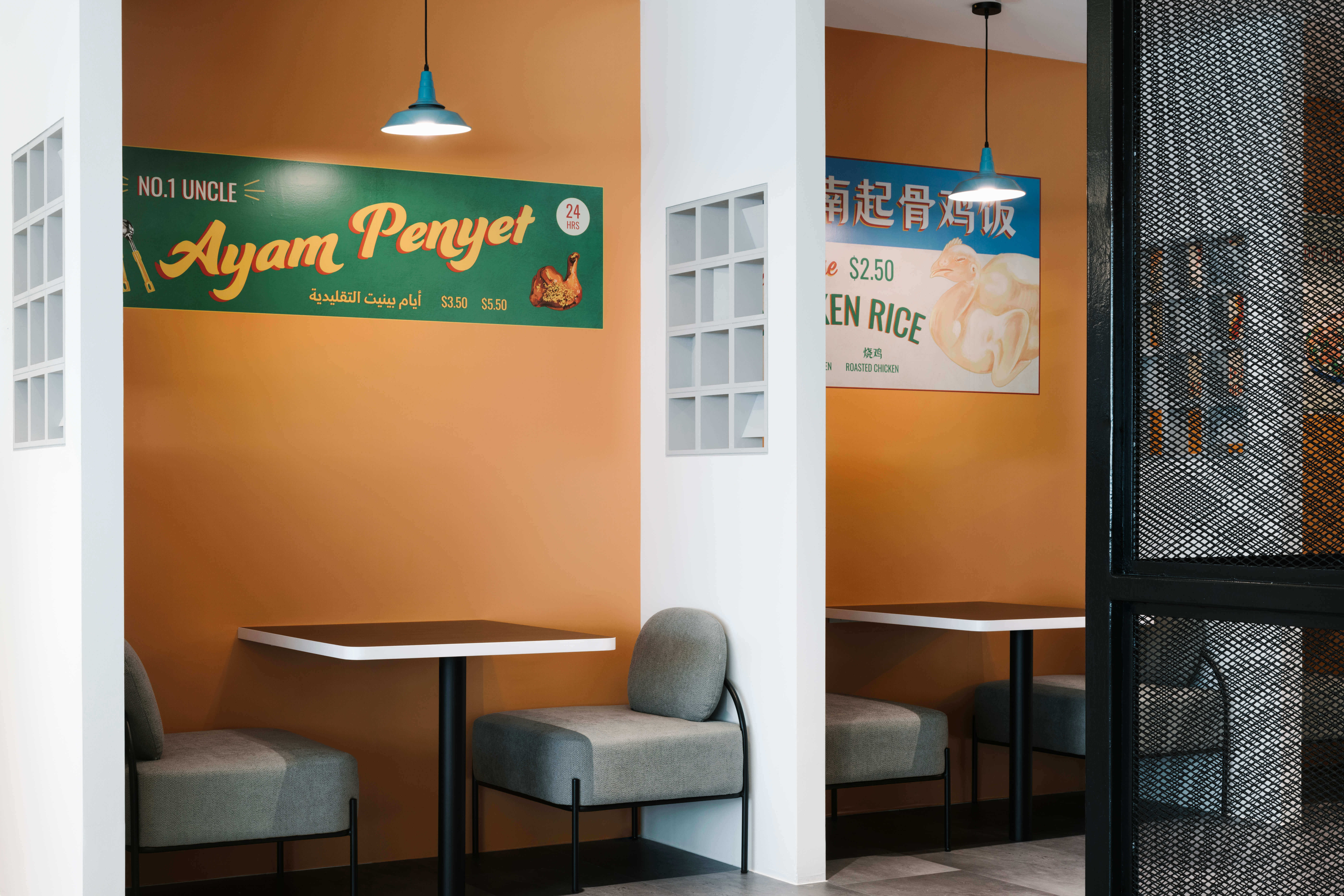
Southeast Asia’s leading superapp Grab celebrated its 10th anniversary by launching a new 9-storey HQ in Singapore. Located at one-north business tech park, this facility spans more than 42,000 sqm. The building houses about 3,000 Grabbers, including its newly-formed digibank team. It also features an R&D Centre, as well as its first GrabMerchant Centre.
“It is a story that is familiar to us because it is a story about the underdog succeeding against all odds, and making the impossible possible. That’s what the Singapore story is about. Like Singapore, Grab started from humble beginnings. It had to grow from virtually nothing, and it had to face and confront and overcome challenges along the way.”
- Deputy Prime Minister and Minister for Finance Lawrence Wong
- Deputy Prime Minister and Minister for Finance Lawrence Wong
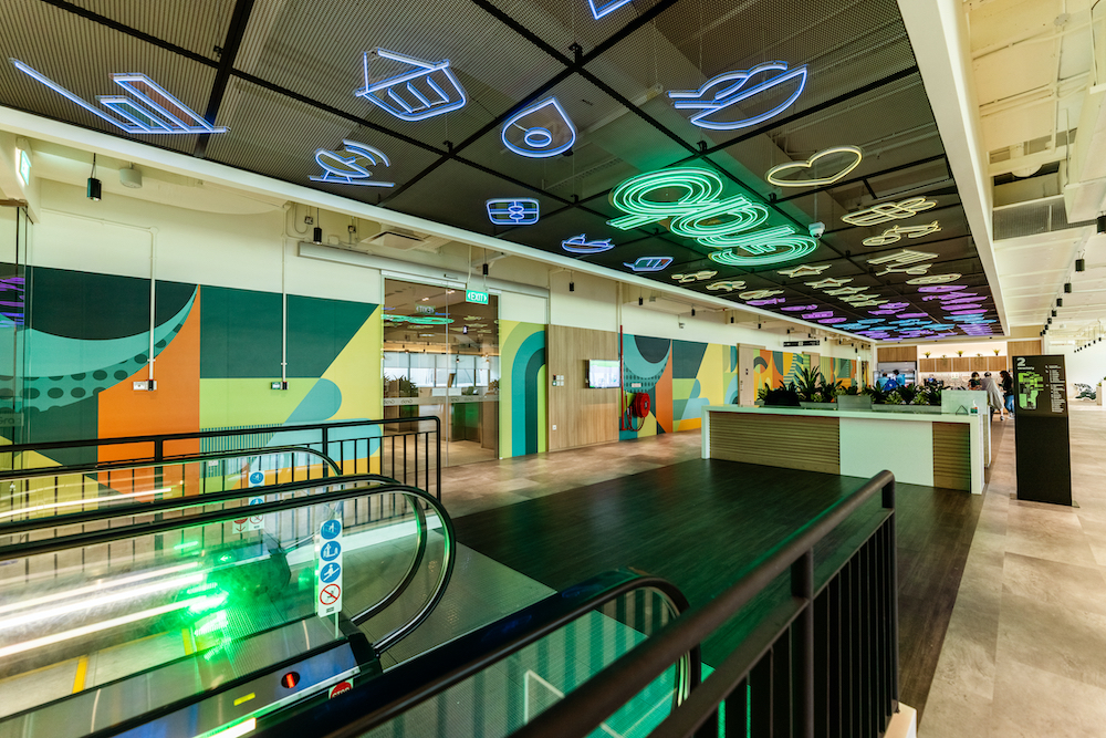
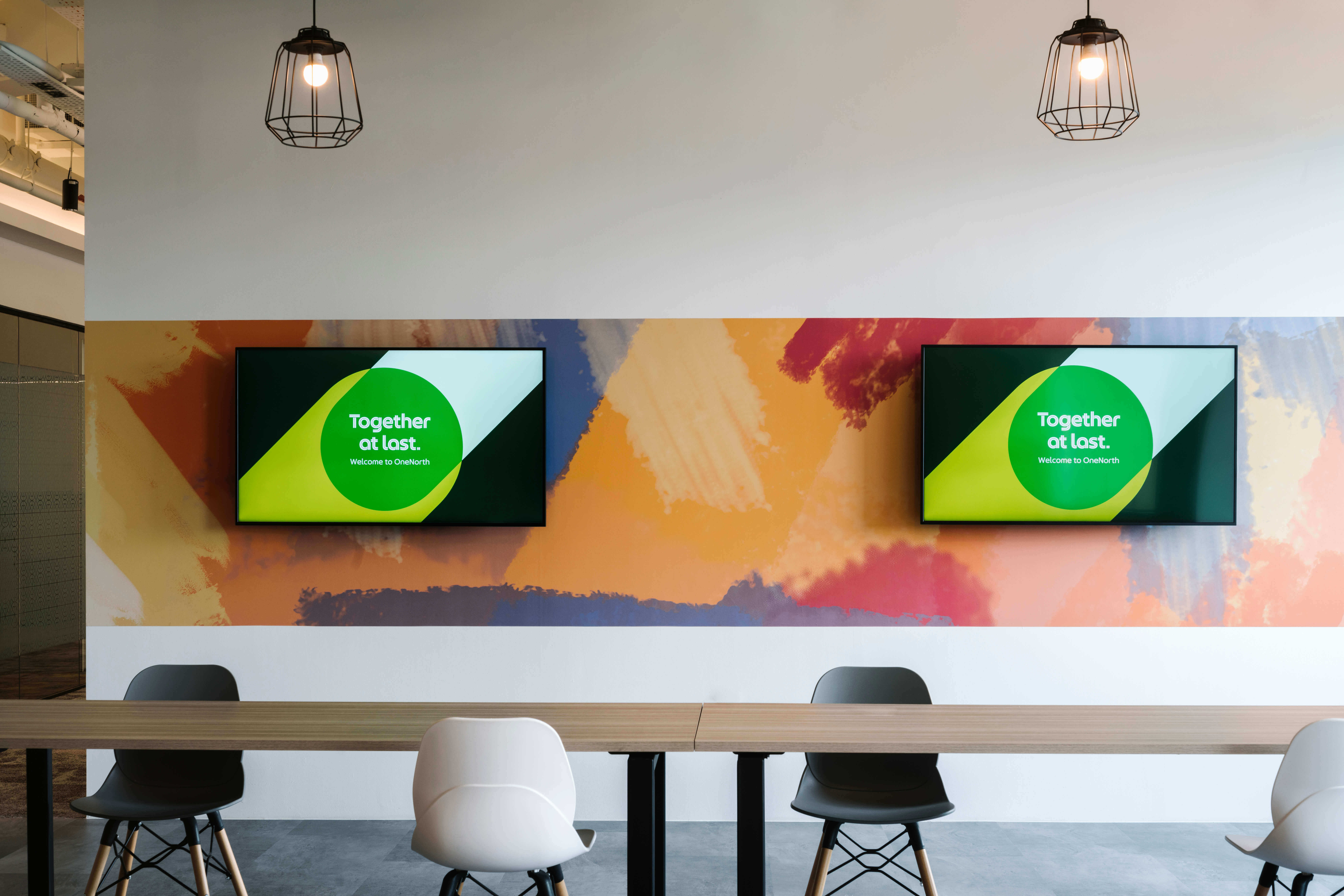
We are proud to be part of this story as we were tasked to work on spatial and interior graphics across all the different levels—ranging from cafeterias to corridor graphics, communal spaces to meeting rooms.
The visuals had to be sensitive to the usage and scale of the space. What tied the graphics together was an overall vision of being progressive, passionate, inclusive, dynamic and vibrant – a clear reflection of Grab’s company culture.
The Grab Way (Grab’s ethos) is intentionally weaved into the different corners of the building.
The Grab Way (Grab’s ethos) is intentionally weaved into the different corners of the building.


Common corridors
A blooming and self-generative design that is based on Kaizen, where the path to achieving the mission is going to involve its fair share of twists and turns, requiring Grabbers to continuously adapt to new information and changing circumstances.
A blooming and self-generative design that is based on Kaizen, where the path to achieving the mission is going to involve its fair share of twists and turns, requiring Grabbers to continuously adapt to new information and changing circumstances.
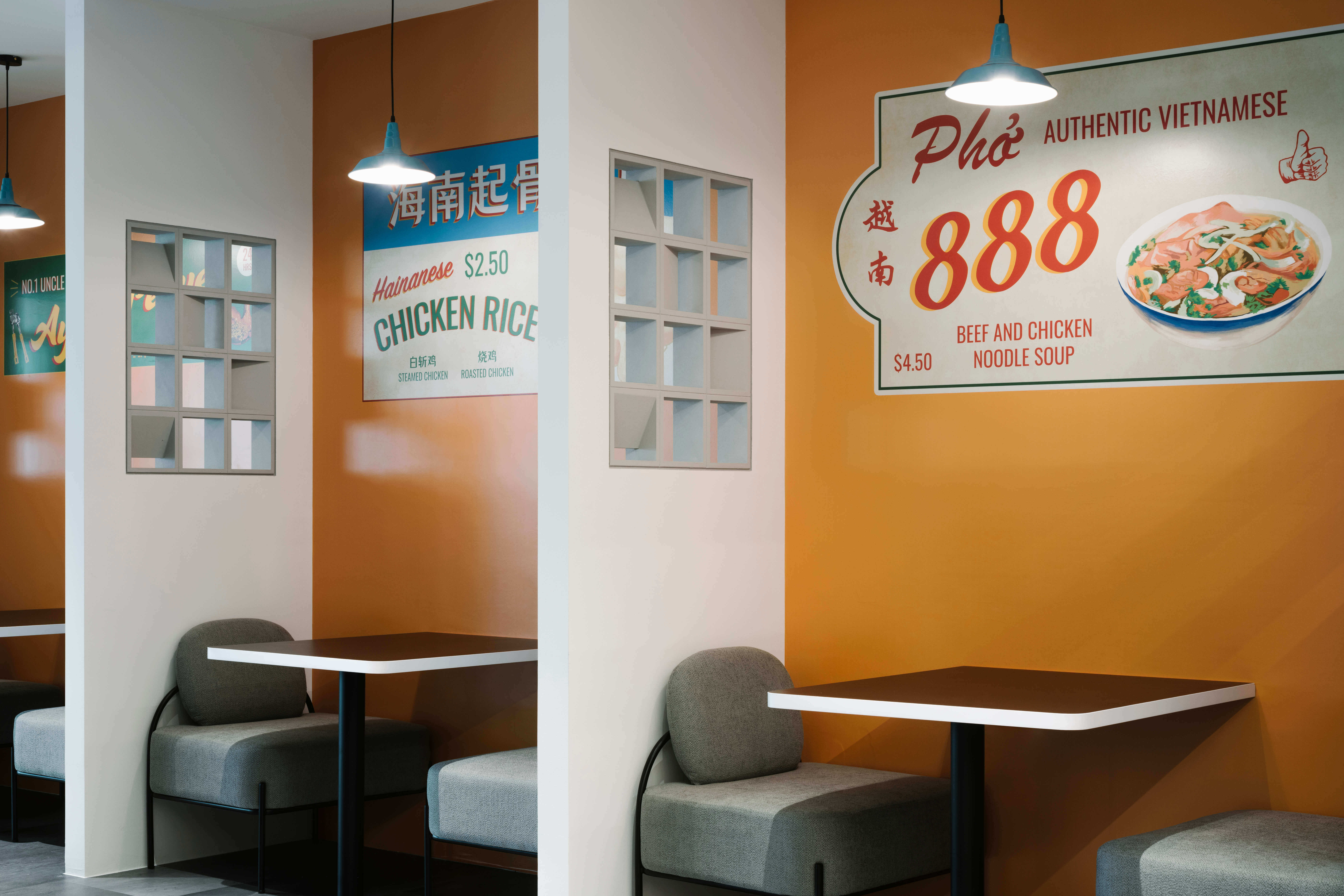
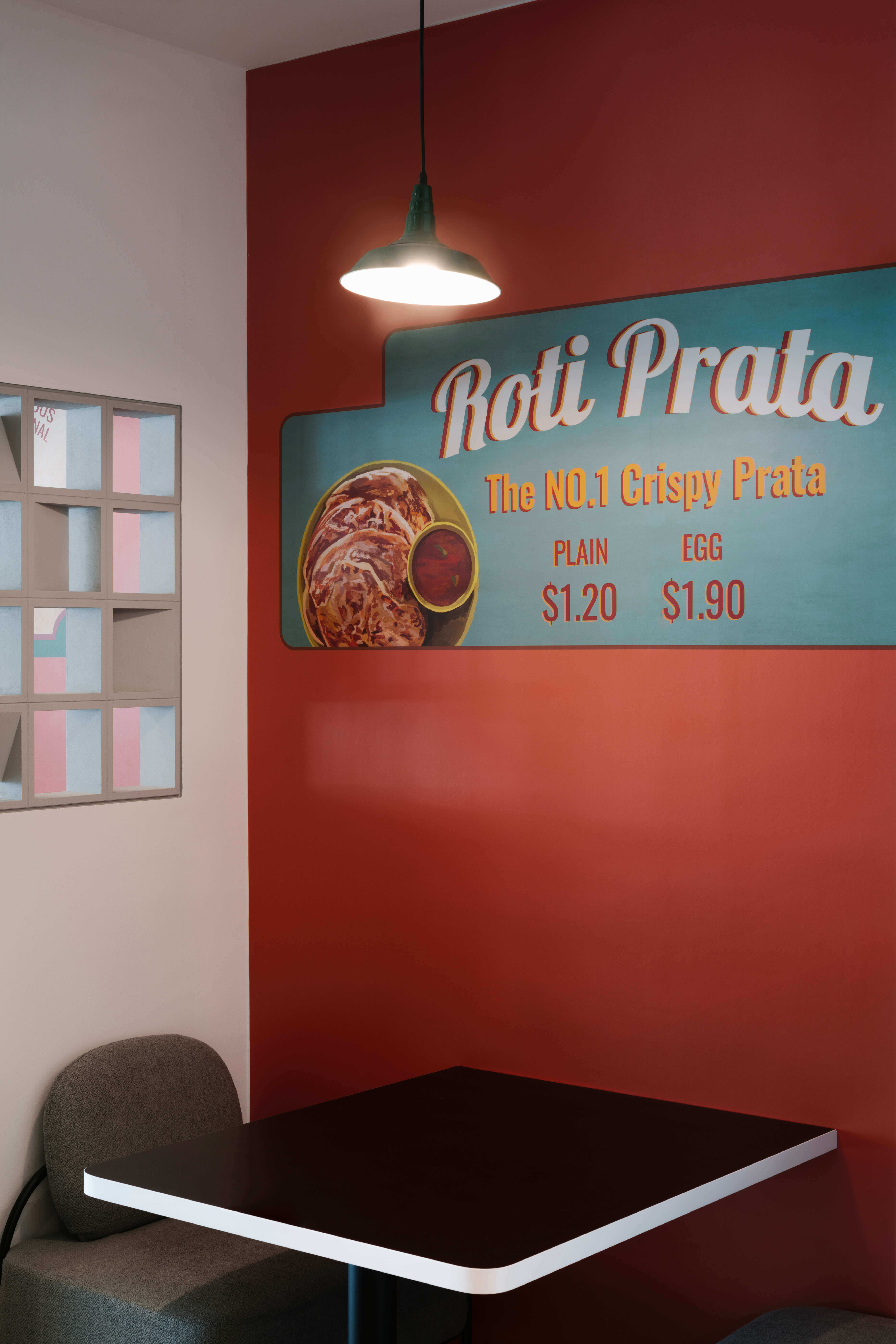
Cafeteria
Retro signboard designs showcase the variety of food in the Southeast Asia region. As GrabFood is a key pillar of the Grab superapp, this set-up acts a tribute to food merchants who have trusted Grab since Day One. This is Grab’s show of honour, where trust in Grab makes the mission possible.
Retro signboard designs showcase the variety of food in the Southeast Asia region. As GrabFood is a key pillar of the Grab superapp, this set-up acts a tribute to food merchants who have trusted Grab since Day One. This is Grab’s show of honour, where trust in Grab makes the mission possible.
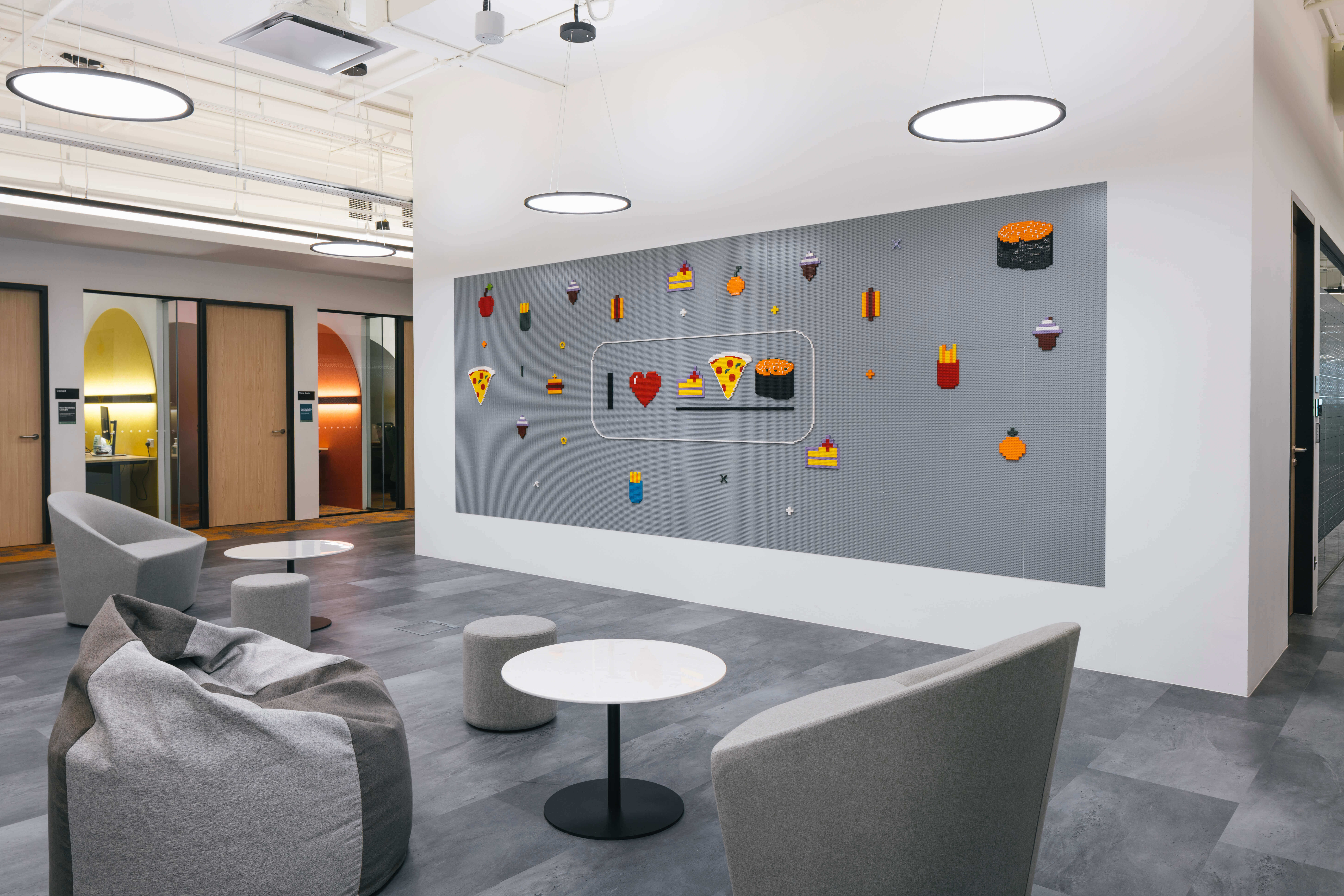
Lego Interactive Walls
The baseline: informal, fun, collaborative. We before me. Interaction at these designed walls foster Grabbers’ socialisation beyond departments and hierarchy. As OneGrab, Grabbers actively work to overcome and break silos across verticals, functions, and hierarchies.
The baseline: informal, fun, collaborative. We before me. Interaction at these designed walls foster Grabbers’ socialisation beyond departments and hierarchy. As OneGrab, Grabbers actively work to overcome and break silos across verticals, functions, and hierarchies.


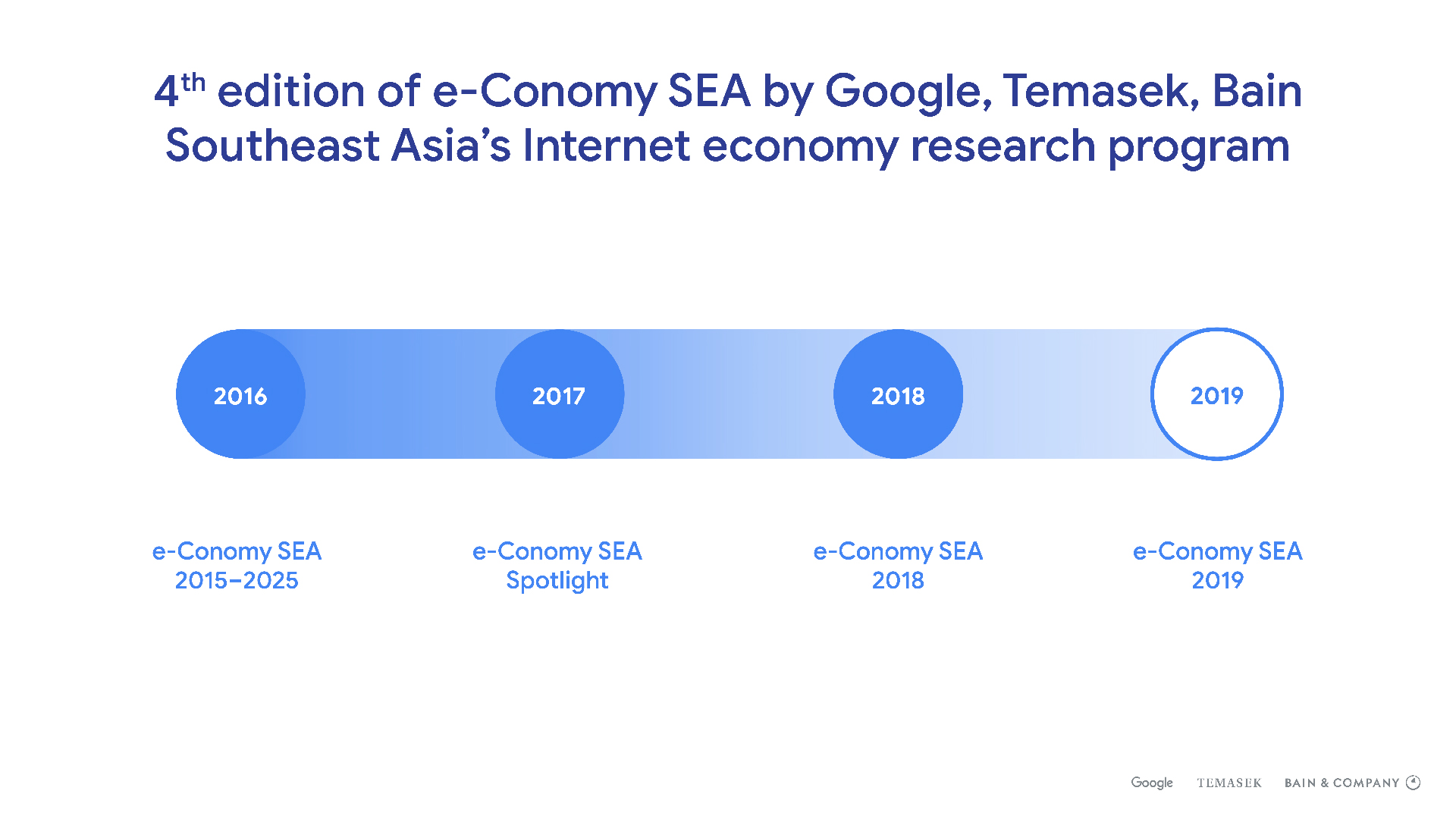
Since 2016,
Google has produced a yearly series of reports on the internet economy of
Southeast Asia, highlighting industry insights and forecasts for the following
year. The reports have become a key piece that is used in various consultancy
projects across both governmental bodies and private sectors, which rely
heavily on the information in their sector-specific analyses.
In 2019, we
were commissioned to design the report—the first time since Google has chosen
to engage an external agency.
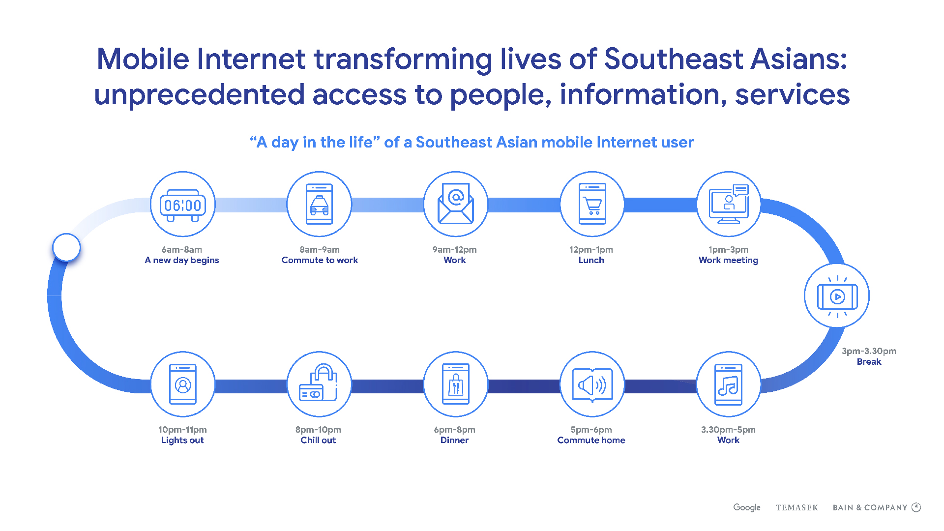
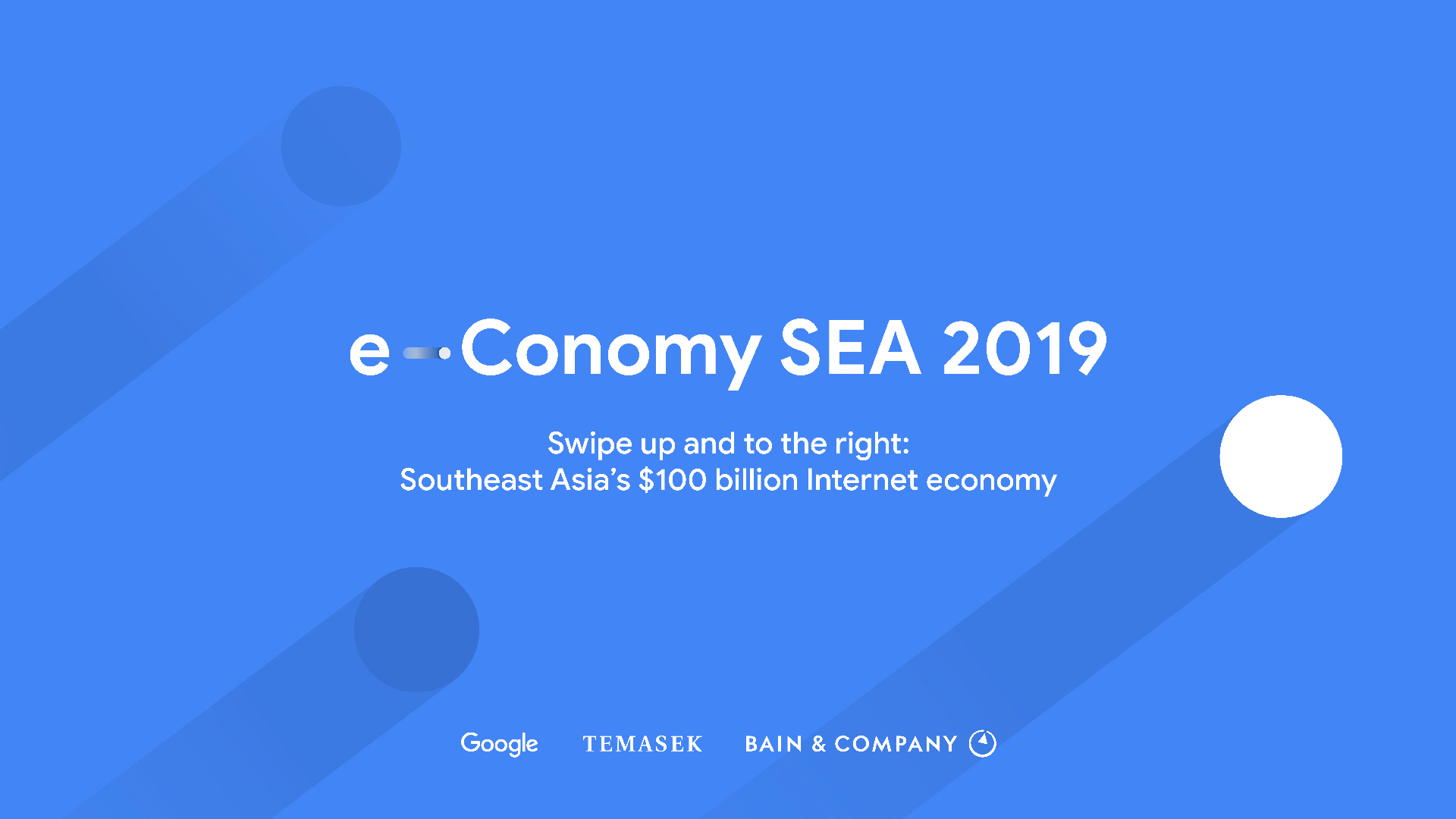
The theme for 2019 was Swipe Up and to the Right: Southeast Asia’s $100 billion internet economy. Inspired by the gaining traction of smartphones and mobile apps in Southeast Asia, the key visual depicted swiping motions that mimicked the unlocking of smartphones to access the various apps.
The theme for 2019 was Swipe Up and to the Right: Southeast Asia’s $100 billion internet economy. Inspired by the gaining traction of smartphones and mobile apps in Southeast Asia, the key visual depicted swiping motions that mimicked the unlocking of smartphones to access the various apps.
The same
design language was further applied to graphs and infographics.

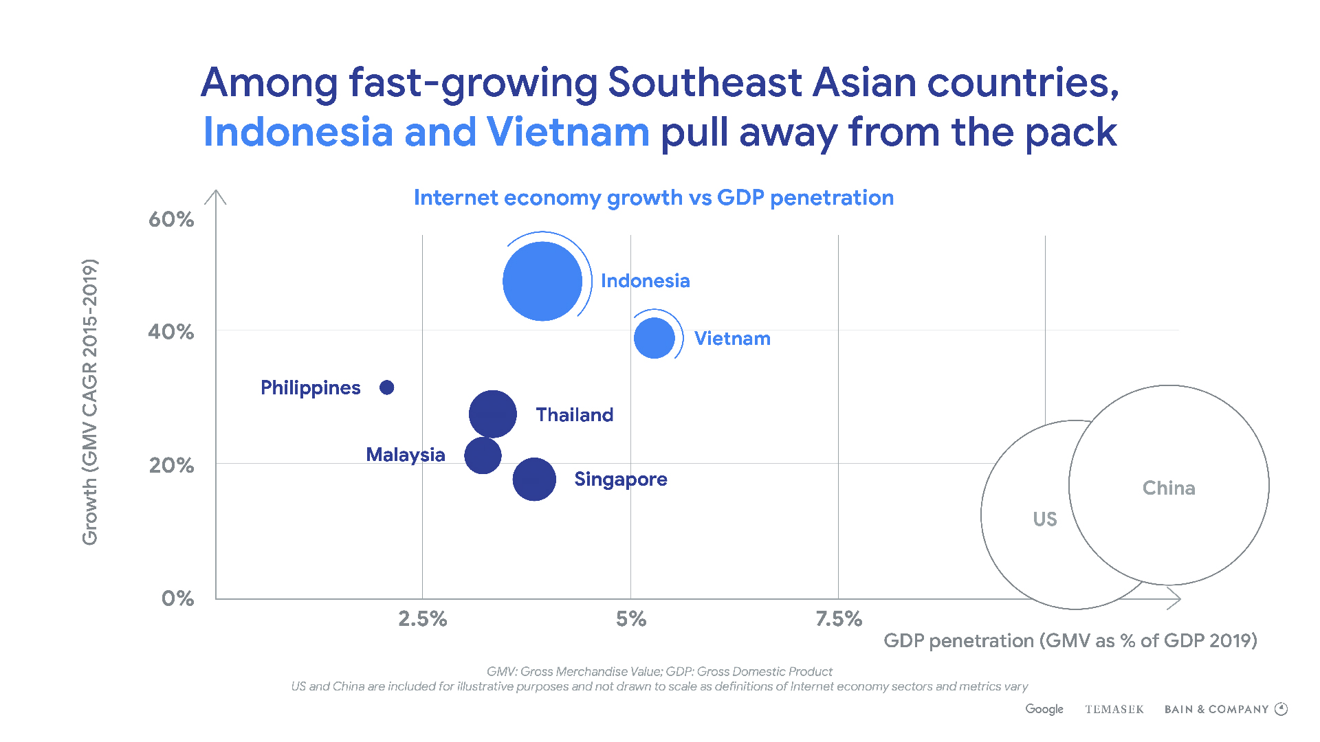
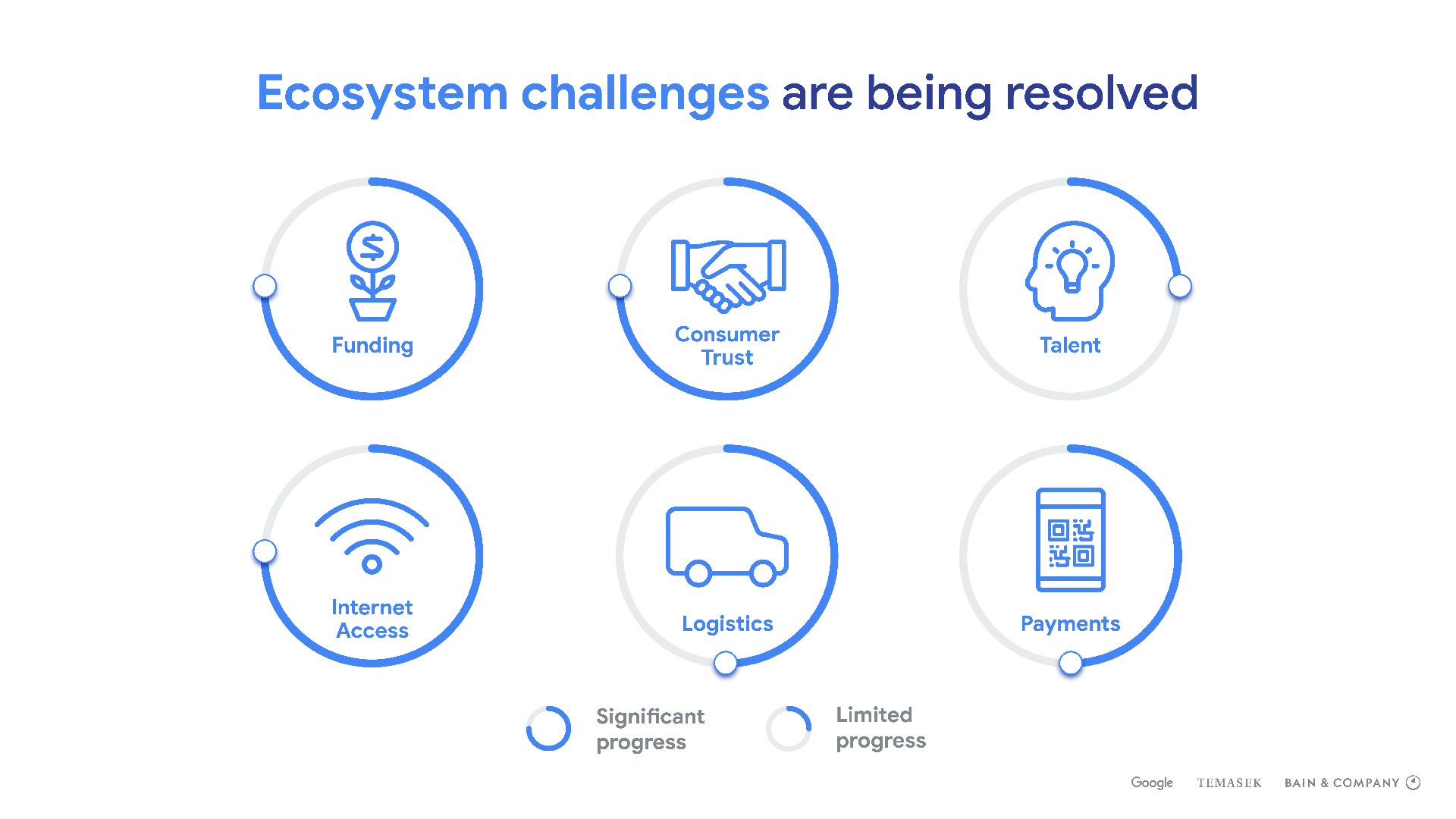
Illustrations
were also deployed to fuse with different sections of the reports, ranging from
Growth Opportunities Beyond Metros to Digital Financial Services.
For the full report, please click here.
Works For All, a UK-based organisation, specialises in community-led design, dedicating its efforts to empowering local groups to develop services and products that precisely address their requirements. The organisation furnishes comprehensive support throughout the design lifecycle—including phases of collaboration, piloting, evaluation, and improvement—to equip communities with the requisite skills and resources to engineer significant and sustainable solutions ranging from families to corporate entities.
Inspired by the intention of “making waves”, the brand identity of Works For All serves as a direct reflection of this core mission. Fluid wave motifs within the logo symbolise movement, transformation, and adaptability, thereby embodying the commitment to dynamic, positive social transformation.
Inspired by the intention of “making waves”, the brand identity of Works For All serves as a direct reflection of this core mission. Fluid wave motifs within the logo symbolise movement, transformation, and adaptability, thereby embodying the commitment to dynamic, positive social transformation.
Interwoven shapes underscore the principle of collaboration, representing the organisation's function in unifying diverse stakeholders to effectively address complex social challenges. Furthermore, the upward trajectory of the wave forms conveys a forward-thinking disposition and a dedication to progress.
The primary colours, Charcoal and Beige, were selected to convey gravitas, balance, stability, and warmth, thereby establishing the mission upon foundations of trust and reassurance. Accent colours are employed to introduce elements of professionalism, hope, and an optimistic vibrancy. Collectively, these visual components encapsulate Works For All’s strategic vision of generating enduring, consequential impact through concerted, community-centric action.
The primary colours, Charcoal and Beige, were selected to convey gravitas, balance, stability, and warmth, thereby establishing the mission upon foundations of trust and reassurance. Accent colours are employed to introduce elements of professionalism, hope, and an optimistic vibrancy. Collectively, these visual components encapsulate Works For All’s strategic vision of generating enduring, consequential impact through concerted, community-centric action.


