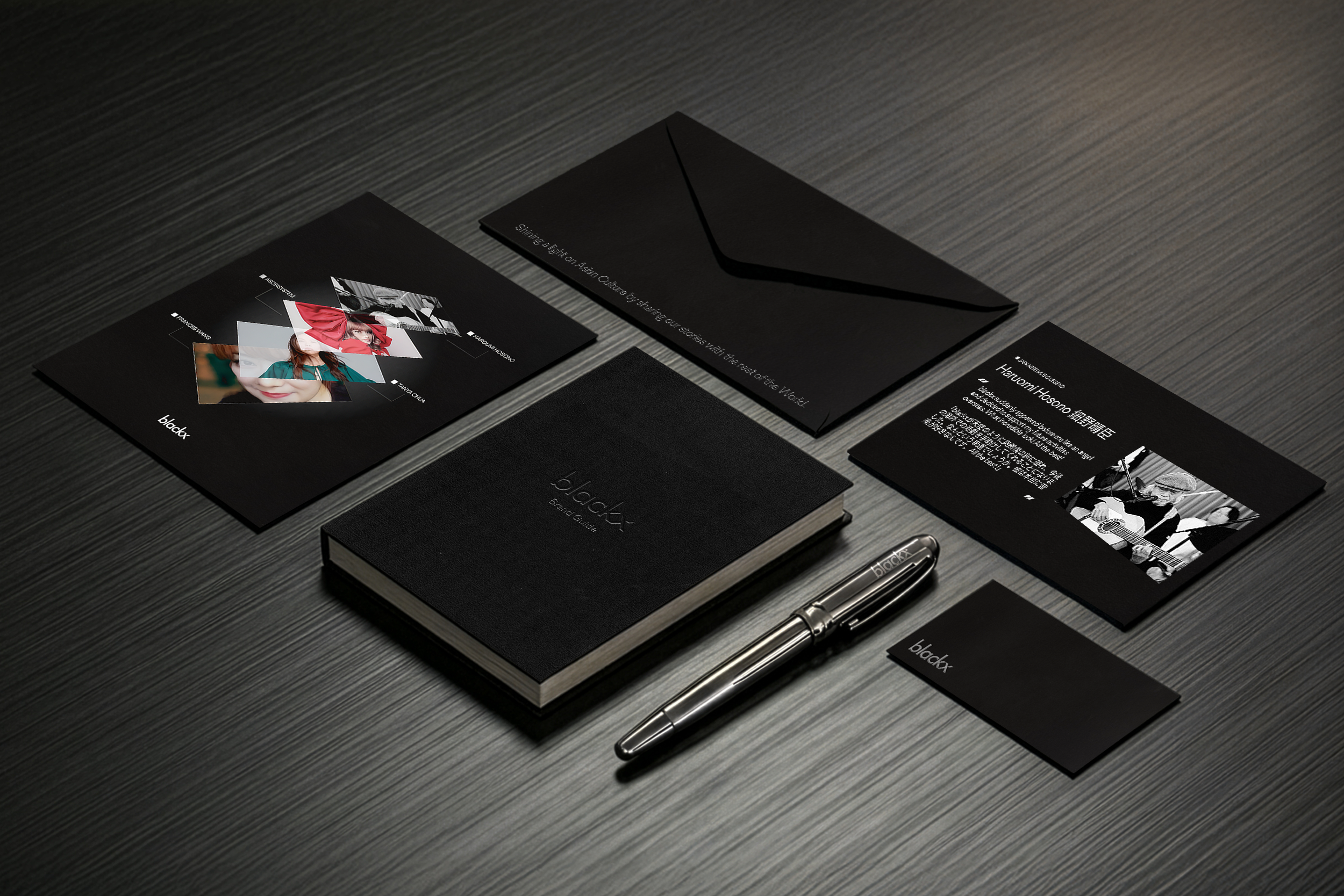
blackx was founded by industry insiders with a single ambition: to propel Asia’s creative voice through ownership, equity, and cutting-edge technology. As an investment firm dedicated to music-related IP, they needed an identity that bridged the gap between financial gravitas and cultural passion.
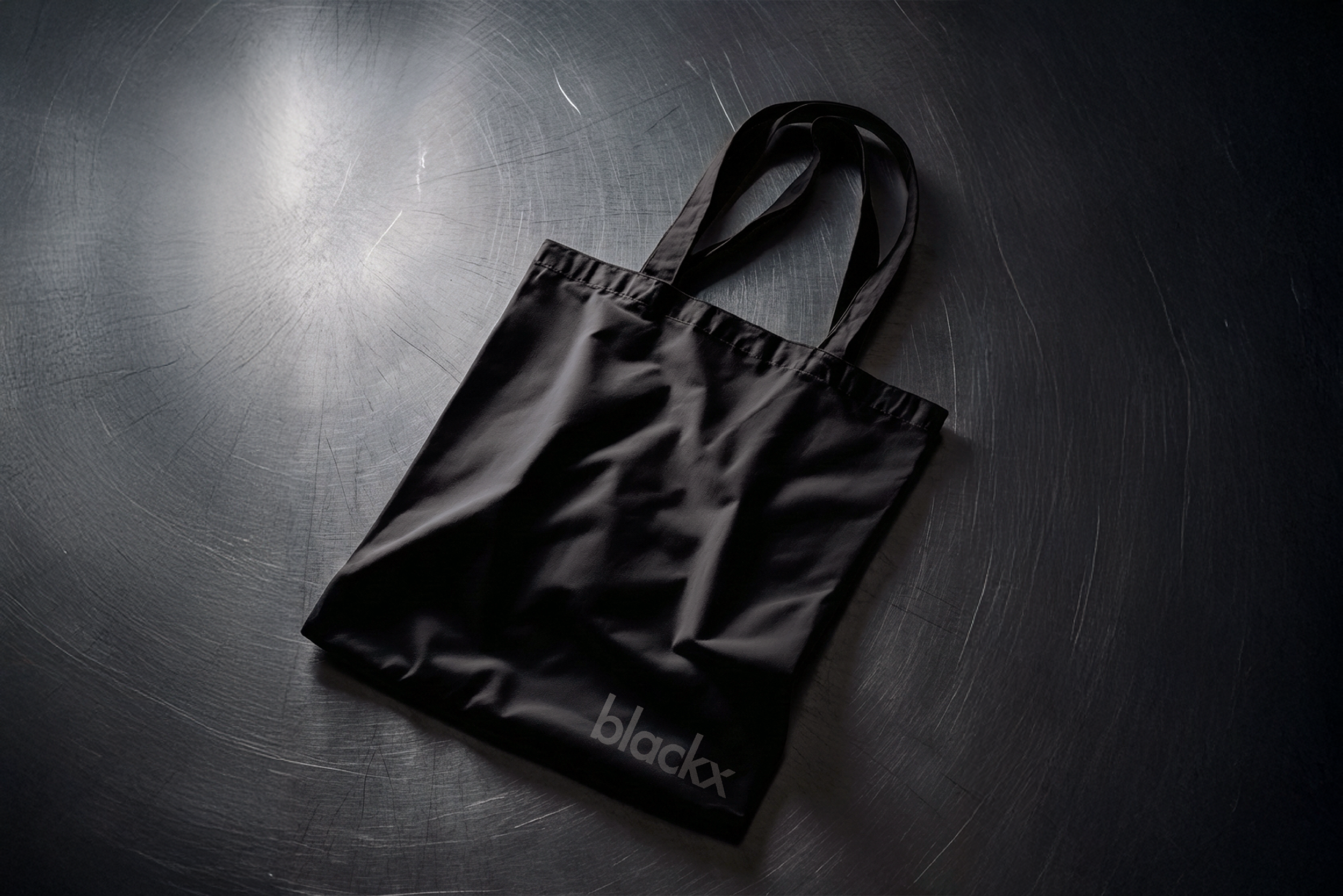
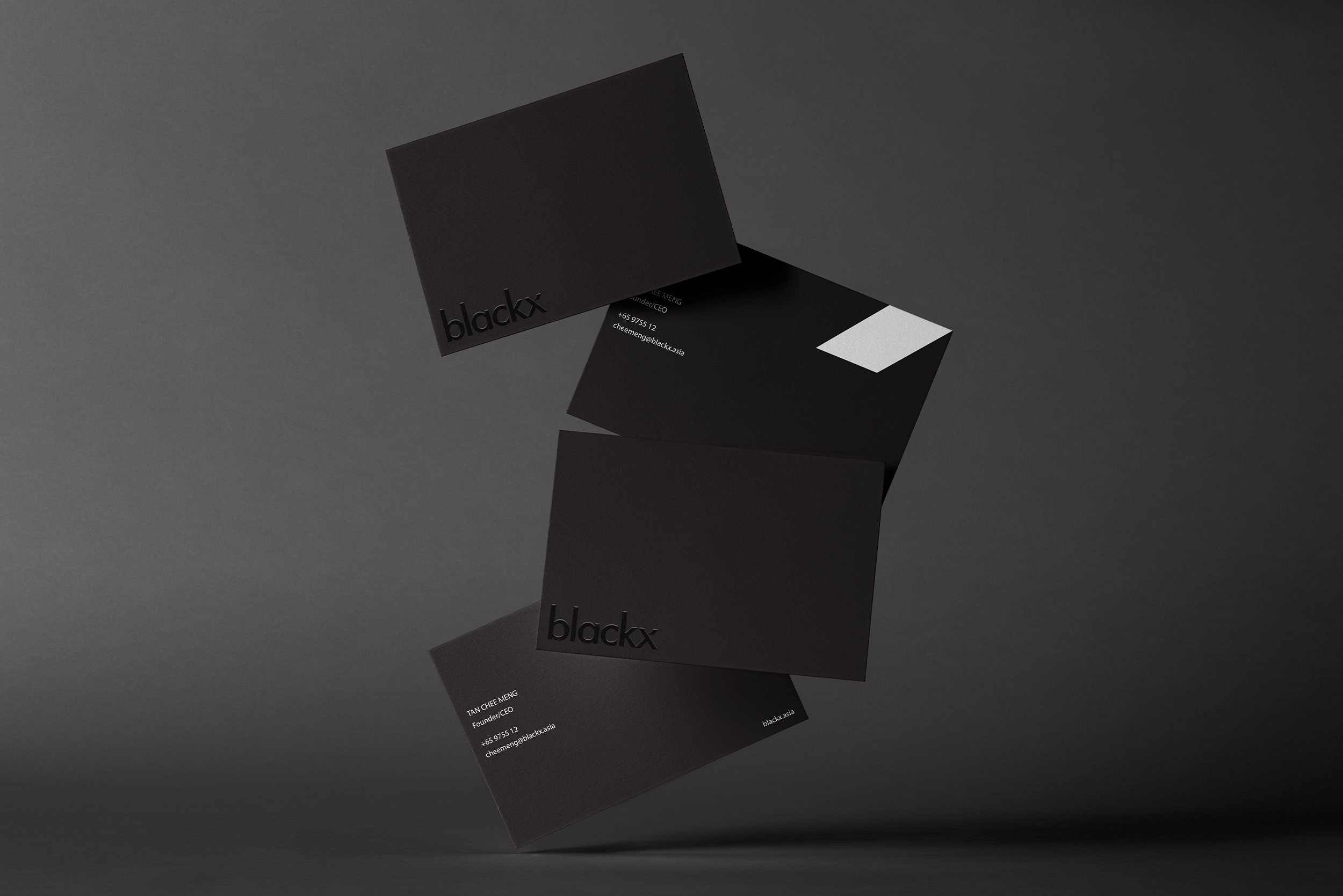
The rebrand is anchored by the cutting-edge geometry of Tenet, our sans serif typeface family chosen for its structural integrity and modern precision. We paired this typography with a strict, sleek black-and-white gradient palette. This monochromatic approach is a deliberate exercise in intention and restraint; it signifies the clarity of ownership and the "black and white" nature of equity.
The rebrand is anchored by the cutting-edge geometry of Tenet, our sans serif typeface family chosen for its structural integrity and modern precision. We paired this typography with a strict, sleek black-and-white gradient palette. This monochromatic approach is a deliberate exercise in intention and restraint; it signifies the clarity of ownership and the "black and white" nature of equity.
Crucially, this sleek identity serves a functional philosophy: Artist First. By stripping away the superfluous, the blackx brand acts as a high-contrast frame, a solid foundation that allows the vibrant, diverse work of the musicians to take center stage. The result is a brand that feels sophisticated and tech-forward, providing the structure so that Asia’s artists can define the culture forward.